Icon Tutorial
From THIS to 
Shrink the image down to a size you like and sharpen it once or twice , so it looks something like this:

The image is a bit dark, so I've duplicated it 3 times and set all the new layers to screen so it looks like this:

A little tip: if you find that after sharpening the image it looks just too sharp, if you can leave the bottom layer slightly blurred, then sharpen the screened or soft light layers above it, this will make the image look sharper without having that horrible over-sharpened look.
I then gave the image a white frame by creating a new layer, selecting a wide area around my image, and filling it with white. Alternatively you could use a brush, or you can fill the whole layer in white and cut out a small area to show your image. It should then look something like this:

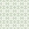
I created a new layer and filled it with a pattern. I think the one I used is by
oxoniensis (if I'm wrong please let me know):
I deleted quite a bit of it but left a small corner detail on the icon, so it looks like:

Next I added this gradient:

And set it to overlay so the icon now looks like:

I added a layer of dark blue set to exclusion (hey, I'm a traditionalist!):

to
Then I added a texture by
inxsomniax and set it to darken to get:
to
I gave the image of Paige a white frame. You can either use a brush or use the shape tool and delete the center as I did to get:

Next I used the shape tool to create a black (or you can use white) rectangle across the icon and set this to saturation so my icon looked like:

Using the shape tool again I added some square shape details in white and red:

Then a little more detail with a dotted line brush by
quebelly, you can find all her brushes at her website square pretties:

...a little bit of mini text (oh how I love mini text!)

...and text (I used Keyboard Elite SSi, size pt. 6)
...and we're done!
Shrink the image down to a size you like and sharpen it once or twice , so it looks something like this:
The image is a bit dark, so I've duplicated it 3 times and set all the new layers to screen so it looks like this:
A little tip: if you find that after sharpening the image it looks just too sharp, if you can leave the bottom layer slightly blurred, then sharpen the screened or soft light layers above it, this will make the image look sharper without having that horrible over-sharpened look.
I then gave the image a white frame by creating a new layer, selecting a wide area around my image, and filling it with white. Alternatively you could use a brush, or you can fill the whole layer in white and cut out a small area to show your image. It should then look something like this:
I created a new layer and filled it with a pattern. I think the one I used is by
oxoniensis (if I'm wrong please let me know):
I deleted quite a bit of it but left a small corner detail on the icon, so it looks like:
Next I added this gradient:
And set it to overlay so the icon now looks like:
I added a layer of dark blue set to exclusion (hey, I'm a traditionalist!):
to
Then I added a texture by
inxsomniax and set it to darken to get:
to
I gave the image of Paige a white frame. You can either use a brush or use the shape tool and delete the center as I did to get:
Next I used the shape tool to create a black (or you can use white) rectangle across the icon and set this to saturation so my icon looked like:
Using the shape tool again I added some square shape details in white and red:
Then a little more detail with a dotted line brush by
quebelly, you can find all her brushes at her website square pretties:
...a little bit of mini text (oh how I love mini text!)
...and text (I used Keyboard Elite SSi, size pt. 6)
...and we're done!