The Colour of Chloe
Was on a buisness trip to Aberdeen yesterday cus the Minister was giving a speech (we make sure that he follows lines that have been agreed between UK Ministers, Devolved Ministers and Officials (i.e. all us evil civil servants) when talking to the press and industry, and that he is aware of current affairs etc.), it completely knackered me out! Didn't get back to the flat till half seven - I swear they don't pay me enough! Then today has been made up of loads of niggling things - I think we've been double charged somewhere cus Ronnie gave me some budget figs today which were a bit dodgy looking, so I'm trying to track that all down. Also I had to get some documents published on the website that should have been up on Monday but weren't cus a) I was away and b) they didn't forward them onto me until Friday afternoon and who the hell wants to convert 3 research reports of 50+ pages each from word to html over the weekend? Not me and not the contractors! Anyway, I'm trying to get some stuff done online that I've been meaning to do for ages, so here's a icon tutorial requested by julia_thorne13:
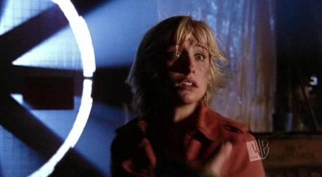
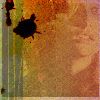
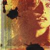
The icon:
Word of warning - this is an icon I made up when I was experimenting so it's pretty random, you'll probably be able to miss out some layers without any problems, these are just the ones I used - I threw things together randomly to see how they worked! I had no particular idea in my head.
I started with THIS SCREENCAP by oxoniensis and cropped it down to:

I duplicated this layer, sharpened, and set the new layer to Screen to get:

Then I added this gradient:

and set it to Darken to get:

Now duplicate the gradient, set to Lighten at 30% opacity to get:

And for a little colour I added a new layer of 9C2225:

and set it at Lighten 50% opacity to get:

Then duplicate the screened layer of Chloe (ya know, the 2nd one that's sharpened) drag it to the top, and set it on Soft Light at 30% opacity. (You could probably argue it barely shows - but hey, it's my icon! Feel free not to use it or up the opacity!)

Then to make her features stand out more I added an Selective Colour adjustment layer (Layer>New Adjustment Layer>Selective Colour) and increased the amount of black to give:

And that's the base layer! (Oh yes, there is more! Aren't you excited?) Merge all the layers together (Layer>Flatten or Merge Visible, whichever you prefer). Now select part of the image - I chose the area around Chloe's face - right-click, and choose Layer via Copy. Set this new layer to Screen to get:

Then I added this truely weird colour - dunno why, and dunno what it's called:

and set it to Lighten at 45% and we get:

Funky lookin'! Now add a thin white border round icon edge (I used the select tool, and fill, but there are some cool brushes you can use too!) I ended up with:

And onto the textures! I can't remember where they all came from so I can't credit here - but they will be from one of the sites listed in my resources. The first texture:
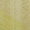
Set this to Hard Light to get:

Now a new gradient for a tad more yellow colour:

Set to Screen at 45% to get:

Then this gradient:

Set at Hard Light to get:

Now a new texture layer!
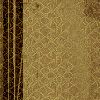
Set at Linear Burn 50% opacity:

Whew! I could have stopped here but No! Not me! *snigger* Where would be the fun in that? So I added this texture:
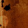
And set it to Pin Light. I then erased everything but the top left corner. You can use an eraser if you like but I used a layer mask. There's a tutorial for using these by wliberation HERE. This gave me:
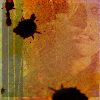
I duplicated this layer, twisted it round, stretched it a little, moved it to the bottom right of the icon - just mucked about really until I liked what I saw! And ended up with:
Now all I need is for Chloe to be clearer! Yay! Duplicate the 2nd layer, that's the 'cut out' focused on Cloe's face, and set it at Soft Light 55% opacity:
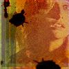
I then duplicated this layer again, set it at Soft Light 100% opacity, but deleted everything but Cloe's face to give:
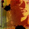
Oh Yeah! NEARLY happy (feel free to call me names if you like, cus I'm sure you're fed up of all these bl**dy layers!) I added a new Selective Colour adjustment layer, increased the black and white, and probably tweaked some of the other colours (not too much though) to give:
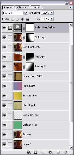
DONE! Now you can add whatever text you fancy! Here's our finished layers:
Whew! You're probably as relieved as I am that that's finished! But I never post in my journal without leaving a Random so....
Random Funny: A Womans Cuckoo Clock Confession....
The other night I was invited out for a night with "the girls." I told my husband that I would be home by midnight, "I promise!"
Well, the hours passed and the champagne was going down way too easily. Around 3am, drunk as a skunk, I headed for home. Just as I got in the door, the cuckoo clock in the hall started up & cuckooed 3 times.
Quickly, realising he'd probably wake up, I cuckooed another 9 times. I was really proud of myself for coming up with such a quick-witted solution (even when smashed), in order to escape a possible conflict with him.
The next morning my husband asked me what time I got in, & I told him 12:00. He didn't seem disturbed at all. Whew! Got away with that one! Then he said, "We need a new cuckoo clock."
When I asked him why, he said, Well, last night our clock cuckooed three times, then said, "Oh sh*t," cuckooed 4 more times, cleared its throat, cuckooed another 3 times, giggled, cuckooed twice more, and then tripped over the cat and farted!"