MY NEW ICON JOURNAL plus ICON PROGRESSION MEME
A week or so ago I decided to make myself a graphics journal. Noticing that I've been making more and more friends-only posts recently and having a too-big to handle F-list convinced me to make a separate journal for my graphics.
You can see my new graphics journal here:
equanimousicons equanimousicons equanimousicons equanimousicons
All of my old graphics are posted there and I hope to make my first new post this week. I'll be posting all my icons/headers/FO banners/colorbars there from now on, though I'll probably post links from here for awhile, at least.
SO, GO FRIEND MY GRAPHICS JOURNAL! Also, if you only friended me for my graphics and don't want to have my personal journal friended I'll totally understand.
In honor of my new graphics journal, I'm doing an Icon Progression Meme, the idea of which I stole from clearthe_area's journal.
It was interesting going back through all the icons I've posted to see how far I've come. I kind of hate looking at the older ones now, they're that bad in my opinion. I like the more recent ones a lot though.
So, without further ado, here is my ICON PROGRESSION:
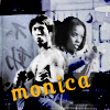
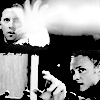
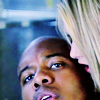
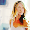
Note: these aren't necessarily my favorite icons of the time. They're more the best icons of that time + the most indicative of "my style" at the time.
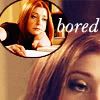
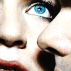
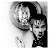
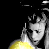
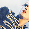
Before I started my Livejournal To October 2006

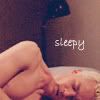


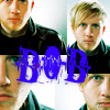
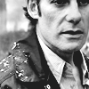
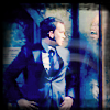
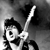
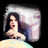
November 2006 To March 2007


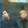


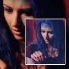
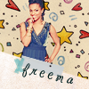
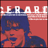
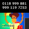
April To June 2007


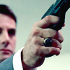
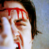
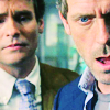


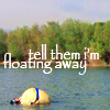
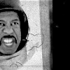
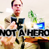


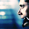
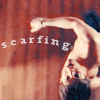
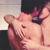
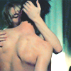
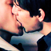


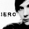
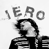
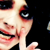
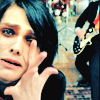

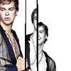
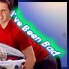
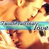
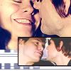
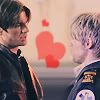
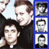
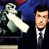
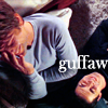
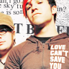
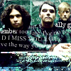
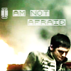
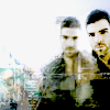
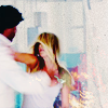
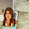
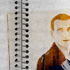
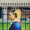
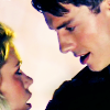
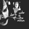
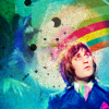
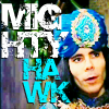
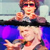
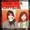
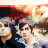
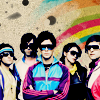
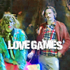
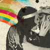
July 2007 To Present


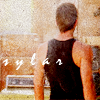


A Few To Come


Some Observations:
Feel free to snag any icons that you want (though I don't really know why anyone would want the older ones).
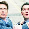
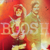
ps: Check out the Doctor Who & Mighty Boosh spam I posted last night. :)
You can see my new graphics journal here:
equanimousicons equanimousicons equanimousicons equanimousicons
All of my old graphics are posted there and I hope to make my first new post this week. I'll be posting all my icons/headers/FO banners/colorbars there from now on, though I'll probably post links from here for awhile, at least.
SO, GO FRIEND MY GRAPHICS JOURNAL! Also, if you only friended me for my graphics and don't want to have my personal journal friended I'll totally understand.
In honor of my new graphics journal, I'm doing an Icon Progression Meme, the idea of which I stole from clearthe_area's journal.
It was interesting going back through all the icons I've posted to see how far I've come. I kind of hate looking at the older ones now, they're that bad in my opinion. I like the more recent ones a lot though.
So, without further ado, here is my ICON PROGRESSION:
Note: these aren't necessarily my favorite icons of the time. They're more the best icons of that time + the most indicative of "my style" at the time.
Before I started my Livejournal To October 2006
November 2006 To March 2007
April To June 2007
July 2007 To Present
A Few To Come
Some Observations:
- It was amusing to read through the few comments that I got in my fist posts and see comments from people on my F-list that I regularly talk to now. I believe citibryd and caesaria82 were two of the first people that ever friended me, thanks to Queer as Folk Icons!
- My older icons aren't terrible but I had to wade through piles of crap before I found ones that I wasn't too embarrassed to post.
- I think I use better placed and more interesting text now than I used to.
- I used to have an easier time making funnier icons. I've lost that ability for some unknown reason.
- I think the biggest change in my icons is coloring, which I've worked hard on improving. I'm definitely better at color layers, brightness/contrast, and hue/sat then I used to be.
- I think my second biggest change is in the use of textures. I sucked at it when I first started but I'm getting much better at it now. Properly learning how to use layer masks helped a lot.
- I think my cropping has got more interesting, which is good because I've been working on improving that. I've become a lot more comfortable making icons where the subject is tiny or extremely close up.
- I started making a lot more black and white icons in my later batches. I think I made some earlier but didn't end up posting them because they weren't very good. Yay for learning how to use levels and gradient maps.
- At some point during the winter of 2007 I became obsessed w/making bandom icons.
- I clearly need to make more Jossverse icons and resume making QAF icons.
- I like everything I've made from July 2007 onwards the most. That's probably not surprising though.
Feel free to snag any icons that you want (though I don't really know why anyone would want the older ones).
ps: Check out the Doctor Who & Mighty Boosh spam I posted last night. :)