(no subject)
My first tutorial!
Yaaaay~
We are going from
to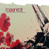
Photoshop Elements 3.0... yes, you may "awe" because that's what I use, imagine... XP It's a pain, but I manage.
Anyhow, I'm sure you can try it with other versions.
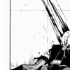
Crop the image. [left]
Then we clean off the messy background stuff with the Brush Tool, set to white or black depending on what you're messing with. You don't have to be too careful, you can sort of still see some traces in mine, I'm just careless.>SHARPEN [with the Sharpen Tool]
strength: 50% -ish
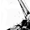

I took this image from gender and rotated it a bit to fit into a decent place on the icon. MEANING: not where Edward's body is, but where there is mostly white.
Set it to Multiply.
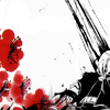

Gradients! :D You knew they were coming.
Darken >> Opacity 100%
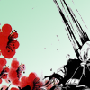

Multiply >> Opacity 60%


Exclusion >> Opacity 62%
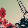

Soft Light >> 61%


Lighten >> 100%
Here, I erased a bit around the flowers.
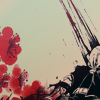
Make a random lil tiny-text text. Everybody loves the tiny-text. This layer goes under the one above.
[if using mine] Set it to Multiply.

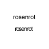
Now for the text. The font I used was ARIAL, SIZE: 12.5pt [I'm hoping that's the same as pixels?]. I used INDIVIDUAL letters. First, I created the "R" then, in a new layer, "O", then again with the "S" and so on.
The purpose of doing them separated is because I wanted the text a little closer together. I placed the letters below my gradients and above the flowers layer.
I believe PS7 has this feature, and you don't have to go through this trouble. XD;


Set this brush, which I rotated, to SCREEN [above all layers]. I seem to have this under the name of "charon_icons_paint", so if anyone knows the creator, kindly inform me so I may credit properly in this tutorial. :)
Finito! :D
I'd love to see your results, and criticism is appreciated. :D
I just wanted to make a tutorial, m'kay, maybe this wasn't the best icon to pick but oh well. 8D;
Yaaaay~
We are going from

to

Photoshop Elements 3.0... yes, you may "awe" because that's what I use, imagine... XP It's a pain, but I manage.
Anyhow, I'm sure you can try it with other versions.

Crop the image. [left]
Then we clean off the messy background stuff with the Brush Tool, set to white or black depending on what you're messing with. You don't have to be too careful, you can sort of still see some traces in mine, I'm just careless.>SHARPEN [with the Sharpen Tool]
strength: 50% -ish


I took this image from gender and rotated it a bit to fit into a decent place on the icon. MEANING: not where Edward's body is, but where there is mostly white.
Set it to Multiply.


Gradients! :D You knew they were coming.
Darken >> Opacity 100%


Multiply >> Opacity 60%


Exclusion >> Opacity 62%


Soft Light >> 61%


Lighten >> 100%
Here, I erased a bit around the flowers.


Make a random lil tiny-text text. Everybody loves the tiny-text. This layer goes under the one above.
[if using mine] Set it to Multiply.


Now for the text. The font I used was ARIAL, SIZE: 12.5pt [I'm hoping that's the same as pixels?]. I used INDIVIDUAL letters. First, I created the "R" then, in a new layer, "O", then again with the "S" and so on.
The purpose of doing them separated is because I wanted the text a little closer together. I placed the letters below my gradients and above the flowers layer.
I believe PS7 has this feature, and you don't have to go through this trouble. XD;


Set this brush, which I rotated, to SCREEN [above all layers]. I seem to have this under the name of "charon_icons_paint", so if anyone knows the creator, kindly inform me so I may credit properly in this tutorial. :)
Finito! :D
I'd love to see your results, and criticism is appreciated. :D
I just wanted to make a tutorial, m'kay, maybe this wasn't the best icon to pick but oh well. 8D;