tutorial #05

At first, when lovely rocketgirl2 asked about my composition, I wondered for a bit if she had commented on the wrong thread. I'm not usually very forward in that department, so this guide might be really boringggg to you. But then, well, challenge accepted! Let's ramble about complex!
There are many ways to make an icon look complex, without really being all that complex at all (oops). Since this won't be a coloring guide, I'll skip the how-to of image coloring and show you only compositions. Also I cheated and used some old icons as examples. BUT MOVING ALONG.
To compose an icon, you basically look for elements that go together in caps and textures.
OKAY CECE BUT HOW DO I KNOW WHAT GOES TOGETHER WITH WHAT?
Not sure, actually! Gut feeling? Consult a tarot reader? Guess? Try lots of them and see what sticks? I usually go for one of the following combos:
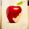
- Negative space + negative space. Reminding you that you can get negative space out of basically any cap. Go here for a tut on subject extraction!.


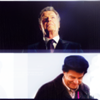

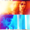
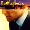
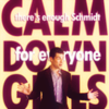
There's also this cool multiple-vertical-composition works best with movement/action caps. You can either do it with a single cap, or with multiple caps if you're feeling particuarly ~daring. Mind the hair porn!

or

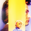
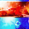
- Negative space + close crop. Negative space + anything, really, Neg. space is so failsafe for complexity it's almost a cop-out.


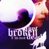
- Silhouettes! Cut them out or enjoy a cap with naturally harsh contrast. Put something inside. PROFIT.


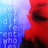
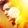
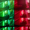
- Color + other color. Color a cap with one predominant color, other cap with another predominant color (or the same cap with two different colors, your choice), and arrange them prettily on the canvas.

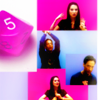
- Stock, images or symbols related to your show/character/etc. Like these


- Use the texture as a "paint-by-numbers" guide, include an image in every little block!

>


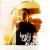
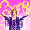
- When all else fails, stop using all else. I mean, include some text. Text is awesome and makes things look more complex then they actually are.


If you picked good caps, arranging them on the canvas is no big deal. Fiddle until you're satisfied and ta-da.
- For blending, specifically, it's also a good idea to find caps with the same or similar contrast and lighting (coloring is easier to change, but coloring and contrast is really important!)
- Usually I do the composition (if there's one) in a larger canvas (200x200 px or 400x400px) and resize later, it blends better that way in my experience.
- Tip picked from vetica: you know those picspams you love to make? Picking a bunch of caps from your favorite show and coloring and then just staring at the pretty? Use them to icon!
- CHEAT SHEET: When I feel an icon is looking boring, I clone stamp, duplicate, move it around the canvas and use textures on top of everything. Results in icons like these:


Insta!complex!
- Profiles/caps of people looking to the side/looking down are incredible versatile. So are outdoorsy caps and silhouettes!
- You don't have to fill every inch of the icon (mostly because icons barely have an inch) to make it complex.
- TEXTURES EVERYWHERE. Textures bring a sense of cohesion to a multiple-image composition. Blank white space textures, "divided" textures & light textures are great for making an icon "come together". Set them to screen, erase parts you don't like. Examples:


my favorite image to use on icons in the history of ever
As you see, no complex funky texture use or complex blending (like manips) or complex anything on my part, because uhm I'm not good at those. Even so, I hope you enjoyed this tiny guide and it was helpful to you in any way. Further questions and comments and tips are lovely and welcome. My thread at ask the maker is still open if you wish for something more detailed!
Up next: watch Cece fail at recreating an icon made by herself. And something else that might interest you. :)