[ theloyalist ] tutorial! 001. →panic! at the disco
upon request by msdiscolady, a tutorial! :D
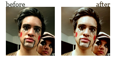
I'm assuming you already know how to shrink and crop the image, so we'll start with the base image after cropping and the like. feel free to experiment with cropping; it's fun!
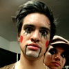
i. now the image is cropped and ready to go! it's a little dark, though, so we'll duplicate it (image or CTRL+J) and set the layer to screen at 50% opacity. (image)

much better, yeah? :D
ii. from here we'll create a new layer (image or CTRL+Shift+N). fill it with #170200 (image).
it should look like this:

from here we're going to set the layer to exclusion. (image)
it should look like this:

iii. it's still a little dull, though, and I'd like it to be browner ('cause it's my preferred coloring style). so we'll create a color balance layer (image).
it should look like this:

in the shadows, we're going to move the top (cyan ... red) slider to +10, which will increase the amount
of red in the shadows.
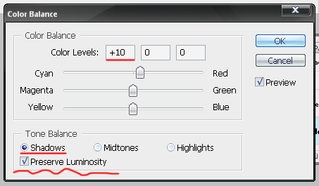
make sure to keep Preserve Luminosity checked!
in the highlights, we're going to move the bottom (yellow ... blue) slider to +10, which will increase the amount of blue in the shadows.
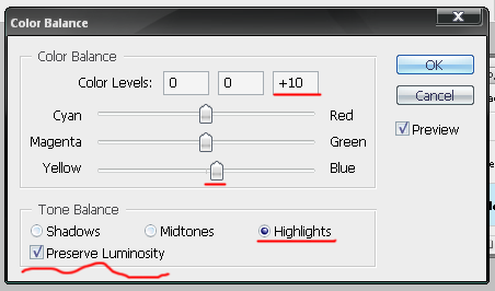
again, make sure to keep Preserve Luminosity checked!
once you've done all this, the icon should look like this:
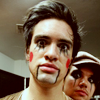
iv. now I've got the colors I want, but the shadows are a little flat (exclusion layers will do that, especially brown ones). to fix this we're going to create a selective coloring layer (image)
it should look like this:
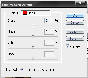
selective coloring is, unfortunately, only available in photoshop (unless something's changed since last I knew), but it's a very nifty tool. if you're not familiar with it, basically what it does is give you the option of increasing or decreasing the yellow, magenta, cyan and black in any particular tone (red, yellow, green, blue, etc.) in your image. it can lead to some really, really nasty mishaps, but it's also very useful if you know how to use it properly.
what we're going to use it for is to increase the blacks without touching the rest of the icon. (which is sort of a lie, lol, 'cause it increases every shade darker than the medium, but. *shrug*) it's a nice way of increasing contrast without blowing out the highlights.
from the drop-down menu we'll select Blacks, and increase the black slider by +10.
it should look like this:

I'm not entirely sure how large a difference there is, but I always have it set (at the bottom) to relative instead of absolute, so it's probably safe to do the same yourself. feel free to experiment, though.
anyway, the final version should look like this:
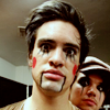
much nicer, yes? :D (not necessarily than the original, lol, but nicer than step 3's results.)
if you don't have photoshop: you can receive a similar effect, for this case, by increasing the contrast of the icon (image and then image; assuming, of course, it looks the same in other programs), but you lose some of the fade and the blue I like. 8(
some final notes: the exact steps used in this tutorial were for this particular icon. settings vary slightly from icon to icon, depending on the original coloring, and always feel free to experiment with different settings. don't copy this verbatim! play around with things, have fun. XD that's the whole point of making graphics.
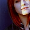
some other examples of this particular coloring:
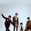

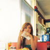
and similar coloring with slightly different settings and the addition of curves:



I'm assuming you already know how to shrink and crop the image, so we'll start with the base image after cropping and the like. feel free to experiment with cropping; it's fun!

i. now the image is cropped and ready to go! it's a little dark, though, so we'll duplicate it (image or CTRL+J) and set the layer to screen at 50% opacity. (image)

much better, yeah? :D
ii. from here we'll create a new layer (image or CTRL+Shift+N). fill it with #170200 (image).
it should look like this:

from here we're going to set the layer to exclusion. (image)
it should look like this:

iii. it's still a little dull, though, and I'd like it to be browner ('cause it's my preferred coloring style). so we'll create a color balance layer (image).
it should look like this:

in the shadows, we're going to move the top (cyan ... red) slider to +10, which will increase the amount
of red in the shadows.

make sure to keep Preserve Luminosity checked!
in the highlights, we're going to move the bottom (yellow ... blue) slider to +10, which will increase the amount of blue in the shadows.

again, make sure to keep Preserve Luminosity checked!
once you've done all this, the icon should look like this:

iv. now I've got the colors I want, but the shadows are a little flat (exclusion layers will do that, especially brown ones). to fix this we're going to create a selective coloring layer (image)
it should look like this:

selective coloring is, unfortunately, only available in photoshop (unless something's changed since last I knew), but it's a very nifty tool. if you're not familiar with it, basically what it does is give you the option of increasing or decreasing the yellow, magenta, cyan and black in any particular tone (red, yellow, green, blue, etc.) in your image. it can lead to some really, really nasty mishaps, but it's also very useful if you know how to use it properly.
what we're going to use it for is to increase the blacks without touching the rest of the icon. (which is sort of a lie, lol, 'cause it increases every shade darker than the medium, but. *shrug*) it's a nice way of increasing contrast without blowing out the highlights.
from the drop-down menu we'll select Blacks, and increase the black slider by +10.
it should look like this:

I'm not entirely sure how large a difference there is, but I always have it set (at the bottom) to relative instead of absolute, so it's probably safe to do the same yourself. feel free to experiment, though.
anyway, the final version should look like this:
much nicer, yes? :D (not necessarily than the original, lol, but nicer than step 3's results.)
if you don't have photoshop: you can receive a similar effect, for this case, by increasing the contrast of the icon (image and then image; assuming, of course, it looks the same in other programs), but you lose some of the fade and the blue I like. 8(
some final notes: the exact steps used in this tutorial were for this particular icon. settings vary slightly from icon to icon, depending on the original coloring, and always feel free to experiment with different settings. don't copy this verbatim! play around with things, have fun. XD that's the whole point of making graphics.
some other examples of this particular coloring:
and similar coloring with slightly different settings and the addition of curves: