(no subject)
First things first...
I can't believe I'm finally done my 10x10variated claim!! Well I'm a little past the deadline, seeing as it's officially the 11th, but still! I seriously thought I would never finish! The effects and stock categories always give me trouble.
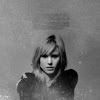
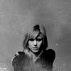
This is the third time I've done 10x10variated but only the second time I completed it. My first set for X-Men 3: The Last Stand is here, and the second set for Harry Potter and the Goblet of Fire (which I didn't finish) can be found here :)
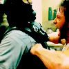
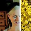
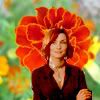
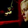
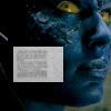
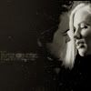
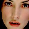
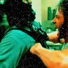
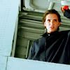
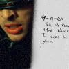
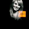
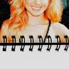
Preview:
Aaaannd without further ado...
First Ten
Use only the original images, changing the color only and nothing else. Color each icon differently, using different color fill layers or adjustment layers.
I really like 5 and 10, I think they both turned out very nice. I like the crop on 1, but the coloring could be better.
001
002
003
004
005
006
007

008
009

010
Second Ten
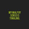
Every icon must have readable text on it. As well, every icon must have a different font.
lol like, all of the text is rotated exactly the same on each icon. Original much? xD Even if it doesn't look like it, I guarantee all of those Times New Roman looking fonts are different, I just don't have my paper with me to prove it :( My favorite is 6 of course xP
001
002
003

004
005
006
007
008
009
010
Third Ten
Use a texture on every icon. A different texture must be used on each one.
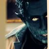
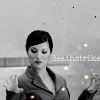
I don't think I'm really thrilled with any of these except the Deathstrike one. And maybe the Wolverine one(7). Maybe.
001
002
003
004
005
006
007

008
009
010
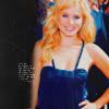
Fourth Ten
Every icon must include a stock image. NO CLOUDS!
Pffft. All of these were rushed so bad, but I thought they were going to be a lot worse. I kind of really like 8, and I don't think I consider 3 as 'clouds'. It's more like...'sky'?
001
002
003
004
005
006
007
008
009
010
Fifth Ten
Rotate the images. This can be done any way, upside down, to the right, the left, caddy cornered, whatever.
Haha these are all rotated the same way XD I was running out of ideas! D: 2 is my favorite of the category, hands down.
001
002
003

004
005
006

007
008
009
010

Sixth Ten
Images must be black and white.
These came out the best, I think and they're a million times better than the B&W batch from my X3 claim. So I'm happy :)
001
002
003
004
005
006
007
008
009
010
Seventh Ten
On each icon, use one effect feature from the Effects menu in your Photoshop or Paintshop.
UGH. I HATE THIS CATEGORY. PERIOD. D: That said, I think they came out looking ok. Ehh...sort of. (Effects used: Film Grain, Gaussian Blur, Radial Blur, Color Halftone, Lens Flare, Patchwork, Mosaic, Facet, Lighting Effects, Wind)
001
002
003
004
005

006
007
008
009
010
Eighth Ten
Every icon must be less than 100x100 pixels.
LOL HALF-ASSED. The X-Men 3 ones are sooo much better.
001

002

003

004

005

006

007
008
009

010

Ninth Ten
Every icon must use one popular icon trend that is hot at the time.
I am in love with 6 SO BAD. Every time I get to this category I feel a little stumped as to what to do, but I think I did a pretty good job this time.
001
002

003
004
005
006
007
008
009
010
Tenth Ten
Free for all! Do whatever you want with these ten! :D
These are...eh. I really liked them when I made them, but I am becoming less and less impressed each time I look at them.
001
002

003
004
005
006

007
008
009
010

Alternatives
JUBILEEEE!
001
002
003
004
005
006
007
008
009
010
011
012
013
014
015
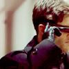
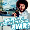
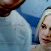
lol and here's the Wolverine manip as a bonus ;P
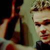
Despite my hate for the third movie, it was surprisingly easier to icon. There was a lot more going on and I think more variety in set location? I don't know, but I found myself wanting to use the SAME CAPS over and over and OVER again this time, and it was really driving me crazy! And I guess because I had more pictures for X-Men 3 because I was collecting them as the movie was being made and stuff. I wasn't that big of a fan when X2 was coming out.
Also, I'm not as proud of this as I am of the last one. I finished the last one in a couple weeks and it was a big step up for me, as far as icon making goes. It really helped to open up my options like it's supposed to, but I don't really feel as if I've made much improvement with this set.
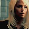
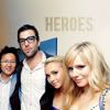
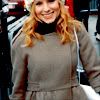
And now some icons from kristenb_lims and a random pottersues.
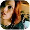
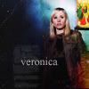
[13] Kristen Bell for kristenb_lims
[01] pottersues (I don't remember what from)
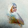
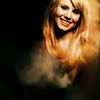
Preview:
001
002
003
004

005

006
007
008
009
010

011
012
013
014
• Textless icons are not bases unless otherwise noted.
• Do not alter icons in any manner, with the exception of the above.
• No hotlinking!
• Comments are always appreciated! :D
• Credit is necessary. Remember to credit lostacanthus, not just the community :)
• Resources
If you like what you see, please feel free to watch us! ♥
Haha as of right now I'm entered in 4 different lims. So...pimpage?
tv_lims
kristenb_lims
cb_lims
Those three still have sign up time!
jam_lims (PLZ CROSS YOUR FINGERS FOR ME, CAUSE I'M SO NERVOUS ABOUT THIS ONE!)
Anddd...That's it! Goodnight! :D
I can't believe I'm finally done my 10x10variated claim!! Well I'm a little past the deadline, seeing as it's officially the 11th, but still! I seriously thought I would never finish! The effects and stock categories always give me trouble.
This is the third time I've done 10x10variated but only the second time I completed it. My first set for X-Men 3: The Last Stand is here, and the second set for Harry Potter and the Goblet of Fire (which I didn't finish) can be found here :)
Preview:
Aaaannd without further ado...
First Ten
Use only the original images, changing the color only and nothing else. Color each icon differently, using different color fill layers or adjustment layers.
I really like 5 and 10, I think they both turned out very nice. I like the crop on 1, but the coloring could be better.
001
002
003
004
005
006
007
008
009
010
Second Ten
Every icon must have readable text on it. As well, every icon must have a different font.
lol like, all of the text is rotated exactly the same on each icon. Original much? xD Even if it doesn't look like it, I guarantee all of those Times New Roman looking fonts are different, I just don't have my paper with me to prove it :( My favorite is 6 of course xP
001
002
003
004
005
006
007
008
009
010
Third Ten
Use a texture on every icon. A different texture must be used on each one.
I don't think I'm really thrilled with any of these except the Deathstrike one. And maybe the Wolverine one(7). Maybe.
001
002
003
004
005
006
007
008
009
010
Fourth Ten
Every icon must include a stock image. NO CLOUDS!
Pffft. All of these were rushed so bad, but I thought they were going to be a lot worse. I kind of really like 8, and I don't think I consider 3 as 'clouds'. It's more like...'sky'?
001
002
003
004
005
006
007
008
009
010
Fifth Ten
Rotate the images. This can be done any way, upside down, to the right, the left, caddy cornered, whatever.
Haha these are all rotated the same way XD I was running out of ideas! D: 2 is my favorite of the category, hands down.
001
002
003
004
005
006
007
008
009
010
Sixth Ten
Images must be black and white.
These came out the best, I think and they're a million times better than the B&W batch from my X3 claim. So I'm happy :)
001
002
003
004
005
006
007
008
009
010
Seventh Ten
On each icon, use one effect feature from the Effects menu in your Photoshop or Paintshop.
UGH. I HATE THIS CATEGORY. PERIOD. D: That said, I think they came out looking ok. Ehh...sort of. (Effects used: Film Grain, Gaussian Blur, Radial Blur, Color Halftone, Lens Flare, Patchwork, Mosaic, Facet, Lighting Effects, Wind)
001
002
003
004
005
006
007
008
009
010
Eighth Ten
Every icon must be less than 100x100 pixels.
LOL HALF-ASSED. The X-Men 3 ones are sooo much better.
001
002
003
004
005
006
007
008
009
010
Ninth Ten
Every icon must use one popular icon trend that is hot at the time.
I am in love with 6 SO BAD. Every time I get to this category I feel a little stumped as to what to do, but I think I did a pretty good job this time.
001
002
003
004
005
006
007
008
009
010
Tenth Ten
Free for all! Do whatever you want with these ten! :D
These are...eh. I really liked them when I made them, but I am becoming less and less impressed each time I look at them.
001
002
003
004
005
006
007
008
009
010
Alternatives
JUBILEEEE!
001
002
003
004
005
006
007
008
009
010
011
012
013
014
015
lol and here's the Wolverine manip as a bonus ;P
Despite my hate for the third movie, it was surprisingly easier to icon. There was a lot more going on and I think more variety in set location? I don't know, but I found myself wanting to use the SAME CAPS over and over and OVER again this time, and it was really driving me crazy! And I guess because I had more pictures for X-Men 3 because I was collecting them as the movie was being made and stuff. I wasn't that big of a fan when X2 was coming out.
Also, I'm not as proud of this as I am of the last one. I finished the last one in a couple weeks and it was a big step up for me, as far as icon making goes. It really helped to open up my options like it's supposed to, but I don't really feel as if I've made much improvement with this set.
And now some icons from kristenb_lims and a random pottersues.
[13] Kristen Bell for kristenb_lims
[01] pottersues (I don't remember what from)
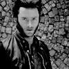
Preview:
001
002
003
004
005
006
007
008
009
010
011
012
013
014
• Textless icons are not bases unless otherwise noted.
• Do not alter icons in any manner, with the exception of the above.
• No hotlinking!
• Comments are always appreciated! :D
• Credit is necessary. Remember to credit lostacanthus, not just the community :)
• Resources
If you like what you see, please feel free to watch us! ♥
Haha as of right now I'm entered in 4 different lims. So...pimpage?
tv_lims
kristenb_lims
cb_lims
Those three still have sign up time!
jam_lims (PLZ CROSS YOUR FINGERS FOR ME, CAUSE I'M SO NERVOUS ABOUT THIS ONE!)
Anddd...That's it! Goodnight! :D