013; Cities in Dust
So my first tutorial here:
from:
to: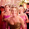
First I have to say that my Photoshop is in German (and apparently i can't change the language), i try to translate and remember the English names but it might be that I translate something wrong. Please tell me and don't be too hard on me ;)
1. Step
First I got rid of the CW logo, because it got in way with my cropping. I made that with this
patch tool.
I won't explain that now. If you want me to explain it, i might do it ^^
2. Step
Now the cropping obviously, I chose a center cropping, because i think it suits blair in this situation the best.

3. Step
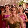
I duplicated the layer and set it on Screen (opacity: 100%)
4. Step
Now I made a new layer with Color Balance
first row (dark colours)
0
0
+5
second row
+5
-3
-4
third row
+2
0
-8

5. Step
New selective color layer
red:
black -10
yellow:
black -10
white:
black -5
black:
black +2

6. Step
New curves layer
Input: 137
Output: 121

7. Step
Now I start working with textures. I always use textures on my icons.

(by bea_lost)
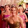
set it on Softlight Opacity: 60%
8. Step
I took this texture

(by chaoticfae)
set it on Softlight Opacity: 60%

9. Step
Another texture:

(by bea_lost)
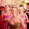
set it on Softlight Opacity: 25%
10. Step
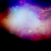
Yet another texture ^^ the last one now:
(by sorry idk)
set on Softlight Opacity: 25%
The End.
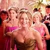
original icon:
result of this tutorial:
not exactly the same, but i think i got pretty close again.
All my icons have a similar colouring, i basically always work with colour balance, selective colour & curves and then add textures.
I hope this was kind of helpful, especially to hopesonhold, who requested it.
PLS DO NOT REPOST THIS ANYWHERE OR CLAIM AS YOURS. making a tut is a shitload of work.
from:

to:

First I have to say that my Photoshop is in German (and apparently i can't change the language), i try to translate and remember the English names but it might be that I translate something wrong. Please tell me and don't be too hard on me ;)
1. Step
First I got rid of the CW logo, because it got in way with my cropping. I made that with this

patch tool.
I won't explain that now. If you want me to explain it, i might do it ^^
2. Step
Now the cropping obviously, I chose a center cropping, because i think it suits blair in this situation the best.

3. Step
I duplicated the layer and set it on Screen (opacity: 100%)

4. Step
Now I made a new layer with Color Balance
first row (dark colours)
0
0
+5
second row
+5
-3
-4
third row
+2
0
-8

5. Step
New selective color layer
red:
black -10
yellow:
black -10
white:
black -5
black:
black +2

6. Step
New curves layer
Input: 137
Output: 121

7. Step
Now I start working with textures. I always use textures on my icons.

(by bea_lost)
set it on Softlight Opacity: 60%

8. Step
I took this texture

(by chaoticfae)
set it on Softlight Opacity: 60%

9. Step
Another texture:

(by bea_lost)
set it on Softlight Opacity: 25%

10. Step
Yet another texture ^^ the last one now:

(by sorry idk)
set on Softlight Opacity: 25%

The End.
original icon:

result of this tutorial:

not exactly the same, but i think i got pretty close again.
All my icons have a similar colouring, i basically always work with colour balance, selective colour & curves and then add textures.
I hope this was kind of helpful, especially to hopesonhold, who requested it.
PLS DO NOT REPOST THIS ANYWHERE OR CLAIM AS YOURS. making a tut is a shitload of work.