(no subject)
As requested, a tutorial for this effect:

NOTE: If you're in Internet Explorer some of the images don't show up. I have no idea why this is. It has me flummoxed. Switch to Firefox. It's a better browser anyway. :D
ETA: If the images aren't showing up, you can view the tutorial HERE. It ain't pretty, but it works. I think.
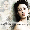
When last I checked, the Emmy icon was destroying the others on the poll, so here it is. This isn't actually the order in which I made the icon, so it may seem like there are jumps being made, but it'll make much more sense than if I tried to reconstruct it in order.
This tutorial is for:
♥ PSP9 (but very translateable if you know your program).
♥ Moderate ability (nothing particularly complex, so as before, if you don't know how to do something I describe, go back to icon_tutorial and raid the memories).
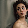
Layer 1 (Background): This is my base layer. As you can see, I've gone through the base prep motions, crop, sharpen, resize, etc. I've also blurred the stone area to the left. That was a fairly late move chronologically, but it's like that because there'll be an image over that area later (FORE-SHA-DOW-ING). Either select the area with your marquee (make sure it's feathered) and do a blur filter, or just run your smudge/soften brush across it.
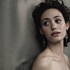
Layer 2: Duplicate the base layer twice. On the lower of the two, run a desaturate over it. DOn't make the image greyscale. You want to preserve some of the colour (Adjust > Hue and Saturation > Hue/Saturation/Lightness > Hue: 0 Saturation: -45 Lightness: 0).
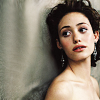
Layer 3: This is your second base duplicate. Set it to Overlay, Opacity 50%.
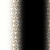
Layer 4: Take this... texture? border? anyway thingo by me (though the pattern you cans ee around the edge of the black is from Squid Finges) and set it to Screen. The way this turned out on the image was a complete accident, but I really liked the effect.
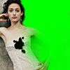
Layer 5: Bear with me, I'll give you a progress report in a moment. :] The green part on this layer is actually transparent. As you can see, I've taken another picture of Emmy from the same photoshoot. I'm assuming nobody's following along with the same images, because if you are... I guess... you'd have to go and find the original pic this was from or something. o_o Anyway, I picked an almost-full body segment and cropped+resized it. Then I took the freehand marquee tool (with a feather of, oh, 5? 10? Not sure.) and deleted Little Emmy's arm where it was overlapping Big Emmy's head. I set the opacity of this layer to 50%.
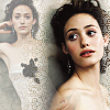
Progress Report: So this is what the icon currently looks like. I think originally I was probably going to leave he icon something like this. :D
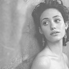
Layer 6: Now, duplicate your backgorund layer and drag it up to this position. Desaturate it completely to greyscale (I prefer to use Adjust > Hue and Saturation > Colorize with a Sat. of 0) and hit it with a brightness/contrast of 75/0. Know what? In my version it looks like this layer predates the blurring on the background layer. *shrugs* Which shows you what an odd order this icon was made in. Aaaaanyway, set it to Hard Light.
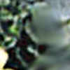
Layer 7: This is a bit of a weird one. It was originally one of the textures from this post (and before that it was a bunch of flowers, I think), and I've blurred the segment atop Big Emmy (as per Layer 1). This layer is set on Overlay 50% Opacity.
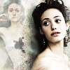
Progress Report: This is basically it as far as the graphics on the icon goes. I just added text with a white box behind it. I want to share with you a neat effect I got while fooling around though.
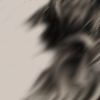
Layer 8: Take this texture and put it on a layer above all the others. I've also turned Layer 4 off. Now set Layer 8 to Dodge, 100% Opacity.
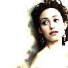
Progress Report: Isn't it a neat look? I've been meaning to experiment with it more.
Anyway, that's your tutorial. Not as exciting or groundbreaking as it could have been, eh? Maybe you should have voted for a different icon. :P


NOTE: If you're in Internet Explorer some of the images don't show up. I have no idea why this is. It has me flummoxed. Switch to Firefox. It's a better browser anyway. :D
ETA: If the images aren't showing up, you can view the tutorial HERE. It ain't pretty, but it works. I think.
When last I checked, the Emmy icon was destroying the others on the poll, so here it is. This isn't actually the order in which I made the icon, so it may seem like there are jumps being made, but it'll make much more sense than if I tried to reconstruct it in order.
This tutorial is for:
♥ PSP9 (but very translateable if you know your program).
♥ Moderate ability (nothing particularly complex, so as before, if you don't know how to do something I describe, go back to icon_tutorial and raid the memories).

Layer 1 (Background): This is my base layer. As you can see, I've gone through the base prep motions, crop, sharpen, resize, etc. I've also blurred the stone area to the left. That was a fairly late move chronologically, but it's like that because there'll be an image over that area later (FORE-SHA-DOW-ING). Either select the area with your marquee (make sure it's feathered) and do a blur filter, or just run your smudge/soften brush across it.

Layer 2: Duplicate the base layer twice. On the lower of the two, run a desaturate over it. DOn't make the image greyscale. You want to preserve some of the colour (Adjust > Hue and Saturation > Hue/Saturation/Lightness > Hue: 0 Saturation: -45 Lightness: 0).

Layer 3: This is your second base duplicate. Set it to Overlay, Opacity 50%.

Layer 4: Take this... texture? border? anyway thingo by me (though the pattern you cans ee around the edge of the black is from Squid Finges) and set it to Screen. The way this turned out on the image was a complete accident, but I really liked the effect.

Layer 5: Bear with me, I'll give you a progress report in a moment. :] The green part on this layer is actually transparent. As you can see, I've taken another picture of Emmy from the same photoshoot. I'm assuming nobody's following along with the same images, because if you are... I guess... you'd have to go and find the original pic this was from or something. o_o Anyway, I picked an almost-full body segment and cropped+resized it. Then I took the freehand marquee tool (with a feather of, oh, 5? 10? Not sure.) and deleted Little Emmy's arm where it was overlapping Big Emmy's head. I set the opacity of this layer to 50%.

Progress Report: So this is what the icon currently looks like. I think originally I was probably going to leave he icon something like this. :D

Layer 6: Now, duplicate your backgorund layer and drag it up to this position. Desaturate it completely to greyscale (I prefer to use Adjust > Hue and Saturation > Colorize with a Sat. of 0) and hit it with a brightness/contrast of 75/0. Know what? In my version it looks like this layer predates the blurring on the background layer. *shrugs* Which shows you what an odd order this icon was made in. Aaaaanyway, set it to Hard Light.

Layer 7: This is a bit of a weird one. It was originally one of the textures from this post (and before that it was a bunch of flowers, I think), and I've blurred the segment atop Big Emmy (as per Layer 1). This layer is set on Overlay 50% Opacity.

Progress Report: This is basically it as far as the graphics on the icon goes. I just added text with a white box behind it. I want to share with you a neat effect I got while fooling around though.

Layer 8: Take this texture and put it on a layer above all the others. I've also turned Layer 4 off. Now set Layer 8 to Dodge, 100% Opacity.

Progress Report: Isn't it a neat look? I've been meaning to experiment with it more.
Anyway, that's your tutorial. Not as exciting or groundbreaking as it could have been, eh? Maybe you should have voted for a different icon. :P