Tutorial: Lucius
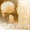

Okay. Today we're going to make this icon. PSP7 is my program of choice, but if you know Photoshop you should be able to follow along. This tutorial isn't for beginners. You need some knowledge of your graphics program of choice. I hope that if you use this tutorial you give me credit somewhere... sometime... because I am giving away many of my iconing techniques. ._. It's like when those magicians go on TV and reveal the secrets to their tricks... well, okay, not really. But sorta! PLus, it took me a really long time to write, and it's really boiling in here at the moment *swelters*. Okay. Enough guilt trip. I'm sorry, my bad. ON TO THE TUTORIAL.
NOTE: Since this tutorial got long and confusing, there's a layer rundown at the end.
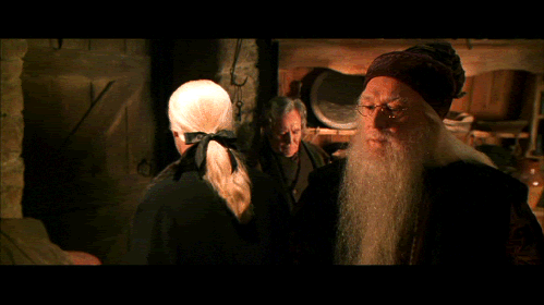
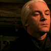
Well, this lovely cap by yours truly of the inestimable Jason Isaacs as Lucius Malfoy in CoS is going to be the primary image in our icon.
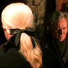
So let's crop & resize it to 100x100 (as per my other tutorials--far too lazy to go through it again <3).
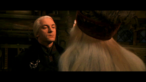
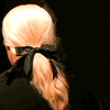
We are also going to be using this charmer of a cap from the same scene in the same movie and the same bloke. <3
So do the crop & resize thingo again!
Now. On the original cap, duplicate the background layer. On the background background (in PSP7, the Background layer has limited fonctions. ie: you can't change the transparency) layer, do a flood fill of black. On the image layer, take a big, soft brush and colour out Fudge from the background. Make sure the colour is still black. This is important for the next layer.
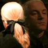
Make a new layer above the other layers. Copy the 2nd image into this layer. Set it to screen, 100%. This nifty screen merging trick works best with black or very dark plain backgrounds. That's why we had to colour in the other stuff in the lower layer.
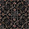
Next. Take this patttern (I've had it on my HD for absolutely yonks and have no clue where it's from--sorry) and paste it onto a layer above the background layer but below the image layers.
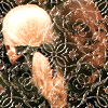
This is what it should look like.
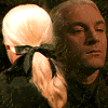
Now, that is pretty bloody freaky, so set it to Soft Light, 100%. Better. o.o

Take this gradient and whack it on a layer above all the others. Set it to Hard Light, 80%.
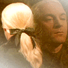
Viola.
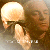
Next we have some text. Create it on a layer UNDERNEATH the Hard Light layer. This unifies the colours nicely. Mine says 'REAL MEN WEAR', in Georgia, 6pt...
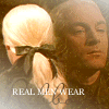
and 'Ribbons' in Miss, and er, about 24pt. Make sure you put 'Ribbons' on a saparate layer to the previous, because otherwise we can't mess with the blending and opacity of thew two independently. The text is difficult to see at the moment, but NEVER FEAR.
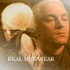
Oh, this is where I changed the blending of the layer with the back of Lucius' head to Screen, 80%.

Now for the fun bit. >:D Make a new layer between the two image layers. Take your freehand marquee (no antialias) and make a squiggly selection. It's meant to look like torn paper. Fill your selection with #D6BD9C (am far too lazy to copy the RGB, sorry). Note that the bit that is white in the image, should actually be transparent. It is white in this image because of the way I saved it.
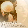
With all the layers enabled, your icon should look something like this.

Now, lock the transparency of the paper layer. In PSP7, this is done by clicking the little icon to the right of the opacity slider in the Layer tool thingo. The icon looks like a lock with a big red cross through it. When you click it, the cross should vanish. Take your paintbrush on a setting of 1 or 2 px, and make an edge around the torn bits. I used #733910 and #A55A18.

Go Effects -> Blur -> Blur. Then, unlock the transparency and go Effects -> 3D Effects -> Drop Shadow. My settings were Offset: vertical -1, horizontal 0. Opacity 72; Blur 16. Colour: #342E2C (though black would work).
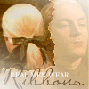
Enable all the layers. Now our icon is starting to look a bit jazzy. Now, I decided that the text was unreadable (an unfortunate side-effect of lightening; the dark text became reradable, the light text became unreadable).

To fix the text up, firstly, I changed the font to Silkscreen (6pt), which is a fabulous pixel font. Defiantly, I left antialias on. I also moved the text over to the right a bit to balance the icon.

A lot of random stuff happened in this step. Firstly, the Soft Light layer (the one with the pattern on it) was changed to Screen, 25%. Secondly, the opacity of the 'Ribbons' text layer was reduced to 90% (aren't we glad we put the to text elements on separate layers?). Next, the 'REAL MEN WEAR' text layer was duplicated and the font colour on the lower one was changed to #342E2C. That layer was converted to a raster layer and Effects -> Geometric Effects -> Wind (Strength: 5, from right) was applied to it. Lastly, I relocated the 'REAL MEN WEAR' text layer to above all the other layers.
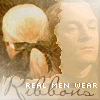
Ok. I decided I needed a border. So, I made a new layer underneath the Hard Light layer (ie , the new layer is third from the top)! Taking my square marquee (with antialias), I made a selection about 2 pixels from the edge, inverted it, and filled it with black, and dropped the opacity to 20%.
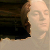
Ok. One last tune-up. Hide all the layers except the paper layer and the top image layer. It should look something like this.
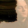
On the image layer, take the clone tool, set the clone source just to the left of Lucius' head, and clone him out of the non-paper area of the image layer. Like so.
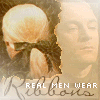
It should end up looking like this, which I think is an improvement, because that side of Lucius' head was annoying me.
Anyway, I think that's it for this icon. Happy iconing to you!
~ ~ ~ ~ ~ ~ ~ ~ ~ ~
I feel that this tutorial may have gotten a bit confusing, so, for your clarity of iconing, here's a rundown of the layers, from BOTTOM to TOP.

Background Layer.

Pattern layer. Screen. 22%.

Image layer 1. Screen. 80%.

Paper layer. Normal. 80%.
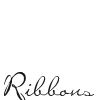
'Ribbons' text layer. Normal. 90%.
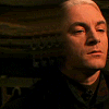
Image layer 2. Screen. 100%.
Wind blur layer. Normal. 100%.

Border layer. Normal. 26%.

Hard Light layer. Hard Light. 80%.

'REAL MEN WEAR' text layer. Normal. 100%. Text is actually white, but I made it light grey here so it could be seen.