Challenge 16: How Did You Do That?
Tutorials for landofart
Main Challenge:
I use Photoshop CS5 but I will try to write these tutorials in such a way that people who use other programs might be able to adapt to their programs as well. :)
These three sigtag tutorials will also build on one another so you can see how I expand on and combine the techniques.
For the first tutorial I am going to show how I made this sigtag

I started out using this screencap: (click to enlarge)

The first thing I did was resize it to the 300 x 150 size for the sigtag so it looks like this:

I then made a duplicate of the image. There are two ways of doing this:
1. Select all, copy, paste
2. In Photoshop right click on the layer in the right-hand panel (see below) and select the "Duplicate layer" option
I actually made two duplicates of the image in case I screwed up and needed to start over again but this part is purely optional.
Next I made all layers invisible except for the one - the top layer.
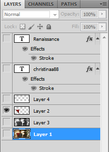
I erased everything around the red sweater. Most tutorials for the color splash effect that I have seen say to erase the item you want in color but I found that doing it this way makes the image come out better.

Next I made the layer right below it (layer 3 in the image above) black and white. The way to do this using Photoshop is "Image > Adjustments > Black & White". There are several presets in the black and white menu, I would suggest to preview all of them to see which one you like. The one I used for this image is called "Green Filter"

I made the layer with the red sweater invisible so that it would not distract me while I made the bottom layer black and white. Now that the bottom layer is ready, I made the red sweater visible again. Then I went to "Image > Adjustments > Hue/Saturation" and increased the saturation. (I do not remember to what but for this it really isn't an exact science - more like what you feel works best for the image).
I also made a small white bar in the bottom of the image because I felt the text would look better on it. The way I did this was by selecting the area using the rectangle marquee tool then using the brush tool to fill it in with white. I then lowered the opacity layer. As with the saturation, this is something that should be eye-balled. The opacity I used for this image is 55%.

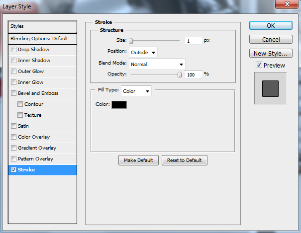
The next step was to add the text itself. I chose the color for the text by using the eyedropper tool on the sweater until I found a shade of red that I liked. I used a font called Cooper Std which can be found here . The way I got the outline around the text is by double clicking the layer in the right-hand panel (see above) and selecting the "stroke" option (see below - click to enlarge).
And that's pretty much it! You should now have an image that looks like this:

For the next tutorial I am going to show how I made this sigtag. This sigtag employs a simple glowing effect that I love so much that I incorporate it in most of the graphics I make.

I started out this sigtag with this image (click to enlarge):

Like with the other image I resized it to 300 x 150 and made a duplicate layer.

Then, taking the top-most layer, I put a gaussian blur filter. The way to do this (in Photoshop) is "Filter > Blur > Gaussian Blur..." When you select this, you will get a window that looks like this:
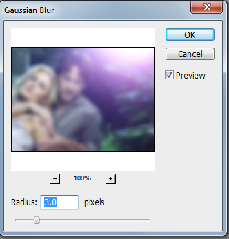
Feel free to play around with the radius however you see fit.
The next thing I did was to set this layer to overlay the lower one:
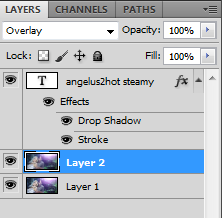

The last step was to add text. I used a True Blood font that can be found here .
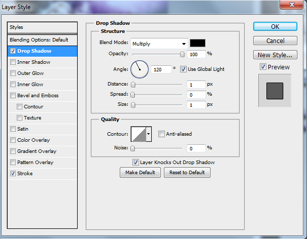
As you can see from the above panel, I used the stroke effect on the text effect. I also used the drop shadow effect, the menu to which looks like this: (click to enlarge)
And that's pretty much it! You should now have an image that looks like this:

For the next tutorial I am going to show how I made this sigtag. This sigtag combines the black and white technique used in the first tutorial and the glowing effect of the second tutorial with a new element - textures.

I started out this sigtag with this image (click to enlarge):

Then I resized the image to 300 x 150 and made a duplicate of the image

I then turned the top-most layer black and white to the "lighter" preset and made a duplicate of the B&W layer.

I used the gaussian blur/ overlay technique from the second tutorial on the duplicate B&W layer, resulting in this:

I then took this texture (really a pattern but I am considering it a texture since I used the .jpg file) which I got from here:

Selected all and copied before pasting it as another layer on the sigtag. Because the texture was much larger than 300 x 150 pixels, it came out looking like this:

The next thing I did was overlay the texture, only instead of selecting "overlay", I chose "hard light" so that the some of the waves were still visible.

Text time! I used a font called Cooper Std which can be found here . Like with the first two sigtags, I used the stroke effect but this time I used a gradient effect as well, the menu to which looks like this:
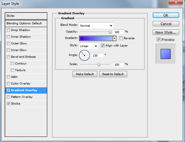
As you can see I already have a few pre-made gradients, but if you want to make a new one click on the part where you see the gradient and you will get this menu:
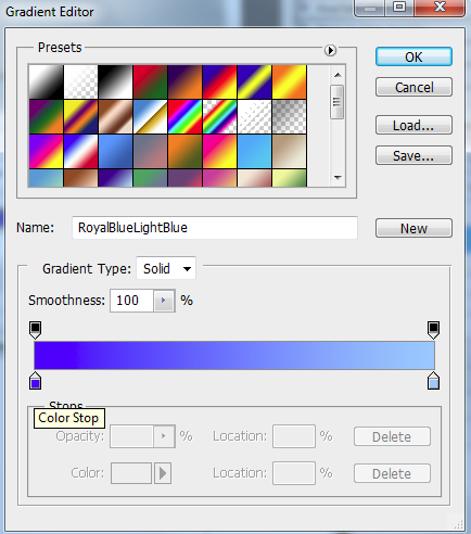
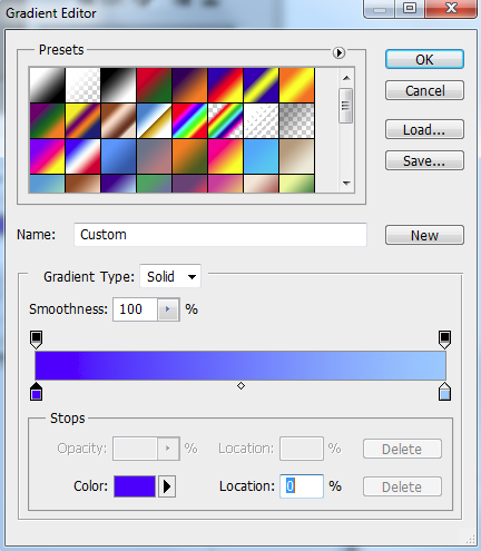
To change the color on one of the end points click on the end point and then on the color below it. You can also click and drag the midpoint to see where you like it best.
And that's pretty much it! You should now have an image that looks like this:

Extra Challenge: (click to enlarge)

Made using the Tagxedo, Wordclouds, and You tutorial by phinjay
Main Challenge:
I use Photoshop CS5 but I will try to write these tutorials in such a way that people who use other programs might be able to adapt to their programs as well. :)
These three sigtag tutorials will also build on one another so you can see how I expand on and combine the techniques.
For the first tutorial I am going to show how I made this sigtag

I started out using this screencap: (click to enlarge)

The first thing I did was resize it to the 300 x 150 size for the sigtag so it looks like this:

I then made a duplicate of the image. There are two ways of doing this:
1. Select all, copy, paste
2. In Photoshop right click on the layer in the right-hand panel (see below) and select the "Duplicate layer" option
I actually made two duplicates of the image in case I screwed up and needed to start over again but this part is purely optional.
Next I made all layers invisible except for the one - the top layer.

I erased everything around the red sweater. Most tutorials for the color splash effect that I have seen say to erase the item you want in color but I found that doing it this way makes the image come out better.

Next I made the layer right below it (layer 3 in the image above) black and white. The way to do this using Photoshop is "Image > Adjustments > Black & White". There are several presets in the black and white menu, I would suggest to preview all of them to see which one you like. The one I used for this image is called "Green Filter"

I made the layer with the red sweater invisible so that it would not distract me while I made the bottom layer black and white. Now that the bottom layer is ready, I made the red sweater visible again. Then I went to "Image > Adjustments > Hue/Saturation" and increased the saturation. (I do not remember to what but for this it really isn't an exact science - more like what you feel works best for the image).
I also made a small white bar in the bottom of the image because I felt the text would look better on it. The way I did this was by selecting the area using the rectangle marquee tool then using the brush tool to fill it in with white. I then lowered the opacity layer. As with the saturation, this is something that should be eye-balled. The opacity I used for this image is 55%.

The next step was to add the text itself. I chose the color for the text by using the eyedropper tool on the sweater until I found a shade of red that I liked. I used a font called Cooper Std which can be found here . The way I got the outline around the text is by double clicking the layer in the right-hand panel (see above) and selecting the "stroke" option (see below - click to enlarge).

And that's pretty much it! You should now have an image that looks like this:

For the next tutorial I am going to show how I made this sigtag. This sigtag employs a simple glowing effect that I love so much that I incorporate it in most of the graphics I make.

I started out this sigtag with this image (click to enlarge):

Like with the other image I resized it to 300 x 150 and made a duplicate layer.

Then, taking the top-most layer, I put a gaussian blur filter. The way to do this (in Photoshop) is "Filter > Blur > Gaussian Blur..." When you select this, you will get a window that looks like this:

Feel free to play around with the radius however you see fit.
The next thing I did was to set this layer to overlay the lower one:


The last step was to add text. I used a True Blood font that can be found here .
As you can see from the above panel, I used the stroke effect on the text effect. I also used the drop shadow effect, the menu to which looks like this: (click to enlarge)

And that's pretty much it! You should now have an image that looks like this:

For the next tutorial I am going to show how I made this sigtag. This sigtag combines the black and white technique used in the first tutorial and the glowing effect of the second tutorial with a new element - textures.

I started out this sigtag with this image (click to enlarge):

Then I resized the image to 300 x 150 and made a duplicate of the image

I then turned the top-most layer black and white to the "lighter" preset and made a duplicate of the B&W layer.

I used the gaussian blur/ overlay technique from the second tutorial on the duplicate B&W layer, resulting in this:

I then took this texture (really a pattern but I am considering it a texture since I used the .jpg file) which I got from here:

Selected all and copied before pasting it as another layer on the sigtag. Because the texture was much larger than 300 x 150 pixels, it came out looking like this:

The next thing I did was overlay the texture, only instead of selecting "overlay", I chose "hard light" so that the some of the waves were still visible.

Text time! I used a font called Cooper Std which can be found here . Like with the first two sigtags, I used the stroke effect but this time I used a gradient effect as well, the menu to which looks like this:

As you can see I already have a few pre-made gradients, but if you want to make a new one click on the part where you see the gradient and you will get this menu:

To change the color on one of the end points click on the end point and then on the color below it. You can also click and drag the midpoint to see where you like it best.

And that's pretty much it! You should now have an image that looks like this:

Extra Challenge: (click to enlarge)

Made using the Tagxedo, Wordclouds, and You tutorial by phinjay