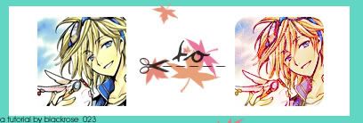
Icon Tutorial #7: Florish with Fai!
My seventh tutorial up to date. Comment? :3

** done using Adobe Photoshop CS2
** involves Selective Coloring, Color Balance and the Channel Mixer (not translatable!)
** intermediate knowledge
Hey everyone! My seventh tutorial, done out of complete and utter boredom passion and dedication. XDXD Remember, please do not copy this tutorial step-by-step! This is merely for inspiration and knowledge. (Although fairly simple^^) Enjoy! Show me your results sometime! :D (I don't think this is dial-up friendly, thanks to animeneko_chan for pointing that out XDXD)
------
I'm certain you all know about the cropping and grabbing your stock/base, so I'll skip that part. Kick the party up by doing a little Auto Contrast/Auto Levels first. This is what my base looks like, (Which, BTW, is Fai from TRC fame.)

Aww, isn't he a sexy little thing cutie? XD After I spicened this baby icon up, (You can already tell I've got it for Fai XDXD) I duplicated the base layer and Sharpened it, setting the opacity at 30%. Here it is now:

Next, I duplicated the base layer again and dragged it to the top, Desaturating it and setting the blending mode on Soft Light. Here Fai, I won't bite it is now:

I am dying to glomp you and tie you to the post inside my basementNext, I made a new layer and filled it with #061437 with the setting on Exclusion. Here he is now:

I made another layer and filled it with #C4F5F2, with the settings on Color Burn. Here it is now:

Another new layer, and now, I fill it with #DEA5ED (AHHH! Run from the pink! RUN NOW!) with the settings on Color Burn at 50%. Here's Fai now:

Last layer! (Color, that is.) I filled this one with #F0E9B9 and set it on Soft Light at 55%. Overall, here he is:

Then, I duplicated the base, dragged it to the top and set on Soft Light at 55%. Dun, dun dun! Here he is now!

Still not enough, huh? So, to spicen up the colors, I made a new Adjustment Layer and went with the much unloved and unpopular Channel Mixer XD This is a little hard to mess with, but to me, the RED settings make a lot of difference so I always play with that before anything else. I suggest playing with the settings according to your icon and, go crazy. :3 If anyone is curious, the settings for my Channel Mixer were:
RED:
132, -50, -13 | Constant: +39
BLUE:
-14, 0, 115 | Constant: +8
And I left the GREEN setting alone. Here's how it's turning out:

Next, I make another Adjustment Layer and choose Selective Coloring (Which, by far, I think is only available to Adobe Photoshop CS, or something. XD). Once again, play with it until the icon looks lovely. :3 Suggestions, make sure that you always play with the NEUTRALS settings, because it makes a lot of difference! :D The settings I used for this icon are:
REDS:
-100, 0, 100, 0
NEUTRALS:
-20, 5, 20, 6
Here is Fai! XD

Then, since they seem still a little too bland, I opened up the Hue/Saturation settings and pumped the MASTER saturation up to 25. This is what it looks like now:

You can stop on any of these steps, but I think I'll keep on going. This is optional but it'll add a little blueish-clear effect on the background, albeit subtly. I opened up the Color Balance layer and played with the settings. The settings are:
MIDTONES:
16, 36, -18
SHADOWS:
-17, -9 16
HIGHLIGHTS:
17, 4, 22
And here it is now. You won't see much of a difference, but if you look close enough to the background behind the very sexy Fai Fai, you'll see the sky cleared up a little. XD

I went back and duplicated the Exclusion blue layer and dragged it to the top, opacity at 65%. Here's Fai now:

Now, you can really stop here. But as for me, I never stop without TEXTURES! Yey! XD I used this texture by awmpdotnet and set it on Hard Light. Here it looks now.

I added another texture, again from awmpdotnet, and set it on Hard Light again. Here it is now:

(You can stop at any of these steps. :)) I went back down and duplicated the base, and dragged it to the top. I set it on Overlay at 45% opacity, and this is what I got:

I duplicated the base again, desaturated it and dragged it back to the top. I put the setting on Luminosity and set the opacity to 50%. It settles those merging colors down a little, ne? (I little trick I learned when I was high with Fai at school XD)

I then added this scratch texture (from xplastique) and set it on Screen. I'm a sucker for scratch textures. XD Here he is now:

Not much but I still like adding scratch XD It's completely optional of course. :D
Almost finished, and Fai is turning out sexier than before very nicely! This is the last step now. I added this texture and set it on Screen on top of everything.
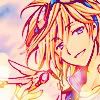
FINAL PRODUCT: Fai D. Fluorite : Smiling For You

And there you have your icon! :D I hope you've enjoyed it! Love it? Hate it? Comment and tell me whatcha think! :3 Now Fai is ready for his Kurogane! XDXD Enjoy experimenting! :D You can use the final product with credit, of course! :D Why not watch/friend the community for more updates? :D
** done using Adobe Photoshop CS2
** involves Selective Coloring, Color Balance and the Channel Mixer (not translatable!)
** intermediate knowledge
Hey everyone! My seventh tutorial, done out of complete and utter boredom passion and dedication. XDXD Remember, please do not copy this tutorial step-by-step! This is merely for inspiration and knowledge. (Although fairly simple^^) Enjoy! Show me your results sometime! :D (I don't think this is dial-up friendly, thanks to animeneko_chan for pointing that out XDXD)
------
I'm certain you all know about the cropping and grabbing your stock/base, so I'll skip that part. Kick the party up by doing a little Auto Contrast/Auto Levels first. This is what my base looks like, (Which, BTW, is Fai from TRC fame.)
Aww, isn't he a sexy little thing cutie? XD After I spicened this baby icon up, (You can already tell I've got it for Fai XDXD) I duplicated the base layer and Sharpened it, setting the opacity at 30%. Here it is now:
Next, I duplicated the base layer again and dragged it to the top, Desaturating it and setting the blending mode on Soft Light. Here Fai, I won't bite it is now:
I am dying to glomp you and tie you to the post inside my basementNext, I made a new layer and filled it with #061437 with the setting on Exclusion. Here he is now:
I made another layer and filled it with #C4F5F2, with the settings on Color Burn. Here it is now:
Another new layer, and now, I fill it with #DEA5ED (AHHH! Run from the pink! RUN NOW!) with the settings on Color Burn at 50%. Here's Fai now:
Last layer! (Color, that is.) I filled this one with #F0E9B9 and set it on Soft Light at 55%. Overall, here he is:
Then, I duplicated the base, dragged it to the top and set on Soft Light at 55%. Dun, dun dun! Here he is now!
Still not enough, huh? So, to spicen up the colors, I made a new Adjustment Layer and went with the much unloved and unpopular Channel Mixer XD This is a little hard to mess with, but to me, the RED settings make a lot of difference so I always play with that before anything else. I suggest playing with the settings according to your icon and, go crazy. :3 If anyone is curious, the settings for my Channel Mixer were:
RED:
132, -50, -13 | Constant: +39
BLUE:
-14, 0, 115 | Constant: +8
And I left the GREEN setting alone. Here's how it's turning out:
Next, I make another Adjustment Layer and choose Selective Coloring (Which, by far, I think is only available to Adobe Photoshop CS, or something. XD). Once again, play with it until the icon looks lovely. :3 Suggestions, make sure that you always play with the NEUTRALS settings, because it makes a lot of difference! :D The settings I used for this icon are:
REDS:
-100, 0, 100, 0
NEUTRALS:
-20, 5, 20, 6
Here is Fai! XD
Then, since they seem still a little too bland, I opened up the Hue/Saturation settings and pumped the MASTER saturation up to 25. This is what it looks like now:
You can stop on any of these steps, but I think I'll keep on going. This is optional but it'll add a little blueish-clear effect on the background, albeit subtly. I opened up the Color Balance layer and played with the settings. The settings are:
MIDTONES:
16, 36, -18
SHADOWS:
-17, -9 16
HIGHLIGHTS:
17, 4, 22
And here it is now. You won't see much of a difference, but if you look close enough to the background behind the very sexy Fai Fai, you'll see the sky cleared up a little. XD
I went back and duplicated the Exclusion blue layer and dragged it to the top, opacity at 65%. Here's Fai now:
Now, you can really stop here. But as for me, I never stop without TEXTURES! Yey! XD I used this texture by awmpdotnet and set it on Hard Light. Here it looks now.
I added another texture, again from awmpdotnet, and set it on Hard Light again. Here it is now:
(You can stop at any of these steps. :)) I went back down and duplicated the base, and dragged it to the top. I set it on Overlay at 45% opacity, and this is what I got:
I duplicated the base again, desaturated it and dragged it back to the top. I put the setting on Luminosity and set the opacity to 50%. It settles those merging colors down a little, ne? (I little trick I learned when I was high with Fai at school XD)
I then added this scratch texture (from xplastique) and set it on Screen. I'm a sucker for scratch textures. XD Here he is now:
Not much but I still like adding scratch XD It's completely optional of course. :D
Almost finished, and Fai is turning out sexier than before very nicely! This is the last step now. I added this texture and set it on Screen on top of everything.
FINAL PRODUCT: Fai D. Fluorite : Smiling For You
And there you have your icon! :D I hope you've enjoyed it! Love it? Hate it? Comment and tell me whatcha think! :3 Now Fai is ready for his Kurogane! XDXD Enjoy experimenting! :D You can use the final product with credit, of course! :D Why not watch/friend the community for more updates? :D