Icon Tutorial 03
Going from 
to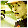
Also achieve quick color variations:
Icon Tutorial 03 - Made by ealias of Bedazzling. Credit is appreciated :)
Step 1: Crop the image and sharpen once.

Step 2: Apply Image > Adjustments > Varitations. First click 'Original' to reset the settings. Then click More Cyan and then More Yellow.

Step 3: Put this gradient on Color Burn, 100%.


Step 4: Put this gradient on Color Burn, 100%.


Step 5: Fill a new layer with #E6D5BA. Set it to Soft Light, 100%.


Step 6: Duplicate the original cropped base and bring the layer to the top. Set it on Screen, 50%. Duplicate that layer, set it on Hard Light, 50%.

Step 7: Add text. I used the font Georgia. The 's' is at 60 pt. 'ydney' is at 7 pt.

Step 8: On a new layer, apply a soft round brush at the lower left corner in white. I used 125 px, but only applied the edge of the brush onto the icon.

Step 9: Add a white border around the icon.
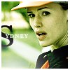
And you're done :) Let me know if this tutorial was helpful, and post the icons you made with it.
Here are some quick ways to get different results. First, flatten the image.

Variations: More Yellow, More Red
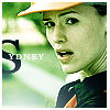
Color Balance: -20, +20, +30
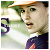
Color Balance: +30, -15, +65
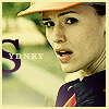
Same as above, plus new layer filled with #050826, set to Exclusion, 100%. Duplicate that layer and set to Difference, 100%.
Original image from Sydney Bristow HDTV Capture. Gradients are my own.

to
Also achieve quick color variations:
Icon Tutorial 03 - Made by ealias of Bedazzling. Credit is appreciated :)
Step 1: Crop the image and sharpen once.

Step 2: Apply Image > Adjustments > Varitations. First click 'Original' to reset the settings. Then click More Cyan and then More Yellow.

Step 3: Put this gradient on Color Burn, 100%.


Step 4: Put this gradient on Color Burn, 100%.


Step 5: Fill a new layer with #E6D5BA. Set it to Soft Light, 100%.


Step 6: Duplicate the original cropped base and bring the layer to the top. Set it on Screen, 50%. Duplicate that layer, set it on Hard Light, 50%.

Step 7: Add text. I used the font Georgia. The 's' is at 60 pt. 'ydney' is at 7 pt.

Step 8: On a new layer, apply a soft round brush at the lower left corner in white. I used 125 px, but only applied the edge of the brush onto the icon.

Step 9: Add a white border around the icon.
And you're done :) Let me know if this tutorial was helpful, and post the icons you made with it.
Here are some quick ways to get different results. First, flatten the image.
Variations: More Yellow, More Red
Color Balance: -20, +20, +30
Color Balance: +30, -15, +65
Same as above, plus new layer filled with #050826, set to Exclusion, 100%. Duplicate that layer and set to Difference, 100%.
Original image from Sydney Bristow HDTV Capture. Gradients are my own.