Challenge 03 Round 03 Results
I'm so sorry, but we have to say "goodbye" to some participants.
Eliminated:

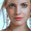
overevery with 4 votes
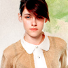
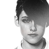
jorge_2 with 4 votes


reich_2 with 3 votes
People's Choice:
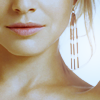

alice_trip with 2 votes


sparklingeye with 2 votes
Mod's Choice:
No MC. Because of PC tie
Did you forget your set number? You can find it HERE
Voting Tally:
01| -1+2= +1
02| -3
03| +1
04| +1
05| -1+1= 0
06| 0
07| -1
08| -1+1= 0
09| +2
10| -4
11| -4+2= -2
12| -1+2= +1
13| -2+2= 0
14| -2
15| -2
16| -4
17| +2
18| -1+2= +1
Favourite sets
set 1 - love the coloring
set #1 - nice crop, simplicity complements the whole icon.
set 3 - great colouring on both icons
set #04 - Great set. The composition and cropping on the first, and the b&w coloring on the second, with that text placement, are all really good.
set # 5 - great crop use on both icons
set 8 - it's creative and not just two bases
set 9 - good colouring and cropping
set #9 - love the coloring and the rotated image
set 11 - Even that the coloring is alike in both icons, the cropping is changing everything and make them look very unique and different. It's not always easy to get it. Also like the use of texture.
set #11 - great crop and use of textures
set 12 - AMAZING coloring. The first icon is completely made of win, such a classic combo.
set #12 - great style in icon1 & the coloring on both icon is pretty
set #13 - great colors use
set 13 - very pretty texture use and colors
set #17 - nice colours use on both icons
set 17 - both colorings are gorgeous
set #18 - coloring is amazing
set #18 - Love the text on the second icon. Also, both croppings are very nice.
Lesser quality sets
set 01 - The colors are too bold. Somehow, the highlights don't work well.
set #2 - at 1st pic too much yellow color and at 2nd - red
set 2 - the coloring in the 1st icon does not complement the pic
set #02 - Coloring on both icons are too oversaturated. Whether it is too red or too yellow. Cropping on the first icon is really good, though.
set 5 - the brush used on the second one does not go with the photo, the coloring needs less blue
set #7 - the text & brush is oddly placed
set #08 - first icon is oversharped and second is too red
set 10 - the text on the first does not go with the image, it would look better w/o it
set 10 - the text in the 1st icon is distracting and takes away from the great crop
set #10 - The text use on the first icon doesn't look very good. Maybe it's the placement, or the font. On the second, the coloring looks somewhat dark.
set #10 - icon 2 is a bit dark, needs more definition
set 11 - too much brightness in both icons
set #11 - unsuccessful crop and harsh colours
set #11 - both icons are oversharped and too bright
set 11 - both look overcontrasted
set 12 - the coloring is a bit light and faded out, not complementing the picture
set 13 - the first icon was cut out badly
set #13 - The first icon isn't well executed. The coloring on the second one is really lovely, but there's too much brightness.
set 14 - in the second icon the image isn't clean
set 14 - composition of the second icon is off (she only has half of body? and text is a bit overpowering), and there's nothing special about first icon that could help
set 15 - a bit too much blue on both, and her clothes merge with the background (especially on the second icon)
set 15 - The icons are too simple and not very different from each other.
set 16 - both icons are oversharpened and the second one has too much brighntess
set #16 - uninteresting colors, too much sharpen
set #16 - second icon is overshaped and too contrasted
set #16 - the brush in icon 1 doesnt compliment the subject
set 18 - Too much contrast on the first icon and uninteresting cropping on the second one.
Eliminated:


overevery with 4 votes


jorge_2 with 4 votes


reich_2 with 3 votes
People's Choice:


alice_trip with 2 votes
sparklingeye with 2 votes
Mod's Choice:
No MC. Because of PC tie
Did you forget your set number? You can find it HERE
Voting Tally:
01| -1+2= +1
02| -3
03| +1
04| +1
05| -1+1= 0
06| 0
07| -1
08| -1+1= 0
09| +2
10| -4
11| -4+2= -2
12| -1+2= +1
13| -2+2= 0
14| -2
15| -2
16| -4
17| +2
18| -1+2= +1
Favourite sets
set 1 - love the coloring
set #1 - nice crop, simplicity complements the whole icon.
set 3 - great colouring on both icons
set #04 - Great set. The composition and cropping on the first, and the b&w coloring on the second, with that text placement, are all really good.
set # 5 - great crop use on both icons
set 8 - it's creative and not just two bases
set 9 - good colouring and cropping
set #9 - love the coloring and the rotated image
set 11 - Even that the coloring is alike in both icons, the cropping is changing everything and make them look very unique and different. It's not always easy to get it. Also like the use of texture.
set #11 - great crop and use of textures
set 12 - AMAZING coloring. The first icon is completely made of win, such a classic combo.
set #12 - great style in icon1 & the coloring on both icon is pretty
set #13 - great colors use
set 13 - very pretty texture use and colors
set #17 - nice colours use on both icons
set 17 - both colorings are gorgeous
set #18 - coloring is amazing
set #18 - Love the text on the second icon. Also, both croppings are very nice.
Lesser quality sets
set 01 - The colors are too bold. Somehow, the highlights don't work well.
set #2 - at 1st pic too much yellow color and at 2nd - red
set 2 - the coloring in the 1st icon does not complement the pic
set #02 - Coloring on both icons are too oversaturated. Whether it is too red or too yellow. Cropping on the first icon is really good, though.
set 5 - the brush used on the second one does not go with the photo, the coloring needs less blue
set #7 - the text & brush is oddly placed
set #08 - first icon is oversharped and second is too red
set 10 - the text on the first does not go with the image, it would look better w/o it
set 10 - the text in the 1st icon is distracting and takes away from the great crop
set #10 - The text use on the first icon doesn't look very good. Maybe it's the placement, or the font. On the second, the coloring looks somewhat dark.
set #10 - icon 2 is a bit dark, needs more definition
set 11 - too much brightness in both icons
set #11 - unsuccessful crop and harsh colours
set #11 - both icons are oversharped and too bright
set 11 - both look overcontrasted
set 12 - the coloring is a bit light and faded out, not complementing the picture
set 13 - the first icon was cut out badly
set #13 - The first icon isn't well executed. The coloring on the second one is really lovely, but there's too much brightness.
set 14 - in the second icon the image isn't clean
set 14 - composition of the second icon is off (she only has half of body? and text is a bit overpowering), and there's nothing special about first icon that could help
set 15 - a bit too much blue on both, and her clothes merge with the background (especially on the second icon)
set 15 - The icons are too simple and not very different from each other.
set 16 - both icons are oversharpened and the second one has too much brighntess
set #16 - uninteresting colors, too much sharpen
set #16 - second icon is overshaped and too contrasted
set #16 - the brush in icon 1 doesnt compliment the subject
set 18 - Too much contrast on the first icon and uninteresting cropping on the second one.