Challenge 03 Round 02 Results
I'm so sorry, but we have to say "goodbye" to some participants.
Eliminated:


edckezia with 8 votes
People's Choice:


elena_vlc_15 with 3 votes
Mod's Choice:


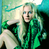
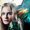
xtine005
Beautiful cropping and colourings on both icons
Did you forget your set number? You can find it HERE
Voting Tally:
01| -1+1= 0
02| +2
03| -1
04| -1+2= +1
05| -1+1= 0
06| -1+1= 0
07| -1
08| -5+1= -4
09| -4
10| +2
11| 0
12| -1+1= 0
13| +3
14| -1+2= +1
15| -1+1= 0
16| +1
17| -8
18| +2
19| -4
Favourite sets
set #01 - Beautiful contrast and coloring.
set #2 - love the coloring and cropping
set #2 - love the coloring, background used and cropping
4 - 1st icon looks just great, perfect crop, and 2nd icon looks really well
set #04 - The first icon has a gorgeous colouring but could maybe be a bit lighter. And both of the icons has an awesome cropping!
set #05 - Great Text and i love the white "fog" Texture
set 6 - great colouring and cropping
set #08 - I like both icons, the flames work especially well in the first one, though the text is a bit hard to read. I didn't realize it was there at first.
set #10 - nice use of textures and "lights"; the 'D' on the second one is very well placed
set #10 - good coloring and love the texture use and composition.
set 12 - Good colouring of the first icon and the cropping of the second is good
set #13 - love the coloring & cropping
set #13 - both croppings are great, & the use of simple brushes/textures doesn't take away from the gorgeous crop
set #13 - love the coloring and cropping
set #14 - Great colouring on the first one.
set #14 - couloring is crispy
set #15 - good texture use on the 1st icon and especialy I liked how 2nd pic is cropped and turned in quiet original way.)
set #16 - intense colour looks good on both icons
18 - Great crop and soft coloring, like the way textures use
set #18 - Love the cropping and the wonderful coloring
Lesser quality sets
set #01 - The first icon is too dark and too red, and the second could use some more contrast.
set #03 - Coloring is very dull, especially so in the second icon. Nothing really "pops".
set 4 - the icons are oversharpened
set #5 - its not really 'different', because it's clearly the same coloring and texture/brush used. she just cropped the other one closer.
set #06 - Her face gets very washed out in both icons. Too much white, not enough definition.
set #07 - Her face has too much white and gets washed out in both icons.
set #8 - it seems a bit washed out.
set #8 - too much undercontrast, it makes the subject look pale
8 - Coloring is boring and does not seem to compliment the image, texture by 1st icon doesn't fit
set #08 - The Fire texture seems out of place with the icon
set #8 - both icons look washed out, flames and text don't really fit
9 - Both icons use the very same dark coloring, also the text by 1st icon is distracting
set #9 - the coloring is rather plain and doesn't seem like much was changed to the coloring
set #9 - icon seem oversharped because of contrast; that texture with white dots doesn't fit the icons as well as the text on the 1st one.
set #09 - The colouring is a bit too dark.
set #12 - the coloring does not compliment the images, but the crop on the second on is great
set #14 - Angelina's face expression became full of suffering because of bad crop; the second pic is oversharped.
set #15 - the first texture is overpowering with the lines right through her, and the border on the second one takes away from the great crop
set #17 - the coloring does not fit the image
set #17 - the green on the 1st is overwelming
set 17 - Too much green colour in those icons,are oversharpened.
set #17 - the coloring of the 1st icon is too green and I'm not sure the light texture on the second is good for it.
17 - The coloring, by 1st icon is too green. The Coloring by 2nd icon is too dark.
set #17 - The first icon is too green.
set #17 - The image does not have much contrast and the colors don't pop and Coloring one is too green
set #17 - colours are too saturated and eyes are "radioactive"
set #19 - wrong choice of textures and colourings are too purple
set #19 - The Coloring is too red and the text on icon one is misplaced
set 19 - The texture don't fit the first icon and the second has too much brightness
set #19 - the texture in icon 1 doesnt suit the image/mood of the icon. the cropping in icon 2 is too common and the coloring is a bit red
Eliminated:


edckezia with 8 votes
People's Choice:


elena_vlc_15 with 3 votes
Mod's Choice:


xtine005
Beautiful cropping and colourings on both icons
Did you forget your set number? You can find it HERE
Voting Tally:
01| -1+1= 0
02| +2
03| -1
04| -1+2= +1
05| -1+1= 0
06| -1+1= 0
07| -1
08| -5+1= -4
09| -4
10| +2
11| 0
12| -1+1= 0
13| +3
14| -1+2= +1
15| -1+1= 0
16| +1
17| -8
18| +2
19| -4
Favourite sets
set #01 - Beautiful contrast and coloring.
set #2 - love the coloring and cropping
set #2 - love the coloring, background used and cropping
4 - 1st icon looks just great, perfect crop, and 2nd icon looks really well
set #04 - The first icon has a gorgeous colouring but could maybe be a bit lighter. And both of the icons has an awesome cropping!
set #05 - Great Text and i love the white "fog" Texture
set 6 - great colouring and cropping
set #08 - I like both icons, the flames work especially well in the first one, though the text is a bit hard to read. I didn't realize it was there at first.
set #10 - nice use of textures and "lights"; the 'D' on the second one is very well placed
set #10 - good coloring and love the texture use and composition.
set 12 - Good colouring of the first icon and the cropping of the second is good
set #13 - love the coloring & cropping
set #13 - both croppings are great, & the use of simple brushes/textures doesn't take away from the gorgeous crop
set #13 - love the coloring and cropping
set #14 - Great colouring on the first one.
set #14 - couloring is crispy
set #15 - good texture use on the 1st icon and especialy I liked how 2nd pic is cropped and turned in quiet original way.)
set #16 - intense colour looks good on both icons
18 - Great crop and soft coloring, like the way textures use
set #18 - Love the cropping and the wonderful coloring
Lesser quality sets
set #01 - The first icon is too dark and too red, and the second could use some more contrast.
set #03 - Coloring is very dull, especially so in the second icon. Nothing really "pops".
set 4 - the icons are oversharpened
set #5 - its not really 'different', because it's clearly the same coloring and texture/brush used. she just cropped the other one closer.
set #06 - Her face gets very washed out in both icons. Too much white, not enough definition.
set #07 - Her face has too much white and gets washed out in both icons.
set #8 - it seems a bit washed out.
set #8 - too much undercontrast, it makes the subject look pale
8 - Coloring is boring and does not seem to compliment the image, texture by 1st icon doesn't fit
set #08 - The Fire texture seems out of place with the icon
set #8 - both icons look washed out, flames and text don't really fit
9 - Both icons use the very same dark coloring, also the text by 1st icon is distracting
set #9 - the coloring is rather plain and doesn't seem like much was changed to the coloring
set #9 - icon seem oversharped because of contrast; that texture with white dots doesn't fit the icons as well as the text on the 1st one.
set #09 - The colouring is a bit too dark.
set #12 - the coloring does not compliment the images, but the crop on the second on is great
set #14 - Angelina's face expression became full of suffering because of bad crop; the second pic is oversharped.
set #15 - the first texture is overpowering with the lines right through her, and the border on the second one takes away from the great crop
set #17 - the coloring does not fit the image
set #17 - the green on the 1st is overwelming
set 17 - Too much green colour in those icons,are oversharpened.
set #17 - the coloring of the 1st icon is too green and I'm not sure the light texture on the second is good for it.
17 - The coloring, by 1st icon is too green. The Coloring by 2nd icon is too dark.
set #17 - The first icon is too green.
set #17 - The image does not have much contrast and the colors don't pop and Coloring one is too green
set #17 - colours are too saturated and eyes are "radioactive"
set #19 - wrong choice of textures and colourings are too purple
set #19 - The Coloring is too red and the text on icon one is misplaced
set 19 - The texture don't fit the first icon and the second has too much brightness
set #19 - the texture in icon 1 doesnt suit the image/mood of the icon. the cropping in icon 2 is too common and the coloring is a bit red