Round 2: Challenge 11: Results!
Round 2: Challenge 11: Unfortunately we didn't get so many votes, but results are here.
Eliminated:
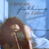
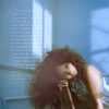
by starrynyc with -2 votes - I'm so sorry for you, especially just before the final, hope to see you back in a next round!
People's Choice:
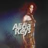
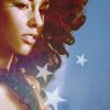
by lihana with +1 vote - Congratulations!
&
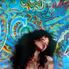
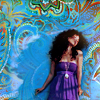
by _virsaviya_ with +1 vote - Congratulations!
Mod's Choice:
No mod's choice
Tally:
1. -2+2 > 0
2. -2
3. +1
4. -1+2 > +1
Comments:
Negative votes:
#01 - Coloring & textures used clash & are too bold with the "sweet-like" feeling of the images.
#01 - too much contrast and colorful textures
#02 - Colors are too pale, the face is too lighted, text is a bit pixelarated.
#02 - Too much blur-tooling. The set is foggy, and the text is hard to read.
#04 - the paisley background is oversaturated and distracting
Positive votes:
#01 - Wonderful use of textures.
#01 - Blurry, but in a good way. The colors make the icons match each other, and they set a calm, soothing mood.
#03 - I like that you used the same coloring on each, but text on one and stars on the other. It works well as a set.
#04 - so colorful! And great croppped too)
#04 - the textures used are lovely, give a nice style to the images.
Eliminated:


by starrynyc with -2 votes - I'm so sorry for you, especially just before the final, hope to see you back in a next round!
People's Choice:


by lihana with +1 vote - Congratulations!
&


by _virsaviya_ with +1 vote - Congratulations!
Mod's Choice:
No mod's choice
Tally:
1. -2+2 > 0
2. -2
3. +1
4. -1+2 > +1
Comments:
Negative votes:
#01 - Coloring & textures used clash & are too bold with the "sweet-like" feeling of the images.
#01 - too much contrast and colorful textures
#02 - Colors are too pale, the face is too lighted, text is a bit pixelarated.
#02 - Too much blur-tooling. The set is foggy, and the text is hard to read.
#04 - the paisley background is oversaturated and distracting
Positive votes:
#01 - Wonderful use of textures.
#01 - Blurry, but in a good way. The colors make the icons match each other, and they set a calm, soothing mood.
#03 - I like that you used the same coloring on each, but text on one and stars on the other. It works well as a set.
#04 - so colorful! And great croppped too)
#04 - the textures used are lovely, give a nice style to the images.