CMD 281 word hybrid series: noncooperation
Hey guys. Back for some more word hybrid series action.
Before I continue, I just wanted to gloat a little bit and say that I got a B- in this class (CMD 281) and a regular ol' B in my other CommDesign class (CMD 251). So I'm slightly above average! Which, for CommDesign, makes me feel awesome. Hahaha.
Anyways. Back to the hybrids. I hope you remember the complete explanation from my last post, so I'll just sum it up really quick for you. Form, type, and image separately on an 8x8 illustration board, then combining all those elements into one hybrid piece finally. Last time it was aggression. Now it's noncooperation.
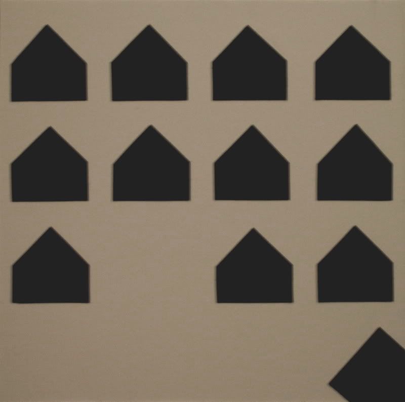
The first form composition I had, the little shapes were circles, not little house-like things. My professor told me they weren't directional enough, so you couldn't tell whether or not it was leaving the group (which it was supposed to be doing) or trying to join the group in its assigned spot. So he told me to pick a more directional form. I didn't just want to do triangles, so I made them little triangles with rectangles attached. I see that one little guy leaving the composition as saying, "eff you guys, I'm goin' home." My other professor said that he couldn't get past it looking like a Century 21 ad or something, but I like them. I think they're kind of cute.
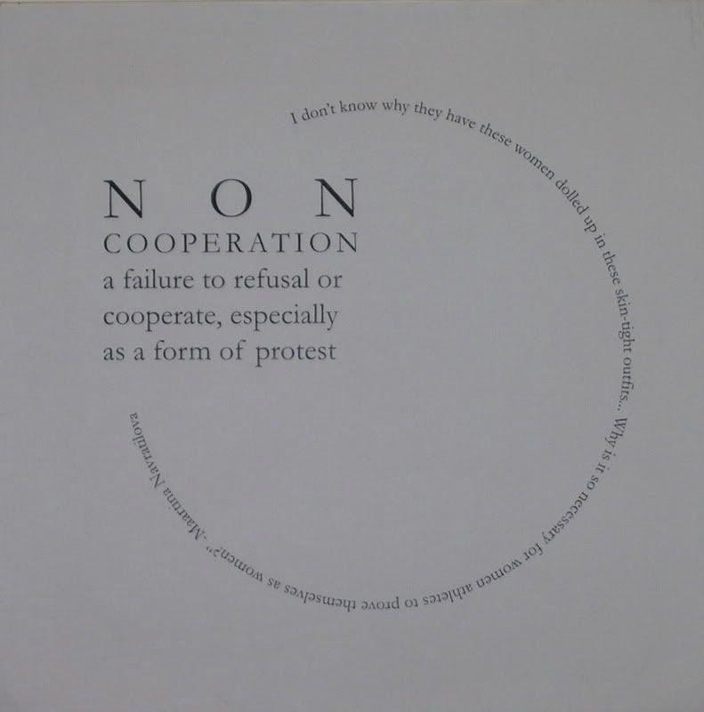
As with the last collection for aggression, the type ones were pretty much the hardest for me to get a handle on. I had the whole "square peg in a round hole" idea, which I tried to get across here. I've got a really cool quote about not conforming from Martina Navratilova in a circle. It took me a few weeks to make this a better design, because originally I had a circle of text with the square completely inside it, and my professor said it looked like everything was fitting neatly. I had to make it seem like the square wouldn't fit in the circle. And for weeks, I couldn't figure out how to type on a circular path in Illustrator, but thanks to a couple friends I got it in the end. Being able to type on a perfect circle helped me get my point across. Looking at it now, I should have made the square larger and on an angle to make it seem more disparate from the circle, but it's too late to change it, so here's the final I came up with.
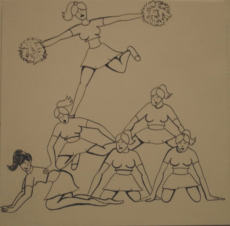
This image also took a few weeks to finalize. Originally I had something completely different, but after a critique in which one of my friends used a form composition with a falling-down pyramid, I got the idea to try that with my image, and with people. I thought it would be sort of funny to see cookie-cutter blonde busty cheerleaders fall because of the one brunette in the corner who's decided she's had enough of the conformity. (But I'm not bitter or anything.) So anyways, this took a few weeks to get it to this design, but I think it's the best one.
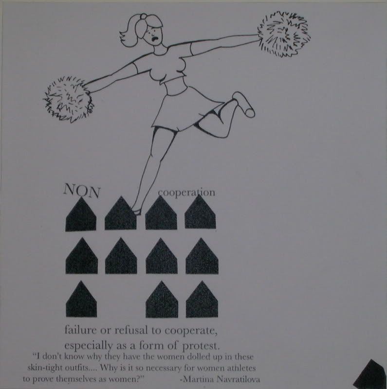
Once again, the hybrids proved to be the biggest challenge, but that was to be expected with this project. Originally, I had every element of every design included in my hybrids. But after some clarification, I understood that we only had to use bits and pieces of each design to get across the larger picture of noncooperation. So I just used the top cheerleader who's really falling on top of the whole form, which is on top of the pyramid-like text. The text had to be readable, so I couldn't keep it in a circle like I had it before. I like this hybrid much more than I did my previous attempts at the same solution.
Alrighty, well that's it for noncooperation. Last up a little later will be sophistication. Stay tuned!
Before I continue, I just wanted to gloat a little bit and say that I got a B- in this class (CMD 281) and a regular ol' B in my other CommDesign class (CMD 251). So I'm slightly above average! Which, for CommDesign, makes me feel awesome. Hahaha.
Anyways. Back to the hybrids. I hope you remember the complete explanation from my last post, so I'll just sum it up really quick for you. Form, type, and image separately on an 8x8 illustration board, then combining all those elements into one hybrid piece finally. Last time it was aggression. Now it's noncooperation.

The first form composition I had, the little shapes were circles, not little house-like things. My professor told me they weren't directional enough, so you couldn't tell whether or not it was leaving the group (which it was supposed to be doing) or trying to join the group in its assigned spot. So he told me to pick a more directional form. I didn't just want to do triangles, so I made them little triangles with rectangles attached. I see that one little guy leaving the composition as saying, "eff you guys, I'm goin' home." My other professor said that he couldn't get past it looking like a Century 21 ad or something, but I like them. I think they're kind of cute.

As with the last collection for aggression, the type ones were pretty much the hardest for me to get a handle on. I had the whole "square peg in a round hole" idea, which I tried to get across here. I've got a really cool quote about not conforming from Martina Navratilova in a circle. It took me a few weeks to make this a better design, because originally I had a circle of text with the square completely inside it, and my professor said it looked like everything was fitting neatly. I had to make it seem like the square wouldn't fit in the circle. And for weeks, I couldn't figure out how to type on a circular path in Illustrator, but thanks to a couple friends I got it in the end. Being able to type on a perfect circle helped me get my point across. Looking at it now, I should have made the square larger and on an angle to make it seem more disparate from the circle, but it's too late to change it, so here's the final I came up with.

This image also took a few weeks to finalize. Originally I had something completely different, but after a critique in which one of my friends used a form composition with a falling-down pyramid, I got the idea to try that with my image, and with people. I thought it would be sort of funny to see cookie-cutter blonde busty cheerleaders fall because of the one brunette in the corner who's decided she's had enough of the conformity. (But I'm not bitter or anything.) So anyways, this took a few weeks to get it to this design, but I think it's the best one.

Once again, the hybrids proved to be the biggest challenge, but that was to be expected with this project. Originally, I had every element of every design included in my hybrids. But after some clarification, I understood that we only had to use bits and pieces of each design to get across the larger picture of noncooperation. So I just used the top cheerleader who's really falling on top of the whole form, which is on top of the pyramid-like text. The text had to be readable, so I couldn't keep it in a circle like I had it before. I like this hybrid much more than I did my previous attempts at the same solution.
Alrighty, well that's it for noncooperation. Last up a little later will be sophistication. Stay tuned!