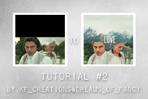
Tutorial #2 ~blending
First icon tutorial requested by lancelotfan
I only had part of my PSD available to replicate this with, so bear with me *flowers*
I also want to add before I start that, I know the in thing is to use a lot of layer masks to hide parts you want to hide, but I got into a habit a long time ago, to duplicate a layer and hide the spare (so I can refer to it again if I want to backstep), and erase parts on the new layer instead. So if you are comfortable with layer masks, then feel free to do that instead :-)
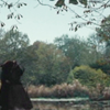
I started off opening up these two screencaps

and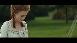
I then opened up a new document 100 x 100 with a black base layer #000000
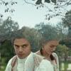
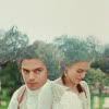
I dragged the first cap over to the icon base and resized it. I then dragged over the second cap, and turned it to lighten and then resized it, and played around with both pictures till I liked how they sat with each other.
Like this

I erased the sky parts on cap 1 and any other parts that prevented me from seeing Georgiana's face the way I wanted.
I then erased the sky from both caps, as this shows through the next layer that gets placed ever the top.
At this point, I merged down and cropped my base back to 100x100 (to loose the hidden wastage out side of the crop area)
You should have this

I cropped this base from another screencap from the film, because of it's skyline.
(here)
Placing this on top of the base that has been created, I set it to lighten. I then erased parts that were covering the faces.
I wanted to leave the hair covered to add to the blending effect I wanted for the final icon.
Giving you this
I don't want the leaves in the icon, so at this point - took the colour picker, and grabber the sky background colour.
Creating a new layer, I then painted over the parts of the top I wanted to cover using a small soft round brush
Giving you this

Again, I merged down at this point, as this is my final base.
Now for the textures and colours
Taking this sky texture (here) from my own stocks, I placed on top, and set to Overlay: opacity 49%

Next - a selective colouring layer:
Reds: -100,0,0,0
Greens: +100,0,0,0
Whites: +11,0,-13,+12
Then take this texture (here) again, one of my own, and set it to Darken: opacity 32%
Giving you this
A new layer: colour balance:
Midtones +14,-8,+4
Highlights -7,0,0
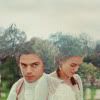
At this point I wanted a bit more subtle interest in the sky, so used this texture (here) another of my own stock, and set it to multiply: 100%
Giving you this
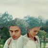
Open a new layer and fill it with white #ffffff and set it to overlay: 20%
Then open a new selective colour layer:
Reds: +3,+2,0,+22
Greens: -47,0,-64,+100
Neutrals: +21,o,+3,+6
Giving you this
Add a new curve layer:
Red:
outputs, 110, input, 97
outputs, 158, input, 132
outputs, 186, input, 177
outputs, 240, input, 240
Blue:
outputs, 107, input, 101
outputs, 172, input, 168
RGB:
outputs, 97, input, 76
outputs, 136, input, 124
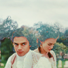
Merge down, and duplicate and turn that layer to overlay: Opacity 41
Add a new brown layer: #302307 and set to screen opacity 42
Add a new blue layer: #629ad4 colour burn opacity 15
And that should leave you with this
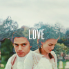
After adding text, this is the final icon :-)
Any questions, feel free to ask. :-)
• Please be respectful of these tutorials, as they are meant as a guide for learning only, not a way of replicating the same icons :-)
• Don’t steal, copy, alter or hotlink anything.
• Do comment as comments are love, knowing what you like really helps.
• Credit in your keywords/resources is not optional, but always appreciated.
Thank you :-) *flowers*
I only had part of my PSD available to replicate this with, so bear with me *flowers*
I also want to add before I start that, I know the in thing is to use a lot of layer masks to hide parts you want to hide, but I got into a habit a long time ago, to duplicate a layer and hide the spare (so I can refer to it again if I want to backstep), and erase parts on the new layer instead. So if you are comfortable with layer masks, then feel free to do that instead :-)
I started off opening up these two screencaps
and
I then opened up a new document 100 x 100 with a black base layer #000000
I dragged the first cap over to the icon base and resized it. I then dragged over the second cap, and turned it to lighten and then resized it, and played around with both pictures till I liked how they sat with each other.
Like this
I erased the sky parts on cap 1 and any other parts that prevented me from seeing Georgiana's face the way I wanted.
I then erased the sky from both caps, as this shows through the next layer that gets placed ever the top.
At this point, I merged down and cropped my base back to 100x100 (to loose the hidden wastage out side of the crop area)
You should have this
I cropped this base from another screencap from the film, because of it's skyline.
(here)
Placing this on top of the base that has been created, I set it to lighten. I then erased parts that were covering the faces.
I wanted to leave the hair covered to add to the blending effect I wanted for the final icon.
Giving you this
I don't want the leaves in the icon, so at this point - took the colour picker, and grabber the sky background colour.
Creating a new layer, I then painted over the parts of the top I wanted to cover using a small soft round brush
Giving you this
Again, I merged down at this point, as this is my final base.
Now for the textures and colours
Taking this sky texture (here) from my own stocks, I placed on top, and set to Overlay: opacity 49%
Next - a selective colouring layer:
Reds: -100,0,0,0
Greens: +100,0,0,0
Whites: +11,0,-13,+12
Then take this texture (here) again, one of my own, and set it to Darken: opacity 32%
Giving you this
A new layer: colour balance:
Midtones +14,-8,+4
Highlights -7,0,0
At this point I wanted a bit more subtle interest in the sky, so used this texture (here) another of my own stock, and set it to multiply: 100%
Giving you this
Open a new layer and fill it with white #ffffff and set it to overlay: 20%
Then open a new selective colour layer:
Reds: +3,+2,0,+22
Greens: -47,0,-64,+100
Neutrals: +21,o,+3,+6
Giving you this
Add a new curve layer:
Red:
outputs, 110, input, 97
outputs, 158, input, 132
outputs, 186, input, 177
outputs, 240, input, 240
Blue:
outputs, 107, input, 101
outputs, 172, input, 168
RGB:
outputs, 97, input, 76
outputs, 136, input, 124
Merge down, and duplicate and turn that layer to overlay: Opacity 41
Add a new brown layer: #302307 and set to screen opacity 42
Add a new blue layer: #629ad4 colour burn opacity 15
And that should leave you with this
After adding text, this is the final icon :-)
Any questions, feel free to ask. :-)
• Please be respectful of these tutorials, as they are meant as a guide for learning only, not a way of replicating the same icons :-)
• Don’t steal, copy, alter or hotlink anything.
• Do comment as comments are love, knowing what you like really helps.
• Credit in your keywords/resources is not optional, but always appreciated.
Thank you :-) *flowers*