New Layouts
I thought it was time to recode my layout and give this place a new look, and kf_creations also. Had I not had a months worth of computer issues, I might have done it sooner :-(. As ever I hate IE!! Firefox is so much easier
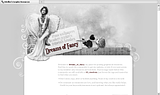
Screencaps, as always as a reminder to myself :-)
( Read more... )
Screencaps, as always as a reminder to myself :-)
( Read more... )
I wonder how you do this...
especially the first. I made at the moment my own community for my graphics and want to make my own layout. Maybe you can give me some tips how to make something like the first one...I am not really good with the lj codes...not yet =D
Thanks...
Reply
Thank you for liking the layouts so much. I am delighted to hear that you want to start to make your own. I cannot recommend this site enough, s2flexisquares they have a wealth of knowledge that will come in handy, as will this post ~ HERE~ this is a break down of what code does what on a flexible squares layout. great for pinpointing code that you don't know yet until you become familiar with what does what ( ... )
Reply
I try to understand all of your help and I will look to the sites too...it´s still confusing...
1rst. because english is not my mother language of course I can understand but with CSS =D..
2nd. I never worked with CSS and I must be patient...always try and try again...so I wanna just thank you so much..for your help..
And I will let you know how it goes..it will need a little time maybe...;D
I think I will do it step by step..!!!!
Reply
Reply
the last two days I worked with CSS and it goes step by step...really....thank you so much....all the tips helped me a lot.. =D
what is a notepad program????? never hear from that.
and you are right the more I play around with CSS the easier it get...
______
I just have one question...=D
here is my site...
http://community.livejournal.com/dusty_flyings/
I know at the moment is not so much to see but I have the problem with the links in the header.I figured already out how I can put it below the header but I want make them invisible and made the links in the sitebar like you can see how I make it with my Profile link. Do you know the CSS code to let them disappear?
Thank you again!
*hugs back* =D
Reply
Notepad is a plain text editor that comes with any windows pc. It doesn't corrupt text when you copy and paste it in - especially CSS. If you don't have window, I am sure there is an equivalent program on your machine :-)
right, let me go get you your code and i will be right back :-)
Reply
ul.navheader li {
display: none;
}
.title {
display: none;
}
.subtitle{
display: none;
}
that will turn off your navigation bar, your title and subtitle. what you will need to do then is in your link list in your sidebar page of your customization, you insert the links to the places you want, and call them the appropriate names, ie, profile, friends, etc. that is how you make your links in the side bar rather than along the top :-)
You will probably not need the #header-content line in this flexable squares layout, as you are using an image as your header. when you have decided on the width of your journal, you can resize the header to fit the width of the journal and then it will fit precisely.
Sorry not to get back even sooner - I am not feeling well tonight.
Hope that helps :-)
Reply
you will need to try with this:
#sidebar {
margin: -150px 0px 0px 0px;
}
If it doesn't work you can always remove it :-)
Reply
Leave a comment