Getting back to my roots

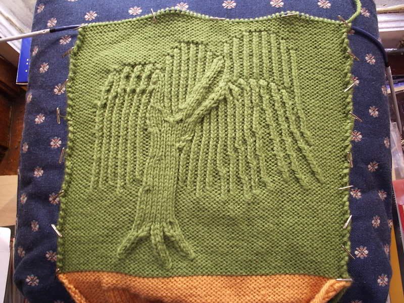
I really think this one needs work.
First, the bare tree (trunk/root/branches) should either (1) look good on its own, or (2) be covered by the fronds.
Second, I need to do something about the tops of the clusters of leaves. They look kind of odd. The one branch in front of another looks fine, but the rest? Ugh.
Third, I'm doing the leaves as columns of twisted stitches, and this means right-slanting cables look a lot worse than left-slanting ones, so I should get rid of those. On that note, I should make some of the fronds in the top tier slant, or make the ones in the bottom tier not.
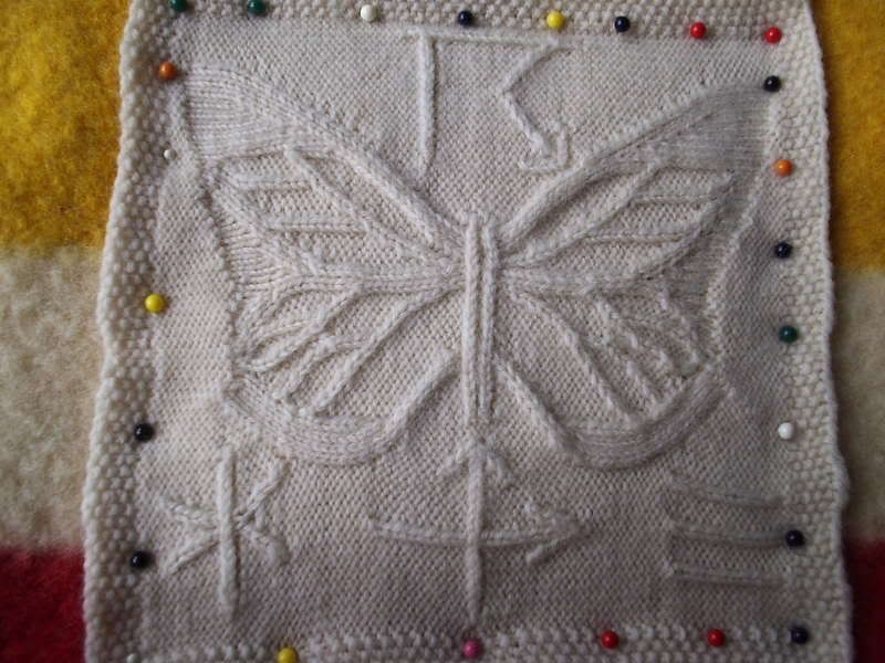
A while ago, I did one of those "comment to recieve art" memes in my personal LJ. I got about three responses, and here's what I came up with for the first of them:

I call this "The Butterfly Effect"; it's for a meteorologist-in-training. Those strange symbols are weather symbols; the top one is "thunderstorms", and the bottom ones are "snow", "dust storm", and "fog". It's worked in KnitPicks yarn on 2.25mm needles. The yarn is what used to be called "Color your own", but I think these days they're calling it "Bare-fingering weight". I did one draft swatch of each symbol (and of course I already had a draft of the butterfly lying around).
I discovered something about horizontal cables, doing this. I used to wrap my yarn in a weird way while doing horizontal cables, to avoid having twisted stitches. I tried just wrapping the yarn in the normal way. It turns out that if this twists things (and horizontal stitches are weird enough that it might not), then you can't see it, and it tightens up the background stitches quite a bit. (They're still loose enough to be noticeable, but not a huge problem anymore.)