Selected Album Cover Art.
First things first: I'm liking this new layout. Turns out it's virtually impossible to completely re-code my old style back into the new LJ system without learning a whole lot of CSS, so I picked this from a theme list and made virtually no changes to it at all. It just feels right.
Today I'm going to go through a number of CD album covers that I happen to think are really well executed. These will probably end up being quite similar in terms of style, and allow me to discover the little nuances of what I like in general, at least as far as music album covers are concerned. Maybe. :) I went through my iTunes in alpabetical order, so these are all albums that I either own or will own soon.
i-Empire - Angels & Airwaves
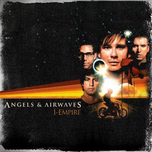
Along with being just an amazing album in general, this cover art strongly reminds me of the Star Wars movie posters. Incidentally, a Wikipedia entry tells me that the cover art was drawn by Drew Struzan, who is indeed the artist behind the Star Wars movies. It seems epic and adventurous, similar to the feel of the album, and has an overall positive feeling to it. Not too much going on with the text in terms of inventiveness, but I like its style nonetheless.
Arm Yourself - Bulletproof Messenger
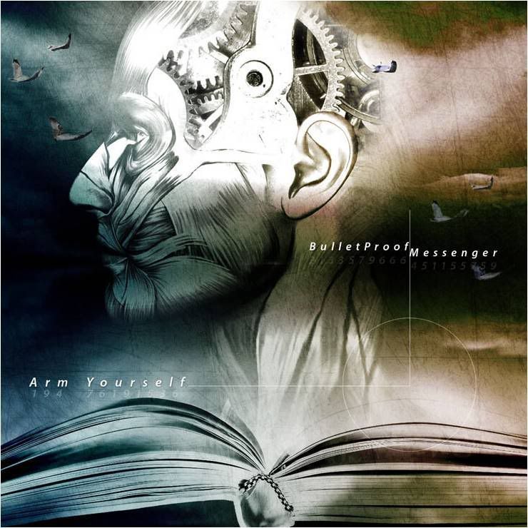
This album isn't out yet, but it will be in a few days. I've already listened to everything on it through BPM's fan club, and it's amazing, but this cover is particularly cool. I'm not really sure what's going on in it, really...we appear to have a dark stormy night on one side, and the sun starting to poke through the clouds on the right. And seagulls. This looks like it might be a storm on the sea. Oh, and there's a book. And a biomechanical face. Yeah, I really don't know what this signifies, all I know is that it's damn cool cover design. I also like the style of the text, and the way that each letter is mirrored with a number underneath it.
The Crucial Line - Bulletproof Messenger
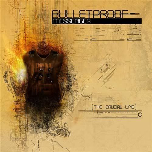
This one makes a little more sense in terms of the band. A bulletproof vest overlayed with a bunch of technical drawing layouts of anatomy. This is a much more technical-type cover, which conveys their music to a degree: lots of digital effects and programming mixed in with the raw intensity of hard rock, signified by, say, the bullets and vest. Not bad. Of the two I'd say Arm Yourself is better, though.
Indestructible - Disturbed

This cover is just badass. You can't really describe it any better than that. An interesting note of Disturbed's covers is that this "character", known as The Guy, has appeared in numerous Disturbed-related media as their mascot since their original album The Sickness. Originally only his eyes and grin were shown, and were the band's symbol for a time. His upper torso was shown completely on the cover for Ten Thousand Fists, and a fully animated version was displayed in the music video for "Land of Confusion". Truly, though, the character's best appearance is on this cover. The animation and artistry was created by Todd McFarlane, creator of the Spawn comic series.
Dawn Escapes - Falling Up

The first thing I notice about this cover is not the house. Actually it's the design of the text, in particular the band's name. Isn't that cool? I've always been a fan of the really thin capital letter motif, so that grabs my attention as well. Finally, we have the house. Originally I thought it was "falling up", rising out of the ocean or something, but now that I take a closer look it seems as if it's being flooded. Well, that makes sense since this is a Christian band.
End of Silence - Red
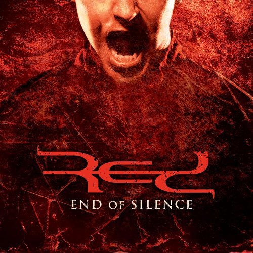
Another Christian band. I included this mainly because of the style of the band's name. Seriously, can you think of a cooler way to write "Red"? The background is solidly done as well, minus the screaming guy which I tend to ingore.
Innocence & Instinct - Red

Unfortunately I can't get a bigger version of this cover (probably because it isn't released yet) but this is just another example of how Red has awesome text designs. It's quite simple, actually, which is a feature I'm starting to recognize with all these albums. Minimalist design with dark or moody atmosphere.
Hybrid Theory EP - Linkin Park

I figured I should put in a Linkin Park cover, but the truth is their cover art isn't really all that amazing...save for this one. Again, it's simple. The text looks good in front of that circle-thing, and the artwork is pretty decent as well. This was hand-drawn by Mike Shinoda, and is one of 3 total covers he designed using his own art. (The original Xero cover is kinda like this, but a bit creepier, and the official Hybrid Theory cover is cool, but I like this better)
The Fake Sound of Progress - Lostprophets

This is essentially an out-of-focus picture with some cool design dressings. I'm a big fan of the text style in particular, and little robot guy in the upper corner. Otherwise, not much else to talk about here. The picture looks like it's from one of their studio sessions. The design seems rather technical as well, which suits the album since it is one of their more technical and progressive-type albums.
Mer De Noms - A Perfect Circle

This cover is what inspired me to do this piece in the first place. Not only is this one of the coolest covers I've ever seen, it's one of the best band logos I've ever seen as well. The logo is formed by overlaying 4 circles on top of each other and cutting out the gaps. The symbols, well...I don't really know where they come from, although the title is Latin for "Sea of Names". So much about A Perfect Circle is excellent, but their art is particularly amazing.
eMOTIVe - A Perfect Circle

Another example of APC's awesome logo. This album is really just a collection of anti-war covers such as "Imagine", "What's Going On", "Peace, Love, and Understanding", and "People Are People". As such, the cover is pretty bleak. Interesting to note this is almost the exact same color palette as the previous album listed. The "other" color scheme they use is green and gold, featured on Thirteenth Step, the cover of which isn't quite as cool as these two.
Tomorrow - SR-71
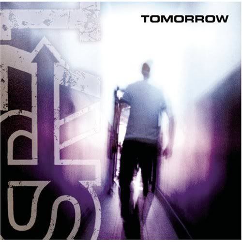
Yet another simple cover design. Band name, picture with effects added, title name. It's still an effective design. I like the way the band's name is put to the side like that and faded into the picture, although that's more due to the picture's whiteout. I'm also a fan of the color scheme, which is essentially purple and black. This cover fits the change in transition for the band at the time, which was into a darker, more serious tone.
Blue - Third Eye Blind
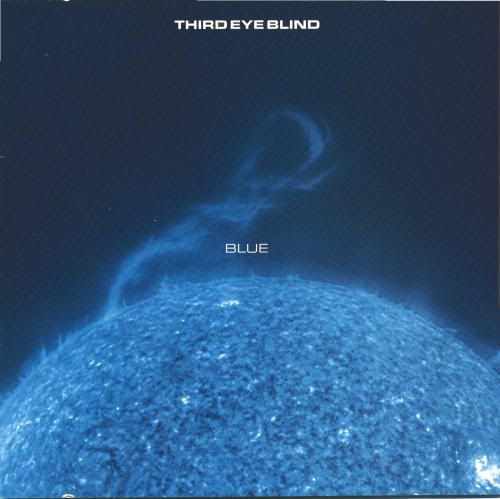
There is just something interesting about a blue sun, in pretty much any context. This is viewed as more or less an "experimental" album for the band, as it is a pretty huge departure from their first. In this respect, the celestial image kinda fits the imagination.
Lateralus - Tool

Another Maynard James Keenan-fronted band. I'm not really sure what draws me to this album, and similarly, I'm not sure what draws me to this cover. For some reason, I find both alluring, but hard to explain. Tool is a band that is rather hard to describe accurately, so I'll label them as Progressive Art Metal. The songs don't adhere to any particular format or pacing and yet are incredibly complex and technical in their execution. Lateralus, for all intents and purposes, is a concept album dealing with celestial fate. How that relates to this cover I'm not sure, but it gives off a sense of deep brooding complexity.
The Autumn Effect - 10 Years

One of my most recent favorite bands. 10 Years is a progressive/hard rock band. Knowing that, picture the cover above and you can get a feel for what the music is like: heavy, but light, mellow, melodic and sweeeping all at the same time. Lots of acoustic, and a beautiful voice, but lots of heavy guitars too. Ah well...this cover is essentially pretty. The styling of the text is of particular note. The band's logo is script, which might suggest something more laid-back or mellow, but doubly layered to give a jarring or vibrating nature. The setting looks like a dark forest, which could also hint at the nature of the music: forests are peaceful and tranquil locations, but add darkness and they develop an edgy quality.
That's pretty much every album I have in my iTunes playlist worth noting. Granted, some of these analysis attempts could be totally off, but they're the first impression I get when I look at these covers. And you have to admit, quite a few of them are just plain cool. I think I'll stop for now and detail the mundane happenings of my life at a later date.