(no subject)
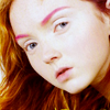
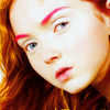
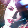
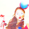
Today we're going from
this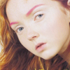
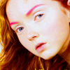
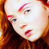
to this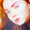
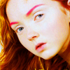
or this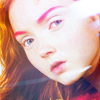
.
12 steps total. Includes Curves and Selective Color layers. Made in Photoshop CS3.
We're going to learn how to make the pinks and reds in your image really pop. This tutorial works best with images that are fairly neutral to start with -- neither too red nor too blue.
1. Crop and resize your base to 100x100 pixels. I used a picture of Lily Cole from a fashion editorial found at mixologies.
2. Duplicate the base and set it to Screen at 30%. Sharpen if necessary. (My image was already quite light, but you may need to up the opacity or even repeat this step.) You want it to be a bit faded so if you do this step and it ends up looking too bright, go to Image > Adjustments > Hue/Saturation and increase the Lightness.

3. Now she's a little washed-out, so we're going to add a Color Fill layer -- ebe7a0 -- set to Color Burn at 100%.
4. So now we have to correct some of that yellow tone. Go to New Adjustment Layer > Color Balance. Insert these values:
Midtones: 0 // 0 // +47
Shadows: 0 // -23 // +23
Highlights: -10 // 0 // 10
Make sure that Preserve Luminosity is toggled On.
5. Go to New Adjustment Layer > Hue/Saturation and up the Saturation to +30.
6. New Adjustment Layer > Selective Color.
Reds: -25 // +25 // +25 // 0
Yellows: 0 // 0 // +50 // 0
Cyans: +100 // 0 // 0 // 0
Blues: +100 // 0 // 0 // 0
Magentas: -100 // +100 // +100 // 0
Neutrals: +30 // 0 // +10 // -10
7. Now it's looking a little too pink, so let's do another solid color layer, filled with d9f3fe and set to Color Burn at 50% opacity.

8. New Adjustment Layer > Selective Color.
Cyans: +100 // 0 // 0 // -100
Blues: +100 // 0 // 0 // -100
Whites: 0 // -41 // 0 // -30
Neutrals: 0 // -10 // -10 // 0
(I lightened up the cyans and blues to make her eyes stand out, but if you have large areas of blue in your icon you're going to want to leave it at Cyan: +100 // 0 // 0 // 0 and Blue: +100 // 0 // 0 // 0.)
9. New Adjustment Layer > Color Balance.
Midtones: +20 // -10 // -10
10. You can just leave it at that, but if you think it's too reddish, go ahead and do New Adjustment Layer > Curves.
RGB, Point 1 -- Input: 139, Output: 127.
Blue, Point 1 -- Input: 237, Output: 247.
11. At this point I started embellishing; I added a texture
(made by _iconographer) and set it to Screen at 50%.
12. I also added this light texture
(made by ewanism and edited a bit by me) and set it to Screen at 100%.
And there you have it! Experiment with textures and such -- lots of great ones are at freshmakers.
Another example of this tutorial:
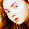
From this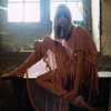
to this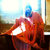
or this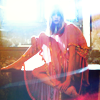
.
Other icons made with variations on this tutorial:
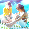
this
to this
or this
.
12 steps total. Includes Curves and Selective Color layers. Made in Photoshop CS3.
We're going to learn how to make the pinks and reds in your image really pop. This tutorial works best with images that are fairly neutral to start with -- neither too red nor too blue.
1. Crop and resize your base to 100x100 pixels. I used a picture of Lily Cole from a fashion editorial found at mixologies.
2. Duplicate the base and set it to Screen at 30%. Sharpen if necessary. (My image was already quite light, but you may need to up the opacity or even repeat this step.) You want it to be a bit faded so if you do this step and it ends up looking too bright, go to Image > Adjustments > Hue/Saturation and increase the Lightness.
3. Now she's a little washed-out, so we're going to add a Color Fill layer -- ebe7a0 -- set to Color Burn at 100%.
4. So now we have to correct some of that yellow tone. Go to New Adjustment Layer > Color Balance. Insert these values:
Midtones: 0 // 0 // +47
Shadows: 0 // -23 // +23
Highlights: -10 // 0 // 10
Make sure that Preserve Luminosity is toggled On.
5. Go to New Adjustment Layer > Hue/Saturation and up the Saturation to +30.
6. New Adjustment Layer > Selective Color.
Reds: -25 // +25 // +25 // 0
Yellows: 0 // 0 // +50 // 0
Cyans: +100 // 0 // 0 // 0
Blues: +100 // 0 // 0 // 0
Magentas: -100 // +100 // +100 // 0
Neutrals: +30 // 0 // +10 // -10
7. Now it's looking a little too pink, so let's do another solid color layer, filled with d9f3fe and set to Color Burn at 50% opacity.
8. New Adjustment Layer > Selective Color.
Cyans: +100 // 0 // 0 // -100
Blues: +100 // 0 // 0 // -100
Whites: 0 // -41 // 0 // -30
Neutrals: 0 // -10 // -10 // 0
(I lightened up the cyans and blues to make her eyes stand out, but if you have large areas of blue in your icon you're going to want to leave it at Cyan: +100 // 0 // 0 // 0 and Blue: +100 // 0 // 0 // 0.)
9. New Adjustment Layer > Color Balance.
Midtones: +20 // -10 // -10
10. You can just leave it at that, but if you think it's too reddish, go ahead and do New Adjustment Layer > Curves.
RGB, Point 1 -- Input: 139, Output: 127.
Blue, Point 1 -- Input: 237, Output: 247.
11. At this point I started embellishing; I added a texture
(made by _iconographer) and set it to Screen at 50%.
12. I also added this light texture
(made by ewanism and edited a bit by me) and set it to Screen at 100%.
And there you have it! Experiment with textures and such -- lots of great ones are at freshmakers.
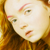
Another example of this tutorial:
From this
to this
or this
.
Other icons made with variations on this tutorial: