Round One - Challenge One: Results

Prompt.

Voting.
ELIMINATED:
09.

by faithfultreat: -72+00= -72
21.

by circury: -52+00= -52
16.

by cyphersushi: -29+03= -26
VOTER'S CHOICE:
10.

by pierhias: -00+37= +37
Congratulations, you have immunity for the next round! You still need to submit an icon, unless you use a bye, but you cannot be eliminated.
MOD'S CHOICE:
22.
by green_queen.
Love the coloring on this icon, very beautiful!
POINTS
01. -00+16= +16
02. -05+19= +14
03. -00+10= +10
04. -00+13= +13
05. -00+06= +06
06. -17+03= -14
07. -08+00= -08
08. -00+00= 000
09. -72+00= -72 {ELIMINATED
10. -00+37= +37 {VOTER'S CHOICE
11. -00+00= 000
12. -00+05= +05
13. -00+11= +11
14. -00+00= 000
15. -00+24= +24
16. -29+03= -26 {ELIMINATED
17. -05+00= -05
18. -01+13= +12
19. -01+03= +02
20. -06+05= -01
21. -52+00= -52 {ELIMINATED
22. -00+08= +08 {MOD'S CHOICE
Please remember that votes are weighted. A "Worst" vote received -5 points, a "Second Worst" vote received -3 points and a "Third Worst" vote received -1 points. Similarly, a "Favorite" vote received +5 points and a "Second Favorite" vote received +3 points. So if you're wondering why your amount of comments doesn't match your points, that's why.
WORST VOTE COMMENTS
#02 - Hair is cropped awkwardly.
#06 - The colours are very good but the way the text is covering her face is ineffective and confusing.
#06 - The font is too large and covers Echo's face awkwardly.
#06 - nicely cropped but the texture used doesn't compliment the icon very well and the text is a bit overpowering.
#06 - The text is very poorly placed. Overlapping the image like this makes it very confusing as to where the focus of the icon is supposed to be.
#06 - font is overwhelming
#06 - The coloring looks very awkward like maybe you put a texture over her and it didn't really work. Also the fact that the text goes over the face bugs me. Sometimes that works, but when its so much on such a small piece it really doesn't fit.
#06 - The quality of the picture seems poor. The textures used gave the icons a grainy look very disturbing.
#06 - The text placement could be improved. Half of the text is lost in the corner and the other half is placed awkwardly over her face, taking the focus off her.
#06 - Icon is too busy and distracting
#07 - very nice crop but the icon appears a bit blurry and pixilated. could use a little sharpening.
#07 - Washed out color and the text doesn't quite work.
#07 - Low compression is very apparent around the text, which also takes too much focus from the subject.
#07 - it's undercontrasted, not sharpened enough, and the text is improperly antialiased.
#09 - The yellow coloring is overpowering.
#09 - Cropping is okay. But the picture looks grainy and over saturated.
#09 - The icon is very unappealing. Echo's skin is way too white and the yellow does nothing to help the icon. It's also way too oversharpened.
#09 - I like the crop, but the colors just don't work. The yellow takes over the icon and distracts from the subject.
#09 - The quality of this icon is extremely poor. The coloring is too bold and the image looks too washed out and grainy.
#09 - First off flipping the image made her eyes look a little odd. And then the coloring is far too bright, she just blends into the background. She also looks a little bit grainy.
#09 - The coloring makes it hard to tell who the subject is.
#09 - The composition is awkward, and so is the colour scheme.
#09 - The icon is way too overcontrasted, resulting in eliza looking washed out and grainy.
#09 - The icon is too yellow and the effect hides Echo's face.
#09 - it looks grainy and washed out.
#09 - yellow is overpowering. image quality is very poor.
#09 - The coloring is really washed out and the image looks a tiny bit pixalated and stretched.
#09 - Way over sharpened, very washed out coloring.
#09 - it looks oversharpened and the colors do not compliment the subject's face.
#09 - The icon is pixelated and the yellow colouring is overpowering the original image.
#09 - Colouring makes it almost impossible to recognise the subject.
#09 - Image is over-sharpened and the texture used takes from the icon.
#16 - Awkward blurring
#16 - Way too blurry.
#16 - Picture is blurred. It leaves no focus in the icon.
#16 - nice crop but the effect used makes the icon blurry and detracts from the overall quality of the icon.
#16 -The image looks blurry and pixelated almost beyond recognition.
#16 - very blurry.
#16 - The faded filters have blurred out the image. Would have probably worked better had the filters been partly erased.
#16 - The effects used detract from the icon, and make it look too blurry.
#16 - filter is distorting echo. would've been fine without all the blocks on her face.
#16 - the effect makes the whole icon look blurry.
#16 - The effect used deforms her face, it doesn't really add anything to the icon, but rather makes it look unnatural.
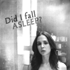
#17 - Too dark. A few screened layers would have helped a lot.
#17 - the text and coloring are plain and don't draw attention to the icon or make it stand out. more could have been done to help it stand out. the font is also hard to read, only the 'asleep' is really readable/noticeable.
#17 - Too dark, text is oddly placed
#18 - Icon can be brightened a bit. It appears a bit dark.
#19 - it's oversharp and overcontrasted.
#20 - The brushes used doesn't add anything to the picture; it covers Eliza up a bit and takes focus completely away from the photo.
#20 - The decorations are abstract and take away from the picture.
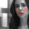
#21 - The clown makeup doesn't make sense to me and just feels really out of place.
#21 - The cropping is good and so is the contrast of black and white but the color in the cheeks and on the lips look clownish and unfinished.
#21 - The pink patches on the face are very distracting.
#21 - The black and white with just a hint of color works, but the color on the cheeks doesn't.
#21 - the blush and lipstick color doesn't look right.
#21 - Its an interesting idea but it just doesn't work out. the color on her lips is a little off, and I think a softer brush would have made the cheeks look a bit more realistic.
#21 - Although the idea is good, the execution doesn't work with the colors and blending.
#21 - It looks badly compressed and the coloured spots are too monochromed, as well as harshly lined out on the cheeks.
#21 - The red on her face looks off and doesn't work with the image.
#21 - The clown face of Echo is inappropriate and strange.
#21 - Colorization is cliched and antiquated. image quality is poor and cropping could be improved.
#21 - The coloring of the cheeks makes the icon look awkward, all though it is very creative (playing on the doll theme of the show) doesn't really draw my attention with the crop.
#21 - Undercontrasted, nonsensical and distracting duotone treatment.
#21 - the brushes on her face look very weird and don't blend well with it.
#21 - The coloured patches on her cheeks look out of place.
#21 - The painted brush is a bit too sharp. It would look better if blurred.
FAVORITE VOTE COMMENTS
#01 - Nice crop and good coloring. :D
#01 - I really like the coloring, it draws my eye to the icon. great job simple but very good.
#01 - Strong colours and balanced composition.
#01 - I really like the simplicity of this icon, especially the crop. She's a little over yellow but not so much that it looks bad. Nice icon.
#02 - The duplicated background and the vibrant colouring are lovely.
#02 - Great contrast, and creative re-use of the original image to the right.
#02 - Great coloring and contrast.
#02 - Love the coloring and the texture.
#02 - Strong coloring and using the lights on both sides of Echo works really well.
#03 - Great coloring and cute text.
#03 - Great use of text and color.
#04 - Nice coloring. :)
#04 - Reasons. nice clear coloring sharpening and good cropping.
#04 - I thought the coloring and the cropping of this was perfect. It doesn't look too overbearing and is very appealing to the eyes.
#05 - The warm coloring looks very nice.
#05 - good coloring.
#06 - The black and white of the picture works very well with both font use and color. Very catchy.
#10 - Nice use of b/w and texture.
#10 - I like the cropping and the text placement.
#10 - Good, interesting crop. Black and white works well.
#10 - Good use of negative space and text.
#10 - The cropping is nice and the b&w is wonderfull. Nice use of textures.
#10 - nice crop, texture use and font positioning.
#10 - The black & white effect is really well done and the texture(s) used add nice extra touch.
#10 - Crop is good and the black and white well balanced in contrast. The texture and use of font works very well.
#10 - The black and white works well with the image and I like the text.
#12 - Very nice composition and interesting use of text.
#13 - The blue touch are very nice.
#13 - Desaturating an icon is hard to do beautifully, but this icon nailed it, with the black/white and blue it makes it stand out.
#13 - the use of black and white with a little bit of blue is very nicely done and makes the icon stand out.
#15 - Nice use of text and the partial erasing of the background works well.
#15 - I really like the composition with the background partially erased and the two names.
#15 - I just love everything about this icon. The coloring is perfect. I love how the text is placed also.
#15 - I loved the usage of black space in the background and the text is not only relevant, but it's the perfect font and text effect.
#15 - Good coloring, cropping, and text use.
#15 - the crop and lighting effects are very nicely done as is the text placement.
#16 - it's a really interesting design concept, tying in with other elements from the show.
#18 - The blending of Echo's picture and the background texture is well done, as is the text.
#18 - I enjoy the coloring and texture placement.
#18 - The texturing is very good and the text works well with the image.
#19 - Good coloring.
#20 - Very eye-catching texture use, it frames the subject well.
#22 - I like the faded sepia coloring, really interesteing and draws my eye to the icon.
#22 - Beautiful colouring and use of textures!
MOD NOTE:
Congratulations to everyone who participated in this round! For those eliminated, we hope you'll stay around, vote, and pay attention for the mid-way pickup challenge where you'll have the chance to win your way back in. The next challenge will be up shortly, and the bye post will be updated as well.
{comments are not screened. | to leave a screened comment for the mods please go to the contact us post.}