Tutorial
Another tutorial. I do not understand what has overcome me recently. Or maybe I just wanted a whole makeover for this account. Seems like I'm gradually becoming more productive. How funny, seeing as school is near. Well, another tutorial, however inconceivable.
Objective:
--
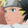
1. Crop your image to 100/100px. Leave it as it is- this will be our base.
2. Duplicate your base layer, and set it to Screen. Change the opacity according to your liking.
3. Next, you then duplicate your Screen layer, but change it to Softlight.
4. Make a new layer, and fill it with #135384. Set this to Exclusion 100%.
5. Then fill in a new layer ontop of the exclusion layer with #c8c8c8, and this time- set it to Colour Burn 100%.
6. Duplicate your base-set-to-Softlight layer, then drag it above the Colour Burn layer. Make more of these if the colour isn't to your liking. I did.
7. Then create a Colour Balance Layer, and place them in these settings: -41, 0, +37 (Midtone).
8. Another colour balance layer, but this time- place them in these settings: 0, 0, -51 (Midtone, again).
9. Now make a new selective colour layer, and place it in these settings:
REDS
Cyan: -100
Magenta: 0
Yellow: -1
Black: 0
GREENS:
Cyan: 100
Magenta: -100
Yellow: -100
Black: 0
CYANS:
Cyan: 100
Magenta: -100
Yellow: -100
Black: 0
BLUES:
Cyan: 100
Magenta: -100
Yellow: -100
Black: 0
NEUTRALS:
Cyan: +19
Magenta: 0
Yellow: -22
Black: -27
10. Make another selective colour layer.
REDS
Cyan: -100
Magenta: 0
Yellow: +100
Black: 0
GREENS:
Cyan: +7
Magenta: -12
Yellow: -10
Black: 0
CYANS:
Cyan: +12
Magenta: -7
Yellow: -10
Black: 0
BLUES:
Cyan: +5
Magenta: -10
Yellow: -7
Black: 0
NEUTRALS:
Cyan: -16
Magenta: -1
Yellow: -16
Black: -2
11. Last selective layer for the tutorial. Settings:
REDS
Cyan: -100
Magenta: +47
Yellow: +8
Black: 0
YELLOWS
Cyan: -92
Magenta: +63
Yellow: +9
Black: 0
MAGENTAS
Cyan: +93
Magenta: -82
Yellow: +76
Black: -48
BLUES:
Cyan: 100
Magenta: -100
Yellow: -100
Black: 0
NEUTRALS:
Cyan: +19
Magenta: 0
Yellow: -22
Black: -27
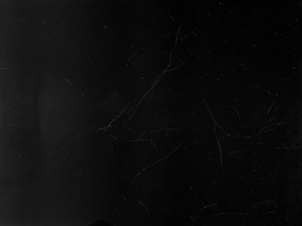
12. Use any texture for that scratched effected. I may have used this. Set it to Screen 100%.
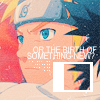
13. Optional: If you wanted to add the extra boxes and such, like I had with my icon- then read ahead.
13a. Duplicate your texture layer, merging them together (Ctrl + E). If you've done this step, then finally move it about until you like it.
13b. Merge everything altogether (except your scatchy texture layer!).
13c. Okay, so leave your icon alone. Now duplicate it and select a small square out of the whole image (if you don't know how, then select Shift whilst using the Rectangle Marque tool). Then Select Inverse (Ctrl + Shift + I) and delete the rest!
13d. Use the transform tool (Ctrl + T) and shrink it down to size that you like. Again, to make it a perfect square (only smaller) then press Shift whilst using it.
13e. Now move it to where you want it to be. Create a new layer, and place it right underneath your layer (confused? the layer I was referring to in the previous steps).
13f. Select a rectangle shape around it. When you're satisfied, fill it with a white colour and deselect it; and then merge them together. Cut off bits you don't need.
13g. Now remember your scratchy texture layer? Well drag it to the top and just leave it there.
14. Add some text, some brushes, merge them together again and you're done!
Objective:
--
1. Crop your image to 100/100px. Leave it as it is- this will be our base.
2. Duplicate your base layer, and set it to Screen. Change the opacity according to your liking.
3. Next, you then duplicate your Screen layer, but change it to Softlight.
4. Make a new layer, and fill it with #135384. Set this to Exclusion 100%.
5. Then fill in a new layer ontop of the exclusion layer with #c8c8c8, and this time- set it to Colour Burn 100%.
6. Duplicate your base-set-to-Softlight layer, then drag it above the Colour Burn layer. Make more of these if the colour isn't to your liking. I did.
7. Then create a Colour Balance Layer, and place them in these settings: -41, 0, +37 (Midtone).
8. Another colour balance layer, but this time- place them in these settings: 0, 0, -51 (Midtone, again).
9. Now make a new selective colour layer, and place it in these settings:
REDS
Cyan: -100
Magenta: 0
Yellow: -1
Black: 0
GREENS:
Cyan: 100
Magenta: -100
Yellow: -100
Black: 0
CYANS:
Cyan: 100
Magenta: -100
Yellow: -100
Black: 0
BLUES:
Cyan: 100
Magenta: -100
Yellow: -100
Black: 0
NEUTRALS:
Cyan: +19
Magenta: 0
Yellow: -22
Black: -27
10. Make another selective colour layer.
REDS
Cyan: -100
Magenta: 0
Yellow: +100
Black: 0
GREENS:
Cyan: +7
Magenta: -12
Yellow: -10
Black: 0
CYANS:
Cyan: +12
Magenta: -7
Yellow: -10
Black: 0
BLUES:
Cyan: +5
Magenta: -10
Yellow: -7
Black: 0
NEUTRALS:
Cyan: -16
Magenta: -1
Yellow: -16
Black: -2
11. Last selective layer for the tutorial. Settings:
REDS
Cyan: -100
Magenta: +47
Yellow: +8
Black: 0
YELLOWS
Cyan: -92
Magenta: +63
Yellow: +9
Black: 0
MAGENTAS
Cyan: +93
Magenta: -82
Yellow: +76
Black: -48
BLUES:
Cyan: 100
Magenta: -100
Yellow: -100
Black: 0
NEUTRALS:
Cyan: +19
Magenta: 0
Yellow: -22
Black: -27
12. Use any texture for that scratched effected. I may have used this. Set it to Screen 100%.
13. Optional: If you wanted to add the extra boxes and such, like I had with my icon- then read ahead.
13a. Duplicate your texture layer, merging them together (Ctrl + E). If you've done this step, then finally move it about until you like it.
13b. Merge everything altogether (except your scatchy texture layer!).
13c. Okay, so leave your icon alone. Now duplicate it and select a small square out of the whole image (if you don't know how, then select Shift whilst using the Rectangle Marque tool). Then Select Inverse (Ctrl + Shift + I) and delete the rest!
13d. Use the transform tool (Ctrl + T) and shrink it down to size that you like. Again, to make it a perfect square (only smaller) then press Shift whilst using it.
13e. Now move it to where you want it to be. Create a new layer, and place it right underneath your layer (confused? the layer I was referring to in the previous steps).
13f. Select a rectangle shape around it. When you're satisfied, fill it with a white colour and deselect it; and then merge them together. Cut off bits you don't need.
13g. Now remember your scratchy texture layer? Well drag it to the top and just leave it there.
14. Add some text, some brushes, merge them together again and you're done!
- Credit: peoplesmachine for scratchy texture.
- Comments/credit will be loved.
- Hope you like what is displayed here.