Colour Split Banner Tutorial
Hello, im going to make a nice tutorial for this banner that I made for my normal journal un4tunate. Its pretty simple but I thought it looked cute and reminded me of those Fruit Salad sweets (candy, depending where your from), simple because of the colours I used on it :P
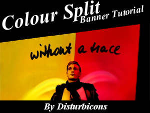
It will look like this in the end;

The size of this banner is 750px in width and 450px in height. It was made using Paint Shop Pro and I am certain it is transferrable to Photoshop, I just find Paint shop easier for this particular tutorial :)
For this tutorial we will be using this picture of the rather attractive (ahem, state the obvious there Leanne XD) Alexander Skarsgård (because im obsessed with him *is not a crazed fangirl though*).

1. So you'll want to open a new image to whatever dimensions you want your banner to be (mine is 750x450). You now need to take whichever picture you're using. Since mine has a background, you'll need to colour that background in white (you could go around it really carefully with a paint brush or layer masks, doesn't really matter either way. Should look like this if you dont know what im talking about.
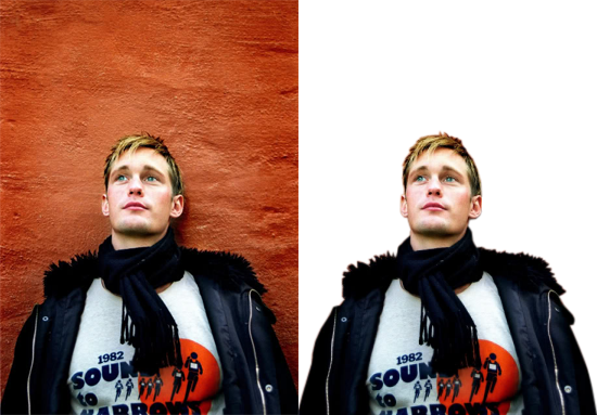
It would be easier to pick a image that has your subject with a white background, but I liked this picture :P I then pasted the pic of Alex onto the centre of the blank background.

2. So now we need to desurate the banner and make it black and white. Again, many ways to do this, in Paint Shop Pro i'll will use the image adjustments (adjust>hue and saturation>hue/saturation/lightness). Saturation = -100. We now have a black and white image, which is important when we add to colours later. I want this to be a little more bold and contrasted so we are going to make another adjustment (adjust>brightness and contrast>brightness/contrast). Change the contrast to 20. I personally think it looks better later in if the black on his jacket and scarf are really dark. You should end up with something similiar to this.

3. Now this next step is to add some texture (I mean make it look as if it would feel like something if you touched it lol) to the banner. I will be using texture 14 from this set of grungy textures by onlyabreath. I slightly altered the texture and got rid of the big black grungy spots on it and filled them in with grey. Paste that as a new layer and set it to Multiply at 40 to get this...

The black strip on the right is still grey though so I duplicated that layer and set it to normal 100% and then I erased all of the grey area and just left with the black strip unerased to get this...

4. Now its time to add the colour to are banner. Your can simply add block colour by making a new layer and setting it to multiply. I decided to use texture number 7 from this set by evelites. This one to be exact...
Of course, this is used as a icon texture so when are going to have to resize it to fit my banner, so resize it to 750x750. Paste this as a new layer on your banner and set it to multiply 100. Its a bit dull but we will sort that out later. Now we have a line going directly down Alex's face. I want this line to be parallel to this black strip on the right (lol for some reason stuff like this really annoys me, I like symmetry) so what I did was switch the layer back to normal. Use the dropper tool to get the colours of the texture and then you can use the paint brush to make the line of the texture symmetrical. Of course, you dont have to do this at all, I just do it because im a freak :P It will now look like this...

5. Next step is to add 2 nice swirly textures from saruna.net. This one will be used on the pink side. I placed the swirly center just to right of Alex and set it to Soft Light 100. Erase all of the texture that is on the yellow side of the banner to get this...

6. Now im going to add this texture (also from saruna.net) to the yellow side, just to the left of Alex. Set it to Soft Light 75. This is what you get...

7. We need to make it more bright and colourful now. Lets add a new adjustment layer (layers>new adjustment layer>brightness/contrast) brightness = 20, contrast = 25. Then we need to add another adjustment layer (layers>new adjustment layer>colour balance). The settings for these are;
Midtones
30 0 0
Highlights
0 0 40
8. Finally, we are going to add a curves layer. It lightens up the yellow alot more. The settings are below;
RGB
Input 111 Output 151
Set this layer to 50%. The banner will now look like this...

9. You can leave it there if you want. But I thought it looked a bit empty at the top. So I decided to add another texture. This time it is text from this set by kuribati. Texture number 3 is the one I used. I have to resize it and adjust it using the negative image tool. I then pasted the texture directly above Alex's head and then set it to multiply 100. It should now looked like this...
And we're done :P Its slightly different to the one on my journal because I forgot how I made it, I may have even used Photoshop/Selective Colouring on that one, but its close enough :)
Please comment here if you liked it. Id love to see the results if you found this tutorial useful.