VOTING for LIMS: Round 11!--CLOSED
It's voting time! We are going to try something different this round, so be sure to read the rules below. Also, everyone entered (you guys had me scared for a while there), so there are no disqualifications. :)
RULES for this round:
You will be voting for the TWO(2) worst icons via screened comments. In addition to just putting the numbers, you will have to give a quick explanation on why you are voting for those icons. If you have any questions about this, go ahead & ask---just please do so before you vote.
Examples:
12: The colors are overpowering the icon and it's oversharpened.
17: It's a bit blurry and not as creative as some of the others.
19: The cropping is centered and the general layout of it is just unoriginal.
Those are the type of answers I expect (actual reasons as to why you are voting for those icons)...meaning if you just say: I didn't like they text they used or I don't like the color yellow, those votes WILL NOT be counted.
01.
02.
03.
04.
05.
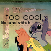
06.

07.
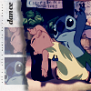
08.
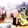
09.
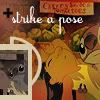
VOTING IS OVER!