.zomgHUGE tutorial (07): large texture collages
I wrote this for namiuchiha at DA, who wanted to see how I put textures together. There's no easy way to explain it, so I put together another zomgHUGE tutorial, which may not explain things very well but at least has the virtue of being long :>
The previous tutorials all included texture work, though they were geared mostly toward making textures with a specific end in mind (the piece of art that came from them). However, the principle is really the same, without taking into consideration things like the subject, subject/background relationships, and so on.
So today's project:
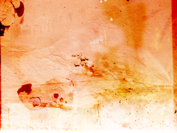
-click for full-
.preface
Like the earlier tutorials, this is really just a general guide for ways to think about persuading various components of a collage to interact with each other. As is standard practice, I've posted the zip file with all project-related images at my DA account**** so you can try things out for yourself. The collage's name, "Atthis", comes from one of the subjects/addressees of Sappho's poetry, though I suppose another name might be "aesc on vacation" because a lot of the stock comes from my vacation albums, which means you'll see photos from Sicily, Maine, and a few other places in the stock folder of the tutorial .zip. Also, there is a picture of my dog.
.caveat
I am a very random person, and my method of graphics making is just to fling things together and try different stuff out to see what I like. Consequently, I believe in flexibility; your resource collection can be used in all sorts of ways and you can modify even a single texture, stock image, and brush until the cows come home--and you can even get unlikely things to do what you need them to do, and some of that will be done here.
I should also say that this is fairly time-consuming. I clocked this at about 8 hours start to finish, though it took me a bit longer because I had to stop to write things down. Either way, these do take a while but hopefully the time spent is worth it :>
Software: PS7
Difficulty: Hard, in the sense that it's long and involved. On the bright side, no selective coloring, curves, variations, &c., so this should be translatable.
NOTE ON THE .ZIP FILE
The .zip folder does not include the .psd file, because the file alone is 38MBs and DA doesn't like that. Instead, I've uploaded that HERE; if the link expires please let me know and I'll re-upload!
Because there's no actual subject, I can't divide stuff into their usual categories *flails in confusion* Instead, I'll improvise and divide them up into sections composition, main background, and stock/blending. The section on composition is a bit longer, mostly so I can talk about ways most of my textures seem to work out.
A. On composition
As I've said elsewhere, these tutorials are really artificial--I'm not this organized :) The steps below are only distillations of a much longer process involving trial and error. Also, when making texture collages I usually start out with only the vaguest ideas of what I'd like to end up with (speaking in terms of color, or how much texture I want), so the collage kind of develops randomly as I go along.
There are some constants, though, things I try to think about at various points when I'm starting to put in the small details. They are:
+ vector and perspective lines: If you take a look at the stock folder, or the tutorial album in my Photobucket account, there are a few images of building exteriors, some landscapes, spiral stairs, and a large close-up of (what I think is) a palmetto heart. Very odd and different, but they do serve a purpose; perspective lines not only add texture, they give a sense of movement across or up and down the image. Most of the time the images are kind of hard to detect in the collage itself, or if they are they don't look much like the stock they came from. Which leads me to my next point...
+ using weird stock in weird ways: Because I spend a lot of my time on tiny details, the actual subjects of a lot of my stock don't really matter--they'll be shrunk down, blended, and otherwise difficult to make out. What does matter for me is what the image in question can bring to the collage. For example, this old building doesn't announce itself in the collage, but the perspective lines at its corners are primarily what I'm interested in. The picture of my dog I used mostly for the light in his eye, which draws attention to the colonnade in a cathedral close. Other stock adds some texture or deepens color, and so on.
+ levels/types of texturization: a collage isn't going to have the same texture throughout most of the time -- it isn't going to be uniformly rough or smooth. I like to have some areas that are more texturized than others, and some that are fairly clean. Mostly this is because I cut icon-sized textures from a lot of them and I like having variety in a texture pack, but also, while I love making complicated collages, I like my icon backgrounds to be simple.
When making this texture, I wanted to do something fairly representative of what I do. As I've said, "what I do" usually equals "trial and error," so while this tutorial is documented as fully as I could, I've likely left out things. If you have any questions on how something works, please let me know :>
Oh, and one more thing:
NOTE ON SIZE RANGES: Because Photobucket's a bitch and I'm cheap, I can't upload anything larger than 1024.768, which is inconvenient and which I didn't think about while writing this. I wrote the tutorial with the .zip file dimensions in mind; if you want to work with the images uploaded to Photobucket, reduce the size of the stock in the stock/blending section by 50-100px (so instead of a 600px stock image, use c 500px, etc.)
B. Main background
I tend to start out with very simple bases, either a fill layer or else a slightly textured piece of stock, because the less you have to start out with in terms of texture and color, the more you can add --there's less that's going to be dictated to you, and less that you'll have to work around.
In the .psd, layers that belong to the main background are marked with [mb].
1.) Open a new document, 1024.768 OR 1200.900 (hereafter 'collage')
2.) wall texture (by me)
if using the .png in the zip file: Image > Adjustments > Image Size > 1200.900
-> Image > Image Adjustments > Desaturate
-> Duplicate > Screen
-> Flatten > Copy > Paste into collage
3.) In collage: New Fill Layer > Gradient > something medium orange (one should be in your preset gradients in PS7) > Overlay
[This starts to build up some orange/red values, which I decided on after I realized that I make a lot of blue stuff *g*]
4.) corroded paint (random stock texture)
if using the .png in the zip file: resize to 1200.900
-> Paste into collage > Color Burn > move to top edge
-> Filter > Blur > Gaussian Blur to 12.6 px
-> Using my favorite eraser (inxsomniax), get rid of the bottom edge
5.) polaroid (gender)
-> Paste into collage > Color Burn
[The bubbles and rough spots on the lower side help give the texture a sense of depth. Variations in the types of stock images you use really make the collage what it is, not simply an aggregation of similar things.]
6.) blue sky (random stock texture)
if using the .png in the zip file: resize to 1200.900
-> Paste into collage > Color Burn
[I decided at this point I wanted parts of the texture to be heavily saturated, and that's what the blue burn layer will do.]
7.) metallic texture (sxc)
if using the .png in the zip file: resize to 1200.900
-> Image > Adjustments > Invert
-> Paste into collage > Color Burn
[More color again, with neat little texture flecks at the bottom.]
You'll notice at this point that the color saturation in the texture follows the gradient, with values skewing toward yellow and white as you move down the image, and that's what I want. Now that we've got that, time for the detail work.
C. Stock/blending
This is the beginning of the fiddly part, and where most of the stock comes in. There's about twenty layers here, and that's a lot, so I've tried to organize things in some kind of comprehensible way. The easiest thing to do in terms of understanding what goes where is to look at the .psd file, but if you can't, I drew up a sort of schematic that may be a little easier to follow than my directions.
If you have access to the .psd file, the layer properties appear in the layers palette like so:
[number] description e.g. [1] lantern
Where the number in brackets corresponds to the step in the tutorial with which the layer is associated. So [1] lantern indicates that instructions for the layer can be found under step 1.
Also, because there are so many pieces of stock involved, I've resized a lot of them to keep the .zip file manageable. With everything at full size it ended up being somewhere around 32MBs, which is a bit much.
PASTING IN, BLENDING, & POSITIONING
[1] lantern (sxc)
-> Duplicate > Multiply > Merge Down
-> Resize to c. 430px wide
-> Paste > Screen > move to upper right corner (dark orange-red space) > 27% opacity
[I like scarcely-visible light textures; they add a bit of interest to a space that's pretty much one color.]
[2] smoke (?)
-> Resize to 400px wide
-> Paste > Color Burn
-> Position so the line of the plume of smoke roughly follows the crack in the wall texture (a bit left of center)
-> With the cloudy eraser, get rid of the sharp edges. [erased]
[The erasing doesn't have to be perfect; blending at color burn gets rid of the most noticeable edges.]
[3] paper stock (rain harbour)
-> Paste > Color Burn
-> Position in the lower left-hand corner, so the top line of the paper connects to the darker line of the crack in the wall texture.
-> Erase a little bit of the text from the center, but leave the larger text pieces intact. [erased]
[Leaving some text will help give the white space at the bottom some interest, so it's not just there, and hooking the top of the texture with the crack in the wall texture is a nice continuity between elements.]
[4] palm (halo)
-> Resize to c. 450px wide
-> Paste > Soft Light > 76% opacity
-> Position low along right edge
-> With the cloudy eraser, make the vector lines a little less obvious & clean up the sharp edges. [erased]
[This is one of my favorite stock pieces to use--it's really great for radial lines, and so flexible. The soft light and lower opacity keep the most prominent lines only, which is what I want, so the image isn't too intrusive--and that side of the texture is getting busy anyway.]
[5] proem (halo)
-> Resize to c. 500px wide
-> Paste > Edit > Transform > Flip Vertical
-> Position low along left edge; the text will overlap with the dark patches in the [mb] gender layer
-> Erase some of the sharp lines and some of the text to make it a bit less obvious. I tried to make the text look like it swirls or twists a little. [erased]
[This will tie in with another element coming up soon.]
[6] beach (mine)
-> Resize to c. 800px wide
-> Paste > Soft Light
-> Position low in right corner
-> Erase sharp lines, some of the wooden lifeguard stand thing. [erased]
[Adding a little more texture into the white space. That space is desaturated and light enough that not much will fill it in without being obvious, so the solution is to keep that area relatively smooth but add in some elements that will make it interesting.]
[7] windows (mine)
-> Resize to c. 500px wide
-> Paste > Soft Light
-> Position low in right corner so the bottom of the top row of balconies is at the lower edge.
-> Erase sharp lines. [erased]
[They're not very visible, and not identifiable as windows, but the lines on the sills and frames still suggest different vanishing points.]
[8] old building (mine)
-> Resize to c. 300px wide
-> Paste > Desaturate > Soft Light
-> Position at the bottom edge in the middle. One of the higher balconies should come to just above the edge of the image.
-> Erase the top lines. [erased]
[9] tile (mine)
-> Resize to c. 500px wide
-> Duplicate 3x > Screen (all duplicates) > Flatten
-> Paste > Desaturate > Soft Light
-> Position as in the schematic, so the outer angles of the pattern look like they're branching out from the crack in the wall texture. (I'm sorry I can't explain it better.)
-> Erase edges and some of the outer pattern. [erased]
[Straight lines, when used sparingly, can be interesting. I tend to keep them relatively unobtrusive and only hinted at, because lines all over the place can be confusing. Even barely there, though, they can direct the eye in different directions. The tessellation here, positioned where it is, suggests branching off from a central line into a few different directions as you move across the page.]
[10] spiral stair (mine, and that's my foot too *g*)
-> Resize to c. 300px wide
-> Paste > Soft Light > opacity 45%
-> Position along left edge, near the blotches in the [mb] gender layer
-> Edit > Transform > Rotate so the steps look like they're radiating out from a center point located somewhere in those blotches.
-> Erase the edges a bit. [erased]
[schematic, which may explain it better :>]
[Another favorite, which gave "Spiral Stair" its name.]
[11] rock (mine)
-> Resize to c. 500px wide
-> Paste > Screen
-> Position just above the plume of smoke near the center
-> Erase edges and most of the background, leaving only the rock and the man standing on it. [erased]
[Just a small detail, but it brings out the smoke texture a bit.]
[12] monreale (mine)
-> Resize to c. 300px wide
-> Paste > Lighten
-> Position along the upepr edge so the windows are in the dark orange bit
[The stock is there mostly for its perspective lines; you don't see the mosaic work much at all (which is a shame). It'll tie in with the next piece of stock.]
[13] canterbury (mine)
-> Resize to c. 600 px wide
-> Paste > Light (NOT Lighten! Light.)
-> Position along left upper margin
-> Erase almost everything except the rose windows and the arches. [erased]
[The Light blending and erasing will get rid of most of the straight lines--remember, they're really only hinted at--and leave some of the decorative work in the arches as points of interest.]
[14] dog eye (mine)
-> Resize to c. 400px wide
-> Paste > Screen
-> Postion near upper left corner, so the light point in the right eye is in the center of one of the cathedral arches
-> Erase edges and some of the interior stuff (mostly it's the light point you want). [erased]
[As I said, mostly it's the light point, but not quite erasing the rest of his face suggests curved lines.]
[15] cloud (sxc)
-> Resize to c. 350-500px
-> Paste > Desaturate > Soft Light
-> Position in lower right corner (with [7] windows)
-> Erase edges. [erased]
[Small bit of texture to fill up the lower corner.]
[16] shattered glass (sxc)
-> Resize to c. 500-600px
-> Paste > Desaturate > Soft Light > 53% opacity
-> Position where the lines from the paper texture and wall texture meet
-> Erase sharp edges and most of the glass (leave the larger piece and a few others) [erased]
[To fill in one segment of that general area which didn't quite go with its surroundings. When doing these sorts of things, I try to transition slowly from one texture area to another, with rougher or more involved parts gradually smoothing out into cleaner ones, with few or no abrupt shifts.]
[17] blue texture (mine)
-> Paste > Desaturate > Soft Light
-> Position flush with lower right corner
-> Erase sharp edges on left side. [erased]
[A little more texture in the lower right corner.]
[18] seaside (mine)
-> Resize to 500px wide
-> Paste > Desaturate > Color Burn
-> Position flush with lower left corner
[And something for the lower left.]
ZOMG DONE! Almost :>
FINAL LAYER ORDER
I saved this for last, because it's easier to explain this way rather than trying to work it into each separate step, and that is putting your layers in order. The final layer order, from top to bottom, looks like this:
[1] lantern
[15] cloud
[mb] inverted
[14] dog eye
[13] canterbury
[12] monreale
[11] rock
[10] spiral stair
[9] tile
[8] old building
[7] windows
[mb] gender
[6] beach
[5] proem
[4] palm
[3] paper stock
[mb] blue sky
[2] smoke
[18] seaside
[17] blue texture
[16] shattered glass
[-> the next few layers in the .psd are text layers I added in. Completely optional! For hidden text, I use Garamond or Georgia at around 14pt or smaller, with color and blending that will fade them into the background so they're barely legible. For lighter colors, use Color Burn; for darker, Soft Light or Screen<-]
[mb] corroded paint
[mb] orange gradient
[mb] wall texture
.the point: I love making textures, I really do. I love the subtlety, and sneaking neat little things in here and there. A lot of times, the textures' names have to do with the stock I used to make them, or things hidden in them; "East Meets West" got its name from two pieces of stock, one of which was a photograph I took in Italy and the other of which was a Japanese painting of a flower. "Atthis" got its name, as I said, from one of the women who appear in Sappho's poems, and some of her poetry, as well as other bits of love poetry (Neruda, Song of Songs, Amy Lowell) that are squirreled away in the texture in various places. It's fun taking a bunch of random stuff and turning it into something fun to look at, with lots of little details that can appear at odd moments when you look at the image.
So, yeah. That's it :>
End!
.Icon appendix
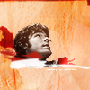
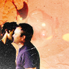
What I usually do when cutting icons from larger textures is set the rectangular marquee to Fixed Size and pick something with an area between 250.250 and 600.600, then shrink everything down to 100.100. It keeps the texture from being really obvious.
And to see how they might work in practice:

.Credits & resources
+ resource list
+ tutorial request
And as always, if you've found this helpful and have gotten anything out of it, I really would love to see your work, so drop me a link to your journal or put the image in a comment so I can check it out :>
The previous tutorials all included texture work, though they were geared mostly toward making textures with a specific end in mind (the piece of art that came from them). However, the principle is really the same, without taking into consideration things like the subject, subject/background relationships, and so on.
So today's project:

-click for full-
.preface
Like the earlier tutorials, this is really just a general guide for ways to think about persuading various components of a collage to interact with each other. As is standard practice, I've posted the zip file with all project-related images at my DA account**** so you can try things out for yourself. The collage's name, "Atthis", comes from one of the subjects/addressees of Sappho's poetry, though I suppose another name might be "aesc on vacation" because a lot of the stock comes from my vacation albums, which means you'll see photos from Sicily, Maine, and a few other places in the stock folder of the tutorial .zip. Also, there is a picture of my dog.
.caveat
I am a very random person, and my method of graphics making is just to fling things together and try different stuff out to see what I like. Consequently, I believe in flexibility; your resource collection can be used in all sorts of ways and you can modify even a single texture, stock image, and brush until the cows come home--and you can even get unlikely things to do what you need them to do, and some of that will be done here.
I should also say that this is fairly time-consuming. I clocked this at about 8 hours start to finish, though it took me a bit longer because I had to stop to write things down. Either way, these do take a while but hopefully the time spent is worth it :>
Software: PS7
Difficulty: Hard, in the sense that it's long and involved. On the bright side, no selective coloring, curves, variations, &c., so this should be translatable.
NOTE ON THE .ZIP FILE
The .zip folder does not include the .psd file, because the file alone is 38MBs and DA doesn't like that. Instead, I've uploaded that HERE; if the link expires please let me know and I'll re-upload!
Because there's no actual subject, I can't divide stuff into their usual categories *flails in confusion* Instead, I'll improvise and divide them up into sections composition, main background, and stock/blending. The section on composition is a bit longer, mostly so I can talk about ways most of my textures seem to work out.
A. On composition
As I've said elsewhere, these tutorials are really artificial--I'm not this organized :) The steps below are only distillations of a much longer process involving trial and error. Also, when making texture collages I usually start out with only the vaguest ideas of what I'd like to end up with (speaking in terms of color, or how much texture I want), so the collage kind of develops randomly as I go along.
There are some constants, though, things I try to think about at various points when I'm starting to put in the small details. They are:
+ vector and perspective lines: If you take a look at the stock folder, or the tutorial album in my Photobucket account, there are a few images of building exteriors, some landscapes, spiral stairs, and a large close-up of (what I think is) a palmetto heart. Very odd and different, but they do serve a purpose; perspective lines not only add texture, they give a sense of movement across or up and down the image. Most of the time the images are kind of hard to detect in the collage itself, or if they are they don't look much like the stock they came from. Which leads me to my next point...
+ using weird stock in weird ways: Because I spend a lot of my time on tiny details, the actual subjects of a lot of my stock don't really matter--they'll be shrunk down, blended, and otherwise difficult to make out. What does matter for me is what the image in question can bring to the collage. For example, this old building doesn't announce itself in the collage, but the perspective lines at its corners are primarily what I'm interested in. The picture of my dog I used mostly for the light in his eye, which draws attention to the colonnade in a cathedral close. Other stock adds some texture or deepens color, and so on.
+ levels/types of texturization: a collage isn't going to have the same texture throughout most of the time -- it isn't going to be uniformly rough or smooth. I like to have some areas that are more texturized than others, and some that are fairly clean. Mostly this is because I cut icon-sized textures from a lot of them and I like having variety in a texture pack, but also, while I love making complicated collages, I like my icon backgrounds to be simple.
When making this texture, I wanted to do something fairly representative of what I do. As I've said, "what I do" usually equals "trial and error," so while this tutorial is documented as fully as I could, I've likely left out things. If you have any questions on how something works, please let me know :>
Oh, and one more thing:
NOTE ON SIZE RANGES: Because Photobucket's a bitch and I'm cheap, I can't upload anything larger than 1024.768, which is inconvenient and which I didn't think about while writing this. I wrote the tutorial with the .zip file dimensions in mind; if you want to work with the images uploaded to Photobucket, reduce the size of the stock in the stock/blending section by 50-100px (so instead of a 600px stock image, use c 500px, etc.)
B. Main background
I tend to start out with very simple bases, either a fill layer or else a slightly textured piece of stock, because the less you have to start out with in terms of texture and color, the more you can add --there's less that's going to be dictated to you, and less that you'll have to work around.
In the .psd, layers that belong to the main background are marked with [mb].
1.) Open a new document, 1024.768 OR 1200.900 (hereafter 'collage')
2.) wall texture (by me)
if using the .png in the zip file: Image > Adjustments > Image Size > 1200.900
-> Image > Image Adjustments > Desaturate
-> Duplicate > Screen
-> Flatten > Copy > Paste into collage
3.) In collage: New Fill Layer > Gradient > something medium orange (one should be in your preset gradients in PS7) > Overlay
[This starts to build up some orange/red values, which I decided on after I realized that I make a lot of blue stuff *g*]
4.) corroded paint (random stock texture)
if using the .png in the zip file: resize to 1200.900
-> Paste into collage > Color Burn > move to top edge
-> Filter > Blur > Gaussian Blur to 12.6 px
-> Using my favorite eraser (inxsomniax), get rid of the bottom edge
5.) polaroid (gender)
-> Paste into collage > Color Burn
[The bubbles and rough spots on the lower side help give the texture a sense of depth. Variations in the types of stock images you use really make the collage what it is, not simply an aggregation of similar things.]
6.) blue sky (random stock texture)
if using the .png in the zip file: resize to 1200.900
-> Paste into collage > Color Burn
[I decided at this point I wanted parts of the texture to be heavily saturated, and that's what the blue burn layer will do.]
7.) metallic texture (sxc)
if using the .png in the zip file: resize to 1200.900
-> Image > Adjustments > Invert
-> Paste into collage > Color Burn
[More color again, with neat little texture flecks at the bottom.]
You'll notice at this point that the color saturation in the texture follows the gradient, with values skewing toward yellow and white as you move down the image, and that's what I want. Now that we've got that, time for the detail work.
C. Stock/blending
This is the beginning of the fiddly part, and where most of the stock comes in. There's about twenty layers here, and that's a lot, so I've tried to organize things in some kind of comprehensible way. The easiest thing to do in terms of understanding what goes where is to look at the .psd file, but if you can't, I drew up a sort of schematic that may be a little easier to follow than my directions.
If you have access to the .psd file, the layer properties appear in the layers palette like so:
[number] description e.g. [1] lantern
Where the number in brackets corresponds to the step in the tutorial with which the layer is associated. So [1] lantern indicates that instructions for the layer can be found under step 1.
Also, because there are so many pieces of stock involved, I've resized a lot of them to keep the .zip file manageable. With everything at full size it ended up being somewhere around 32MBs, which is a bit much.
PASTING IN, BLENDING, & POSITIONING
[1] lantern (sxc)
-> Duplicate > Multiply > Merge Down
-> Resize to c. 430px wide
-> Paste > Screen > move to upper right corner (dark orange-red space) > 27% opacity
[I like scarcely-visible light textures; they add a bit of interest to a space that's pretty much one color.]
[2] smoke (?)
-> Resize to 400px wide
-> Paste > Color Burn
-> Position so the line of the plume of smoke roughly follows the crack in the wall texture (a bit left of center)
-> With the cloudy eraser, get rid of the sharp edges. [erased]
[The erasing doesn't have to be perfect; blending at color burn gets rid of the most noticeable edges.]
[3] paper stock (rain harbour)
-> Paste > Color Burn
-> Position in the lower left-hand corner, so the top line of the paper connects to the darker line of the crack in the wall texture.
-> Erase a little bit of the text from the center, but leave the larger text pieces intact. [erased]
[Leaving some text will help give the white space at the bottom some interest, so it's not just there, and hooking the top of the texture with the crack in the wall texture is a nice continuity between elements.]
[4] palm (halo)
-> Resize to c. 450px wide
-> Paste > Soft Light > 76% opacity
-> Position low along right edge
-> With the cloudy eraser, make the vector lines a little less obvious & clean up the sharp edges. [erased]
[This is one of my favorite stock pieces to use--it's really great for radial lines, and so flexible. The soft light and lower opacity keep the most prominent lines only, which is what I want, so the image isn't too intrusive--and that side of the texture is getting busy anyway.]
[5] proem (halo)
-> Resize to c. 500px wide
-> Paste > Edit > Transform > Flip Vertical
-> Position low along left edge; the text will overlap with the dark patches in the [mb] gender layer
-> Erase some of the sharp lines and some of the text to make it a bit less obvious. I tried to make the text look like it swirls or twists a little. [erased]
[This will tie in with another element coming up soon.]
[6] beach (mine)
-> Resize to c. 800px wide
-> Paste > Soft Light
-> Position low in right corner
-> Erase sharp lines, some of the wooden lifeguard stand thing. [erased]
[Adding a little more texture into the white space. That space is desaturated and light enough that not much will fill it in without being obvious, so the solution is to keep that area relatively smooth but add in some elements that will make it interesting.]
[7] windows (mine)
-> Resize to c. 500px wide
-> Paste > Soft Light
-> Position low in right corner so the bottom of the top row of balconies is at the lower edge.
-> Erase sharp lines. [erased]
[They're not very visible, and not identifiable as windows, but the lines on the sills and frames still suggest different vanishing points.]
[8] old building (mine)
-> Resize to c. 300px wide
-> Paste > Desaturate > Soft Light
-> Position at the bottom edge in the middle. One of the higher balconies should come to just above the edge of the image.
-> Erase the top lines. [erased]
[9] tile (mine)
-> Resize to c. 500px wide
-> Duplicate 3x > Screen (all duplicates) > Flatten
-> Paste > Desaturate > Soft Light
-> Position as in the schematic, so the outer angles of the pattern look like they're branching out from the crack in the wall texture. (I'm sorry I can't explain it better.)
-> Erase edges and some of the outer pattern. [erased]
[Straight lines, when used sparingly, can be interesting. I tend to keep them relatively unobtrusive and only hinted at, because lines all over the place can be confusing. Even barely there, though, they can direct the eye in different directions. The tessellation here, positioned where it is, suggests branching off from a central line into a few different directions as you move across the page.]
[10] spiral stair (mine, and that's my foot too *g*)
-> Resize to c. 300px wide
-> Paste > Soft Light > opacity 45%
-> Position along left edge, near the blotches in the [mb] gender layer
-> Edit > Transform > Rotate so the steps look like they're radiating out from a center point located somewhere in those blotches.
-> Erase the edges a bit. [erased]
[schematic, which may explain it better :>]
[Another favorite, which gave "Spiral Stair" its name.]
[11] rock (mine)
-> Resize to c. 500px wide
-> Paste > Screen
-> Position just above the plume of smoke near the center
-> Erase edges and most of the background, leaving only the rock and the man standing on it. [erased]
[Just a small detail, but it brings out the smoke texture a bit.]
[12] monreale (mine)
-> Resize to c. 300px wide
-> Paste > Lighten
-> Position along the upepr edge so the windows are in the dark orange bit
[The stock is there mostly for its perspective lines; you don't see the mosaic work much at all (which is a shame). It'll tie in with the next piece of stock.]
[13] canterbury (mine)
-> Resize to c. 600 px wide
-> Paste > Light (NOT Lighten! Light.)
-> Position along left upper margin
-> Erase almost everything except the rose windows and the arches. [erased]
[The Light blending and erasing will get rid of most of the straight lines--remember, they're really only hinted at--and leave some of the decorative work in the arches as points of interest.]
[14] dog eye (mine)
-> Resize to c. 400px wide
-> Paste > Screen
-> Postion near upper left corner, so the light point in the right eye is in the center of one of the cathedral arches
-> Erase edges and some of the interior stuff (mostly it's the light point you want). [erased]
[As I said, mostly it's the light point, but not quite erasing the rest of his face suggests curved lines.]
[15] cloud (sxc)
-> Resize to c. 350-500px
-> Paste > Desaturate > Soft Light
-> Position in lower right corner (with [7] windows)
-> Erase edges. [erased]
[Small bit of texture to fill up the lower corner.]
[16] shattered glass (sxc)
-> Resize to c. 500-600px
-> Paste > Desaturate > Soft Light > 53% opacity
-> Position where the lines from the paper texture and wall texture meet
-> Erase sharp edges and most of the glass (leave the larger piece and a few others) [erased]
[To fill in one segment of that general area which didn't quite go with its surroundings. When doing these sorts of things, I try to transition slowly from one texture area to another, with rougher or more involved parts gradually smoothing out into cleaner ones, with few or no abrupt shifts.]
[17] blue texture (mine)
-> Paste > Desaturate > Soft Light
-> Position flush with lower right corner
-> Erase sharp edges on left side. [erased]
[A little more texture in the lower right corner.]
[18] seaside (mine)
-> Resize to 500px wide
-> Paste > Desaturate > Color Burn
-> Position flush with lower left corner
[And something for the lower left.]
ZOMG DONE! Almost :>
FINAL LAYER ORDER
I saved this for last, because it's easier to explain this way rather than trying to work it into each separate step, and that is putting your layers in order. The final layer order, from top to bottom, looks like this:
[1] lantern
[15] cloud
[mb] inverted
[14] dog eye
[13] canterbury
[12] monreale
[11] rock
[10] spiral stair
[9] tile
[8] old building
[7] windows
[mb] gender
[6] beach
[5] proem
[4] palm
[3] paper stock
[mb] blue sky
[2] smoke
[18] seaside
[17] blue texture
[16] shattered glass
[-> the next few layers in the .psd are text layers I added in. Completely optional! For hidden text, I use Garamond or Georgia at around 14pt or smaller, with color and blending that will fade them into the background so they're barely legible. For lighter colors, use Color Burn; for darker, Soft Light or Screen<-]
[mb] corroded paint
[mb] orange gradient
[mb] wall texture
.the point: I love making textures, I really do. I love the subtlety, and sneaking neat little things in here and there. A lot of times, the textures' names have to do with the stock I used to make them, or things hidden in them; "East Meets West" got its name from two pieces of stock, one of which was a photograph I took in Italy and the other of which was a Japanese painting of a flower. "Atthis" got its name, as I said, from one of the women who appear in Sappho's poems, and some of her poetry, as well as other bits of love poetry (Neruda, Song of Songs, Amy Lowell) that are squirreled away in the texture in various places. It's fun taking a bunch of random stuff and turning it into something fun to look at, with lots of little details that can appear at odd moments when you look at the image.
So, yeah. That's it :>
End!
.Icon appendix
What I usually do when cutting icons from larger textures is set the rectangular marquee to Fixed Size and pick something with an area between 250.250 and 600.600, then shrink everything down to 100.100. It keeps the texture from being really obvious.
And to see how they might work in practice:


.Credits & resources
+ resource list
+ tutorial request
And as always, if you've found this helpful and have gotten anything out of it, I really would love to see your work, so drop me a link to your journal or put the image in a comment so I can check it out :>