.zomgHUGE tutorial (04): blending and composition
I wrote this for tx_tart, who wanted to see something on blending and composition. As with all things, it grew and grew until it became a catch-all tutorial for texture and icon making as well. But the core should still be the same :) I hope you like it! *heart*
Making this today:
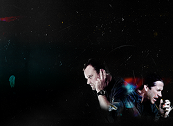
.preface
The tutorial spends most of its time composing a larger piece, which can then be resized and worked with in all sorts of ways--icons, headers, wallpapers, background textures, etc. It's rather long and involved, but you can get a lot of material out of it :) I've uploaded a .zip file (12.4MB) of the project, including all related image files (draft images, screencaps, base textures, stock, icons) and the .psd file, and I tossed in drafts of the subject files so if you want to try erasing, blending, and composing based on this template, you can. The tutorial below is meant to clarify how I went about building the composition, which is what tx_tart wanted to hear.
Software: PS7, with some selective coloring
Difficulty: Hard-ish? Not much knowledge of PS7 is required past selective coloring and knowing how blending layers work, but the difficulty is really in the amount of time you're willing to devote to adjusting and nitpicking, and your willingness to use the Undo and Step Backward options.
That all being said, let's get started!
As in previous tutorials, this is more or less a full one, covering all stages of production, with digressions on why/how for tx_tart and the curious :D I've broken it down into the following sections: composition, image prep, background, and assembly (subdivided into blending and texture work).
A. On composition
I thought about this a bit before starting, and spent some time hunting through my stock for images that could work together. I chose this one of Rodney and this one of John, for a few reasons. First, the quality of both images is similar and hi-res; second, the coloring is close enough for me to work with; and third, both images--though they're from different episodes--work together, with Rodney listening into his radio and John shouting into his.
Other things to think about: background color and its relationship to the main elements. I decided on a black, scratched-up background with some color in it, mostly because I find darker backgrounds easy to work with, and in this particular instance the black seems to lend some drama to how I thought Rodney and John should be interacting. It also gave me a little more leeway if I couldn't get the coloring to cooperate--I could always desaturate Rodney and John, for instance. (And so I did, for some of the icons.)
B. Image prep
I tried to keep the coloring simple, with minimal fuss. I find it helpful to have both images up on the screen at the same time to compare coloring, brightness, and so on. Once these are put into the collage there will still be coloring work to do, but this should be close enough for now.
Rodney
1.) Duplicate 2x. Set duplicates to Screen.
2.) Desaturate the second screen layer
3.) New Adjustment Layer > Selective Coloring: (WHITES) B -62 (NEUTRALS) Y +7; B -7 (BLACKS) B +5
4.) New Fill Layer > #E4EBFF to Color Burn
5.) Layer > Merge Visible (Ctrl + Shift + E)
result
John
1.) Duplicate 4x. Set duplicates to Screen.
2.) Desaturate the fourth screen layer.
3.) New Adjustment Layer > Brightness/Contrast: Bright +14
4.) New Fill Layer > #E4F3FF to Color Burn
5.) New Fill Layer > #F5F5F5 to Color Burn
6.) Layer > Merge Visible (Ctrl + Shift + E)
result
Crop all the background stuff out of the images. With John, I cropped out his backpack too.
->Cropped .psds are in the .zip file.
C. Background
1.) Starting with this (halo images), copy into a new document.
2.) Image > Rotate Canvas > Rotate 90° CW.
3.) Duplicate 3x. Set duplicates to Multiply.
4.) Flatten.
D. Assembly
This is where the very long, involved stuff comes in. As I said, the assembly isn't technically difficult, but it is time-consuming. It's a good idea to be sure the .psd files of your cropped images are saved--I found myself having to scrap the versions I'd pasted into the collage, and it would have sucked in all kinds of ways to start over from scratch.
1.) Resize the subjects until they fit the dimensions you need them to be. For this, I wanted Rodney and John to be in the bottom corner and close together, with a lot of black space to bring them out and emphasize that it's just the two of them against the universe. The black space isn't going to be empty, though--there'll be stuff going on :) Rodney and John ended up being around 250px high each, a little less than a half of the composition's height, closer to a third after the erasing is done. (Law of thirds in composition and all, but the ratio here isn't perfect.)
2.) Paste John and Rodney into the background document and move them around until you find a position that works. As I said above, I originally was going to have this be a vertical composition as in this one, which I based this tutorial on. It ended up that both Rodney and John were too horizontally oriented, so I changed things up a little. I tried two different horizontal versions, this and this, and ended up going with the latter.
(You'll notice the background is different--another thing I changed :) The present background was the second choice after I realized the scuffed texture in the margins of the first background interfered with John's face.)
Blending
Okay, this is the part tx_tart wanted, and it's the hard part to describe, because it's 100% trial and error (read: screwing up and starting over). It took me quite a few tries to get everything where I wanted it, so what follows is the stripped-down version of a much more involved process.
1: For more contrast, I duplicated the subject layers and set the duplicates to Soft Light, then merged down. With Rodney, I sharpened the first layer once and the Soft Light layer twice before merging, to get a bit more definition--you'll see how John's cap is a little grainier because of the lighting.
2: is getting the subjects to blend into the background. To do this, I got rid of straight edges and bright edges to clothes, hair, and skin--basically anything that defines the subject too sharply. My preferred method is using a cloudy eraser, especially this one by inxsomniax, from her brushwork_09 set. I use this for almost everything, in wallpapers and icons alike. The eraser gives you the flexibility to work in multiple directions and multiple sizes, which is why I like it :)
So, erasing:
Rodney
To erase with the cloudy brush, keep the brush back from the edge of whatever you're erasing and slowly work your way in. The idea is to have the eraser effect diminish the further in from the edge you go, and to make the edges curvy and variable, rather than uniform. For Rodney, the erasing contour should (roughly) follow John's shoulder, with some overlap so you get a nice layered effect a bit later on.
1.) Set to 94px for the back of his head to get rid of the light edging.
2.) Set to c. 100 to erase his right arm and some of his left, as well as his back (up to around the seam line on the shoulder of his t-shirt).
3.) Set to 140px to erase the straight base line.
John
1.) Set to 94px for his left sleeve, to just under the cuff.
2.) Set to c. 84px for the back of his his head, collar, and shoulder. I tried to keep the Atlantis patch as clear as possible.
3.) Set to 140px to erase the straight base line.
(The second trial composition is an early attempt at erasing--I didn't stay with it, though.)
3: is blending to get Rodney and John to become one with the darkness.
Rodney
1.) Duplicate, set the bottom layer to Screen and the top to Multiply.
John
1.) Do the same thing :D
IMPORTANT: Don't merge them!
4: Now, for some more color work. All of this is very fiddly, and I have to admit I didn't document everything *shame* In the end, I decided to desaturate the screen layers, and played around with Selective Coloring in the Multiply layers (Image > Adjustments > Selective Coloring) to get Rodney's and John's skin tones to match up a bit more. I can't find the last set of numbers I wrote out, but I do remembering concentrating on selective coloring for Red, Yellow, White, Neutral, and Black. The changes are very subtle, but worked out well, I think. Mostly, it was a matter of keeping my eye on relative color; John's skin tone tends toward olive, while Rodney is paler, so what I tried to do was minimize the red highlights in John's face and bring down the red/magenta in Rodney's skin as well.
Afterward, I played around with erasing one last time, moving between the Screen and Multiply layers and messing with the eraser size. The end results are:
+John: multiply; screen
+Rodney: multiply; screen
Last of all is the fun bit, and my personal favorite: adding in the details.
Texture & detail work
I just love this part. I have a rather large collection of stock and finished textures, some that I've made but most that others have made, and I'm rather addicted to hunting through them and finding strange things to combine in strange ways :)
(Here's where the .psd file comes in handy to see how everything comes together.)
1.) Under halo_base, add in a New Fill Layer > #000000 > Normal.
2.) Set halo_base to Screen.
3.) As the very top layer (over everything else), paste in this scratch texture (wash_when_dirty). To prep it: Image > Rotate Canvas > Flip 90° CW; duplicate and set to Multiply, flatten. Then paste in to the collage, set to Screen. [The scratches on top give some depth to the collage, and kind of tie John and Rodney a bit more tightly into the rest of the background stuff.]
4.) Open this light texture (gender). Duplicate > Multiply > Flatten, then paste into the collage file.
->Set to Screen and move so it's positioned behind John and Rodney.
->Shrink the image (Edit > Transform > Scale) so it doesn't interfere too much with their faces.
->Duplicate > Multiply > move to upper left corner so the red fills up the large white mark.
5.) Between the two light texture layers, paste this texture (sanami276). Set to Multiply.
->Erase the parts of the texture over Rodney and John's faces--the yellow should show up in the white spaces in the other textures.
6.) Open another halo scratch texture. Duplicate > Multiply > Flatten, then paste into the collage.
->Move so the large circle is over John and Rodney. I erased some of the extra lines, and some of the circle so it wasnt' too sharply defined.
7.) Paste in this scratch texture (??oxoniensis??) and set to Screen.
8.) Open this scratch texture (wash_when_dirty). Prep it in the same way you did the first one, paste it in as usual.
9.) Paste in this light texture (??lookslikerain??) (if it's yours, let me know!).
->Set to Multiply
->Move so the blue parts are over the white splotch on the left side of the frame; you'll see too that the blue picks up some of the smudges in one of the scratch textures. After positioning the texture where I wanted it, I cleaned up the edges with the cloudy eraser to get rid of straight lines.
[The top layers will be the subjects and the one scratch texture on top; check the .psd file.]
And you're done! *faints*
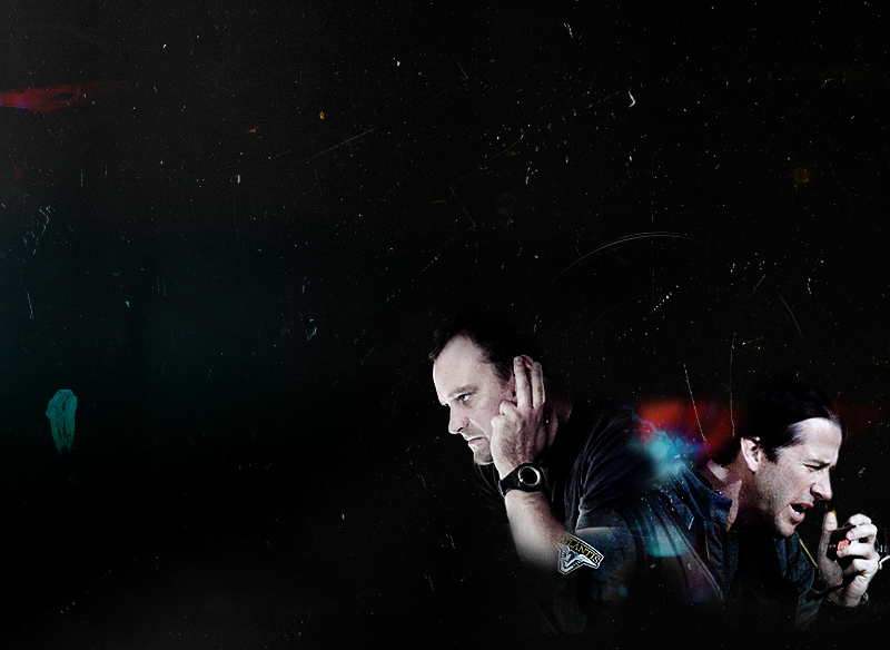
The goal of all this nonsense: Grah, it's hard to explain, but for tx_tart I will try :D Basically, the way I erase and blend is to try to make the entire composition organic, with all the parts flowing together, layering over and working off one another. The Multiply/Screen combination brings the subjects into the background a bit, without having them fade into it completely (and you can play with the screen layer opacity as much as you need), while the cloudy eraser lets me mess around until I feel that the subject "belongs" with the background--that it's not a removable part of the picture, so to speak. The light textures come in to cover over rough edges and, in this case, bring Rodney and John together with each other, and then pull them into the background; the top scratch texture then ties everything together. The three other textures are meant to spread color around the rest of the composition, so it's not all concentrated in the lower right third.
I wanted to have something kind of cool, intense, and sci-fi-looking (hence all the black), with minimal color that's still sharp and interesting. Whether or not it worked is up to you :D
ETA: Just after my morning coffee infusion, I realized I should maybe say this. The blending techniques I've talked about are techniques I use on pretty much all my other graphics (at least the ones where I'm cropping things), so they're great for general purposes and can be adapted for almost anything you want. The coloring and contrast work, though, is specific to this tutorial; you won't use the same color values or strategies (except maybe Soft Light for contrast & saturation) on other cuts, so you'll need to experiment and play around with color and blending layers to get what you want.
One thing to consider, and what I did when I was first starting out, is working in black and white first, or with subjects that don't have much color in them. The less color saturation (or the more white/black space) there is, the easier an image is to work with... And that's as true for me today as it was when I first bumbled my way into PhotoShop :D
* * *
Completely optional stuff
One of the virtues of large pieces is you can do lots of things with them. (Also, I am ruining my eyesight with much reading and looking at computer screens, and working with larger images is easier for me.)
After flattening the image (Image > Flatten) to save as a completed .png, go to Edit > Step Backward until you un-flatten the image. Now you can start playing around with making icons, textures, headers, and all sorts of things. In the .zip file, I've dumped .pngs of the large texture (minus John and Rodney), some 100.100 cuts, and a few icons, which you can also see below!
To get the icons: With the .psd unflattened, you can take out elements, desaturate, and do all sorts of things. Below are just a few of the ways you can rework this collage for icon purposes:
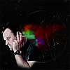
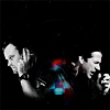
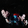
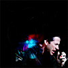
Working in a 100.100 space, I usually duplicate the base file and either set to Soft Light and sharpen as appropriate, or else play with Hue/Saturation to get it to stand out a bit. But that's all really :)
The cropping, erasing and Multiply/Screen blending is also my standard procedure with icons (as in this, this, and this from the last collection), though done on a smaller scale.
PS: If you just want the icons and textures, feel free to download the .zip file anyway! If you've found this helpful and have gotten anything out of it, I really would love to see your work, so drop me a link to your journal or put the image in a comment so I can check it out :)
Looking for textures, stock, and such for your own stuff? I have lots of links over in my resource post, and there is much wisdom to be found therein.
Making this today:

.preface
The tutorial spends most of its time composing a larger piece, which can then be resized and worked with in all sorts of ways--icons, headers, wallpapers, background textures, etc. It's rather long and involved, but you can get a lot of material out of it :) I've uploaded a .zip file (12.4MB) of the project, including all related image files (draft images, screencaps, base textures, stock, icons) and the .psd file, and I tossed in drafts of the subject files so if you want to try erasing, blending, and composing based on this template, you can. The tutorial below is meant to clarify how I went about building the composition, which is what tx_tart wanted to hear.
Software: PS7, with some selective coloring
Difficulty: Hard-ish? Not much knowledge of PS7 is required past selective coloring and knowing how blending layers work, but the difficulty is really in the amount of time you're willing to devote to adjusting and nitpicking, and your willingness to use the Undo and Step Backward options.
That all being said, let's get started!
As in previous tutorials, this is more or less a full one, covering all stages of production, with digressions on why/how for tx_tart and the curious :D I've broken it down into the following sections: composition, image prep, background, and assembly (subdivided into blending and texture work).
A. On composition
I thought about this a bit before starting, and spent some time hunting through my stock for images that could work together. I chose this one of Rodney and this one of John, for a few reasons. First, the quality of both images is similar and hi-res; second, the coloring is close enough for me to work with; and third, both images--though they're from different episodes--work together, with Rodney listening into his radio and John shouting into his.
Other things to think about: background color and its relationship to the main elements. I decided on a black, scratched-up background with some color in it, mostly because I find darker backgrounds easy to work with, and in this particular instance the black seems to lend some drama to how I thought Rodney and John should be interacting. It also gave me a little more leeway if I couldn't get the coloring to cooperate--I could always desaturate Rodney and John, for instance. (And so I did, for some of the icons.)
B. Image prep
I tried to keep the coloring simple, with minimal fuss. I find it helpful to have both images up on the screen at the same time to compare coloring, brightness, and so on. Once these are put into the collage there will still be coloring work to do, but this should be close enough for now.
Rodney
1.) Duplicate 2x. Set duplicates to Screen.
2.) Desaturate the second screen layer
3.) New Adjustment Layer > Selective Coloring: (WHITES) B -62 (NEUTRALS) Y +7; B -7 (BLACKS) B +5
4.) New Fill Layer > #E4EBFF to Color Burn
5.) Layer > Merge Visible (Ctrl + Shift + E)
result
John
1.) Duplicate 4x. Set duplicates to Screen.
2.) Desaturate the fourth screen layer.
3.) New Adjustment Layer > Brightness/Contrast: Bright +14
4.) New Fill Layer > #E4F3FF to Color Burn
5.) New Fill Layer > #F5F5F5 to Color Burn
6.) Layer > Merge Visible (Ctrl + Shift + E)
result
Crop all the background stuff out of the images. With John, I cropped out his backpack too.
->Cropped .psds are in the .zip file.
C. Background
1.) Starting with this (halo images), copy into a new document.
2.) Image > Rotate Canvas > Rotate 90° CW.
3.) Duplicate 3x. Set duplicates to Multiply.
4.) Flatten.
D. Assembly
This is where the very long, involved stuff comes in. As I said, the assembly isn't technically difficult, but it is time-consuming. It's a good idea to be sure the .psd files of your cropped images are saved--I found myself having to scrap the versions I'd pasted into the collage, and it would have sucked in all kinds of ways to start over from scratch.
1.) Resize the subjects until they fit the dimensions you need them to be. For this, I wanted Rodney and John to be in the bottom corner and close together, with a lot of black space to bring them out and emphasize that it's just the two of them against the universe. The black space isn't going to be empty, though--there'll be stuff going on :) Rodney and John ended up being around 250px high each, a little less than a half of the composition's height, closer to a third after the erasing is done. (Law of thirds in composition and all, but the ratio here isn't perfect.)
2.) Paste John and Rodney into the background document and move them around until you find a position that works. As I said above, I originally was going to have this be a vertical composition as in this one, which I based this tutorial on. It ended up that both Rodney and John were too horizontally oriented, so I changed things up a little. I tried two different horizontal versions, this and this, and ended up going with the latter.
(You'll notice the background is different--another thing I changed :) The present background was the second choice after I realized the scuffed texture in the margins of the first background interfered with John's face.)
Blending
Okay, this is the part tx_tart wanted, and it's the hard part to describe, because it's 100% trial and error (read: screwing up and starting over). It took me quite a few tries to get everything where I wanted it, so what follows is the stripped-down version of a much more involved process.
1: For more contrast, I duplicated the subject layers and set the duplicates to Soft Light, then merged down. With Rodney, I sharpened the first layer once and the Soft Light layer twice before merging, to get a bit more definition--you'll see how John's cap is a little grainier because of the lighting.
2: is getting the subjects to blend into the background. To do this, I got rid of straight edges and bright edges to clothes, hair, and skin--basically anything that defines the subject too sharply. My preferred method is using a cloudy eraser, especially this one by inxsomniax, from her brushwork_09 set. I use this for almost everything, in wallpapers and icons alike. The eraser gives you the flexibility to work in multiple directions and multiple sizes, which is why I like it :)
So, erasing:
Rodney
To erase with the cloudy brush, keep the brush back from the edge of whatever you're erasing and slowly work your way in. The idea is to have the eraser effect diminish the further in from the edge you go, and to make the edges curvy and variable, rather than uniform. For Rodney, the erasing contour should (roughly) follow John's shoulder, with some overlap so you get a nice layered effect a bit later on.
1.) Set to 94px for the back of his head to get rid of the light edging.
2.) Set to c. 100 to erase his right arm and some of his left, as well as his back (up to around the seam line on the shoulder of his t-shirt).
3.) Set to 140px to erase the straight base line.
John
1.) Set to 94px for his left sleeve, to just under the cuff.
2.) Set to c. 84px for the back of his his head, collar, and shoulder. I tried to keep the Atlantis patch as clear as possible.
3.) Set to 140px to erase the straight base line.
(The second trial composition is an early attempt at erasing--I didn't stay with it, though.)
3: is blending to get Rodney and John to become one with the darkness.
Rodney
1.) Duplicate, set the bottom layer to Screen and the top to Multiply.
John
1.) Do the same thing :D
IMPORTANT: Don't merge them!
4: Now, for some more color work. All of this is very fiddly, and I have to admit I didn't document everything *shame* In the end, I decided to desaturate the screen layers, and played around with Selective Coloring in the Multiply layers (Image > Adjustments > Selective Coloring) to get Rodney's and John's skin tones to match up a bit more. I can't find the last set of numbers I wrote out, but I do remembering concentrating on selective coloring for Red, Yellow, White, Neutral, and Black. The changes are very subtle, but worked out well, I think. Mostly, it was a matter of keeping my eye on relative color; John's skin tone tends toward olive, while Rodney is paler, so what I tried to do was minimize the red highlights in John's face and bring down the red/magenta in Rodney's skin as well.
Afterward, I played around with erasing one last time, moving between the Screen and Multiply layers and messing with the eraser size. The end results are:
+John: multiply; screen
+Rodney: multiply; screen
Last of all is the fun bit, and my personal favorite: adding in the details.
Texture & detail work
I just love this part. I have a rather large collection of stock and finished textures, some that I've made but most that others have made, and I'm rather addicted to hunting through them and finding strange things to combine in strange ways :)
(Here's where the .psd file comes in handy to see how everything comes together.)
1.) Under halo_base, add in a New Fill Layer > #000000 > Normal.
2.) Set halo_base to Screen.
3.) As the very top layer (over everything else), paste in this scratch texture (wash_when_dirty). To prep it: Image > Rotate Canvas > Flip 90° CW; duplicate and set to Multiply, flatten. Then paste in to the collage, set to Screen. [The scratches on top give some depth to the collage, and kind of tie John and Rodney a bit more tightly into the rest of the background stuff.]
4.) Open this light texture (gender). Duplicate > Multiply > Flatten, then paste into the collage file.
->Set to Screen and move so it's positioned behind John and Rodney.
->Shrink the image (Edit > Transform > Scale) so it doesn't interfere too much with their faces.
->Duplicate > Multiply > move to upper left corner so the red fills up the large white mark.
5.) Between the two light texture layers, paste this texture (sanami276). Set to Multiply.
->Erase the parts of the texture over Rodney and John's faces--the yellow should show up in the white spaces in the other textures.
6.) Open another halo scratch texture. Duplicate > Multiply > Flatten, then paste into the collage.
->Move so the large circle is over John and Rodney. I erased some of the extra lines, and some of the circle so it wasnt' too sharply defined.
7.) Paste in this scratch texture (??oxoniensis??) and set to Screen.
8.) Open this scratch texture (wash_when_dirty). Prep it in the same way you did the first one, paste it in as usual.
9.) Paste in this light texture (??lookslikerain??) (if it's yours, let me know!).
->Set to Multiply
->Move so the blue parts are over the white splotch on the left side of the frame; you'll see too that the blue picks up some of the smudges in one of the scratch textures. After positioning the texture where I wanted it, I cleaned up the edges with the cloudy eraser to get rid of straight lines.
[The top layers will be the subjects and the one scratch texture on top; check the .psd file.]
And you're done! *faints*

The goal of all this nonsense: Grah, it's hard to explain, but for tx_tart I will try :D Basically, the way I erase and blend is to try to make the entire composition organic, with all the parts flowing together, layering over and working off one another. The Multiply/Screen combination brings the subjects into the background a bit, without having them fade into it completely (and you can play with the screen layer opacity as much as you need), while the cloudy eraser lets me mess around until I feel that the subject "belongs" with the background--that it's not a removable part of the picture, so to speak. The light textures come in to cover over rough edges and, in this case, bring Rodney and John together with each other, and then pull them into the background; the top scratch texture then ties everything together. The three other textures are meant to spread color around the rest of the composition, so it's not all concentrated in the lower right third.
I wanted to have something kind of cool, intense, and sci-fi-looking (hence all the black), with minimal color that's still sharp and interesting. Whether or not it worked is up to you :D
ETA: Just after my morning coffee infusion, I realized I should maybe say this. The blending techniques I've talked about are techniques I use on pretty much all my other graphics (at least the ones where I'm cropping things), so they're great for general purposes and can be adapted for almost anything you want. The coloring and contrast work, though, is specific to this tutorial; you won't use the same color values or strategies (except maybe Soft Light for contrast & saturation) on other cuts, so you'll need to experiment and play around with color and blending layers to get what you want.
One thing to consider, and what I did when I was first starting out, is working in black and white first, or with subjects that don't have much color in them. The less color saturation (or the more white/black space) there is, the easier an image is to work with... And that's as true for me today as it was when I first bumbled my way into PhotoShop :D
* * *
Completely optional stuff
One of the virtues of large pieces is you can do lots of things with them. (Also, I am ruining my eyesight with much reading and looking at computer screens, and working with larger images is easier for me.)
After flattening the image (Image > Flatten) to save as a completed .png, go to Edit > Step Backward until you un-flatten the image. Now you can start playing around with making icons, textures, headers, and all sorts of things. In the .zip file, I've dumped .pngs of the large texture (minus John and Rodney), some 100.100 cuts, and a few icons, which you can also see below!
To get the icons: With the .psd unflattened, you can take out elements, desaturate, and do all sorts of things. Below are just a few of the ways you can rework this collage for icon purposes:
Working in a 100.100 space, I usually duplicate the base file and either set to Soft Light and sharpen as appropriate, or else play with Hue/Saturation to get it to stand out a bit. But that's all really :)
The cropping, erasing and Multiply/Screen blending is also my standard procedure with icons (as in this, this, and this from the last collection), though done on a smaller scale.
PS: If you just want the icons and textures, feel free to download the .zip file anyway! If you've found this helpful and have gotten anything out of it, I really would love to see your work, so drop me a link to your journal or put the image in a comment so I can check it out :)
Looking for textures, stock, and such for your own stuff? I have lots of links over in my resource post, and there is much wisdom to be found therein.