tutorial 01
subject: mischa barton
program: PS CS2
difficulty: easy/intermediate
translatable: yes (?)
GOING FROM.....

TO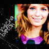
REMINDER: This tutorial will NOT work for every icon, and must be altered/tweaked to acheive the best effect for your individual base.
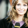
001.
Create a curves layer and input the following settings.
1st Click
Input : 72
Output: 118
2nd Click
Input: 99
Output: 160
This will brighten the base a considerable amount.
I suggest lowering the opacity of the curves layer for images that are originally light.
002.
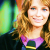
Create a new color layer and fill it with a bright, lime green color (#00FF00).
Set it to saturation at 50%.
This will elaborate the colors in your base, but for some its a bit too much.
If thats the case, try lowering the opacity to 20%.
003.
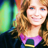
Create a new layer and fill it with a purple-ish color (#757AA9).
Set it to softlight at 100%.
If the saturation overwhelmed the icon, the softlight layer will soften it a bit.
004.
Mischa's face was a little too light for my liking, so I added a new color layer and filled it with a light grey (#E8E8E8).
I set it to colorburn at 100%.
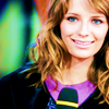
This layer depends on your own base, but its not a very heavy colorburn, so it wont look terrible if you test it.
005.
The coloring is finished, but it was lacking.
I took a texture by
lovelamp and resized, rotated, and set it to multiply at 100%.
Next came a scratch texture by
peoplemachines .
Finally, I added her name in font paul maul, size 14.

Easy, yes?
Any questions or comments, im glad to hear them.
If it works well for you, i'd love to see what you came up with.
program: PS CS2
difficulty: easy/intermediate
translatable: yes (?)
GOING FROM.....

TO

REMINDER: This tutorial will NOT work for every icon, and must be altered/tweaked to acheive the best effect for your individual base.
001.
Create a curves layer and input the following settings.
1st Click
Input : 72
Output: 118
2nd Click
Input: 99
Output: 160
This will brighten the base a considerable amount.
I suggest lowering the opacity of the curves layer for images that are originally light.

002.
Create a new color layer and fill it with a bright, lime green color (#00FF00).
Set it to saturation at 50%.
This will elaborate the colors in your base, but for some its a bit too much.
If thats the case, try lowering the opacity to 20%.

003.
Create a new layer and fill it with a purple-ish color (#757AA9).
Set it to softlight at 100%.
If the saturation overwhelmed the icon, the softlight layer will soften it a bit.

004.
Mischa's face was a little too light for my liking, so I added a new color layer and filled it with a light grey (#E8E8E8).
I set it to colorburn at 100%.

This layer depends on your own base, but its not a very heavy colorburn, so it wont look terrible if you test it.
005.
The coloring is finished, but it was lacking.
I took a texture by
lovelamp and resized, rotated, and set it to multiply at 100%.

Next came a scratch texture by
peoplemachines .
Finally, I added her name in font paul maul, size 14.

Easy, yes?
Any questions or comments, im glad to hear them.
If it works well for you, i'd love to see what you came up with.