Map geek stuff
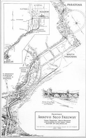
I ran across this image recently:

It's from an old planning document from the 1930's (which is a huge pdf, by the way, but the image quality is much better. It's on page 73 or so of the document) of the "Arroyo Seco Parkway", which later became the Pasadena Freeway, which they're now, inexplicably, calling the "Arroyo Seco Parkway" again.
As a freeway, though, it kind of sucks. There are a lot of sharp curves, and portions of it have posted speed limits of 40mph. Some of the on- and off-ramps have posted limits of 5mph because they're basically a sharp 90-degree turn. And the onramps have stop signs at the entrances, forcing you to merge into freeway traffic from a standstill.
Anyway, the parkway/freeway was Los Angeles's first freeway, and its northern end is a couple of blocks from my apartment. I really like the map because it satisfies my inner map nerd and my inner engineer, and it looks kind of cool. And it has relevance to where I live. And it's wrong, sort of... the route actually more or less follows the dotted line in the upper right corner, not how it's actually drawn in on the map. And it lets out on a street called "Broadway", which is actually called "Arroyo Parkway" today.
I love the way it's rendered. I just wish there was a way to get a decent, poster-sized print of it. I'd love to hang it in my office/guest room or something.