Clarification & Mid-Week Reminder
Okay, so I had a few things I wanted to clarify since I was becoming a bother and all...
The themes that I gave this week, I really wanted some difference between the two groups's icons. So I'm putting up some example icons:
EXCELLENT:
Icons should have a noticeable texture/brush and it should have text. A correction to the text area, no tiny text unless you already have readable text.
Here are some example icons:
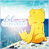
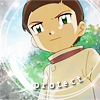
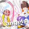
Crappy icons by me.
PLAIN:
Icons should not have a noticeable texture/brush. It should not have text unless it is tiny text. You may use a texture to enchance the colouring of the image but it must not be legible.
Example icons:

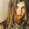
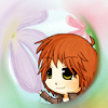
The sparkles in #1 are not from a texture/brush, it was from the original image. #3 uses radial blur from Photoshop.
I hope that cleared up some misunderstandings :/ I'm really sorry I didn't clarify until now... If you need to remake your icon, I'll extend the theme for one more day if you need it.
These participants still need to submit their icon:
Sora *
Impmon
Ruki *
Please submit your icon & either a .psd or a screencap of your layers box here
The themes that I gave this week, I really wanted some difference between the two groups's icons. So I'm putting up some example icons:
EXCELLENT:
Icons should have a noticeable texture/brush and it should have text. A correction to the text area, no tiny text unless you already have readable text.
Here are some example icons:


Crappy icons by me.
PLAIN:
Icons should not have a noticeable texture/brush. It should not have text unless it is tiny text. You may use a texture to enchance the colouring of the image but it must not be legible.
Example icons:


The sparkles in #1 are not from a texture/brush, it was from the original image. #3 uses radial blur from Photoshop.
I hope that cleared up some misunderstandings :/ I'm really sorry I didn't clarify until now... If you need to remake your icon, I'll extend the theme for one more day if you need it.
These participants still need to submit their icon:
Sora *
Impmon
Ruki *
Please submit your icon & either a .psd or a screencap of your layers box here