(no subject)
Hah, no, I'm not dead. Just busy. I plan on perhaps making some icon updates soon...
Going from this to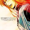
Program: Adobe Photoshop Elements 4.0
Translateable? Yes.
Difficulty Level: Easy to Moderate
Image Heavy? Yes
Won Second Place and Best Use of Text at Abyssawards Week 15
First, I began with this picture of Jade Curtiss from Tales of the Abyss (click on the thumbnail for a larger veiw, if needed):
I chose this image not only because of the subject, but it had lots of room for text (that blank side). Since I wanted to make an effort to put text on this icon, I kept that in mind while cropping.
So here's my now cropped base:
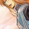
Since I wanted the colors to be a bit brighter, I duplicated it and set it to Overlay, %100. You may have to change the opacity depending on your image, or maybe even totally skip this step. I suppose Soft Light could also work, but I prefer the vibrance that Overlay gives us.
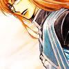
Next, I took a texture: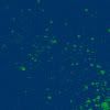
by Fragilecorpse. I set that to Exclusion, %36. Once again, your percentage will vary depending on personal prefrences and the image used. Also, you could just use an exclusion layer here instead of a texture (The color off the majority of the texture is #003364). I just chose the texture because I liked the variety of color, but a regular fill layer should also work nicely.
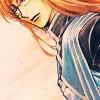
This next step won't really do much, so you might not even need to do it. But I took a texture:
by ? (If someone knows, please tell me). It just looks like a black square (at least on my screen...), but it will put a little light in the corner of the icon. I set that to Screen, %100
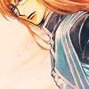
It's a bit hard to notice, but it's in the lower right-hand side of the image.
I wanted a bit more color in the icon, so next I used this light texture:
by ?. I set that to Screen, %100 (I don't really need to keep saying that percantages will vary, do I?)
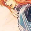
Now, for more color variance! This texture: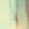
by Erniemay. I set it to Color Burn, %100 because I wanted a bit of darkness in the icon before I proceeded on to the next steps.
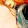
More light texture time! I took this light texture: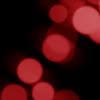
by Ghostsheep and set it to Screen, 100%. Remember, you can rotate your textures so that they're not blocking something you don't want to be blocked!
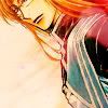
Next, I duplicated my base image, dragged it all the way to the top, and set it to Screen, 75%
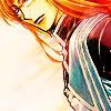
Now's when you can add on text, tiny text, brushes, whatever.

And that's it!
REMEMBER:
You don't have to follow this step by step. In fact, don't. I used the colors and textures I did for a reason; the complimented the picture. If you have a picture with more say, blue or something, then red light textures might not look as great. So go ahead and use your own resources!
Percentages and placement also vary per icon. Lighter or darker images will need diffrent percentages, or maybe even duplicates of some layers (For the first step, a darker icon may even require a screen layer). But that's up to you. Just do what works best for your icon.
Oh, and I do like to see the lovelies people make with my tutorials.
Going from this to

Program: Adobe Photoshop Elements 4.0
Translateable? Yes.
Difficulty Level: Easy to Moderate
Image Heavy? Yes
Won Second Place and Best Use of Text at Abyssawards Week 15
First, I began with this picture of Jade Curtiss from Tales of the Abyss (click on the thumbnail for a larger veiw, if needed):

I chose this image not only because of the subject, but it had lots of room for text (that blank side). Since I wanted to make an effort to put text on this icon, I kept that in mind while cropping.
So here's my now cropped base:

Since I wanted the colors to be a bit brighter, I duplicated it and set it to Overlay, %100. You may have to change the opacity depending on your image, or maybe even totally skip this step. I suppose Soft Light could also work, but I prefer the vibrance that Overlay gives us.

Next, I took a texture:

by Fragilecorpse. I set that to Exclusion, %36. Once again, your percentage will vary depending on personal prefrences and the image used. Also, you could just use an exclusion layer here instead of a texture (The color off the majority of the texture is #003364). I just chose the texture because I liked the variety of color, but a regular fill layer should also work nicely.

This next step won't really do much, so you might not even need to do it. But I took a texture:

by ? (If someone knows, please tell me). It just looks like a black square (at least on my screen...), but it will put a little light in the corner of the icon. I set that to Screen, %100

It's a bit hard to notice, but it's in the lower right-hand side of the image.
I wanted a bit more color in the icon, so next I used this light texture:

by ?. I set that to Screen, %100 (I don't really need to keep saying that percantages will vary, do I?)

Now, for more color variance! This texture:

by Erniemay. I set it to Color Burn, %100 because I wanted a bit of darkness in the icon before I proceeded on to the next steps.

More light texture time! I took this light texture:

by Ghostsheep and set it to Screen, 100%. Remember, you can rotate your textures so that they're not blocking something you don't want to be blocked!

Next, I duplicated my base image, dragged it all the way to the top, and set it to Screen, 75%

Now's when you can add on text, tiny text, brushes, whatever.

And that's it!
REMEMBER:
You don't have to follow this step by step. In fact, don't. I used the colors and textures I did for a reason; the complimented the picture. If you have a picture with more say, blue or something, then red light textures might not look as great. So go ahead and use your own resources!
Percentages and placement also vary per icon. Lighter or darker images will need diffrent percentages, or maybe even duplicates of some layers (For the first step, a darker icon may even require a screen layer). But that's up to you. Just do what works best for your icon.
Oh, and I do like to see the lovelies people make with my tutorials.