Crystal Towers 2 XL Progress update 5
With me now updating the game's user interface, here's a look back at the complete history of Crystal Towers 2's menu screen!
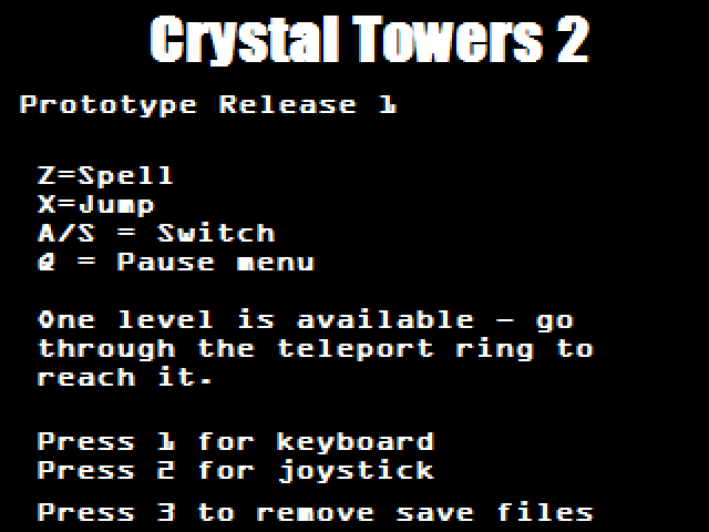
1. The earliest thing that could loosely be called a menu on the first released prototype, just giving early testers some description, controls and a couple of options so they could see what the game was about. Note the A and S keys to switch magic, prohibitively unwieldy even very early in the game - and the unusual choice of ugly machine-readable credit card number font.
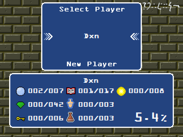
2. The first attempt at a real menu screen. The layout actually changed very little from here on, though the ugly font is still present and the order of items is different on the progress window at the bottom - I was yet to think up the idea of medals, or the synthesis side quest that produced recipes (scroll) and rewards (cup).
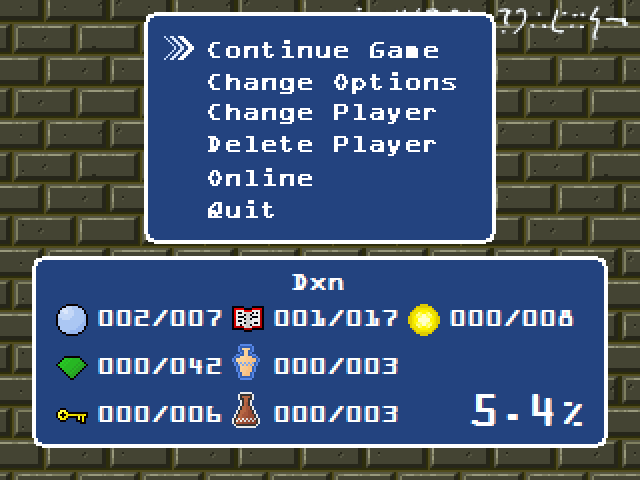
2a. This is from the same version, I just found it interesting that the menu includes an “Online” option. I think this was the first place for the feature that was eventually moved into the computers scattered around the hub level - of being able to upload and share your progress.
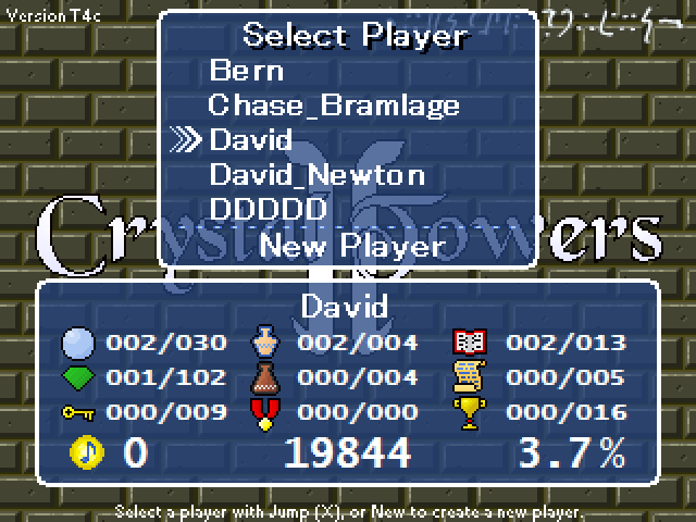
3. I think it took a reinstall of Windows (and so I was missing the font) to make me realize the font was ugly as sin and go for something more palatable instead. Version T4c puts this around 2009 or so - it looks much more finished, and adds some transparency to show off the awful unfinished game logo in the background.
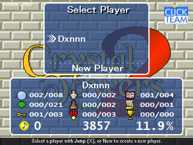
4. The real logo appears for the first time in this menu from a Clickteam-branded demo version that I initially didn’t remember writing, but now I recall it was for their monthly sort of “gold” subscription, Klikdisc, where you got a pack of demos and extensions ahead of other users. The background bricks have been changed but they’re far too bright.
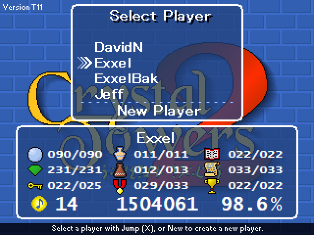
5. Getting close now! This much later test version replaces the beige bricks with blue, a background that was used right up until near the game’s release.
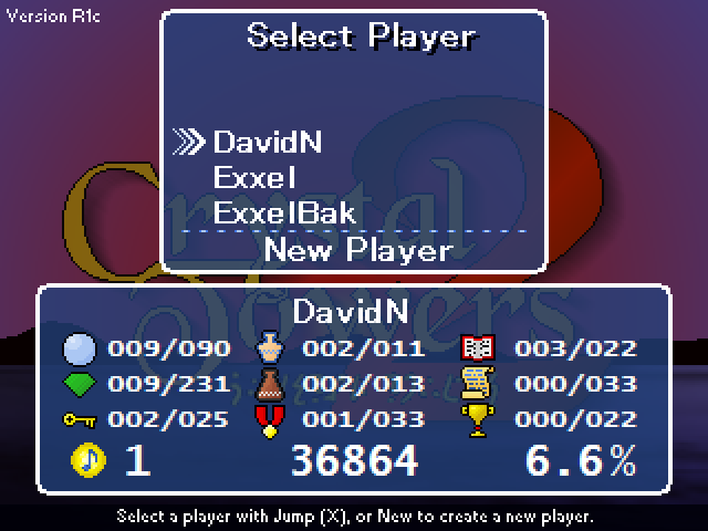
6. In the released version, the background was chosen at random from a selection of in-game level backgrounds, and the fade effect was added when you entered the menu.
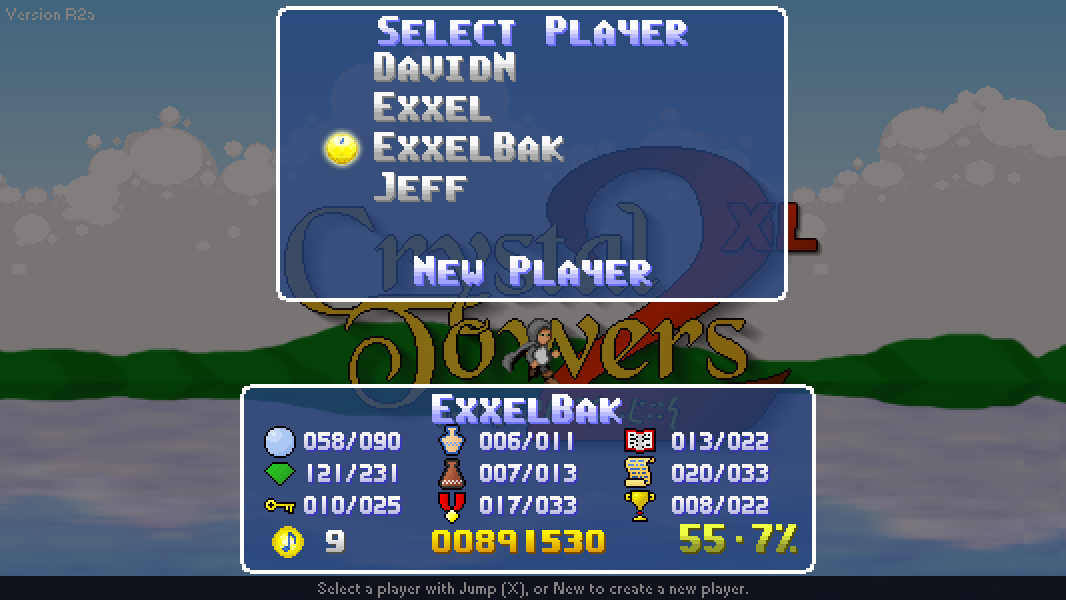
7. And now, the XL version does away with the Windows fonts altogether and uses bitmap fonts throughout - in the process, the menu has also been scaled to match the new screen size.