Tutorial #3 - COMPLETE header tutorial (from start to finish!)
Seeing as I really want to make a new layout but am unable to find a decent subject matter, I’ve decided to write my first graphics tutorial. This is being written for two reasons: 1) to satisfy my muse slightly and 2) help sflynn out as she learns more about photoshop. I know you didn’t ask Shan, but I’ve nothing but time and I’ve always wanted to attempt a full graphics tutorial! Don’t you think it ironic though, that *I’m* writing *you* a tutorial when not even two years ago you were still making me my forum banners? Haha!
I attempted to find a graphic I’ve made using photoshop default tools only but I’m a total brush ho so sadly, it was kinda impossible. However, I will point you in the direction of any brushes I have used that aren’t included in a standard installation. I made this particular piece in Photoshop 7 but currently have CS2. It should translate the same though. Also, most of the stuff you can do in PSP also, just the custom brushes won’t work unless you can find the image packs for them. Good luck.
On with the show!
Complete header - graphics tutorial
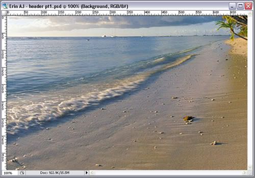
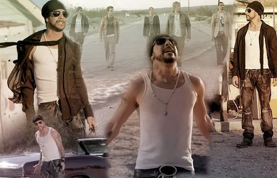
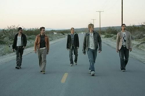
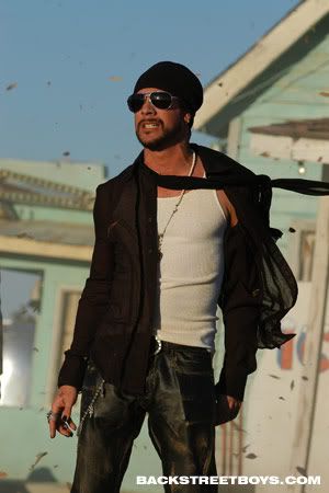
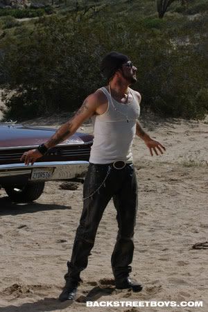
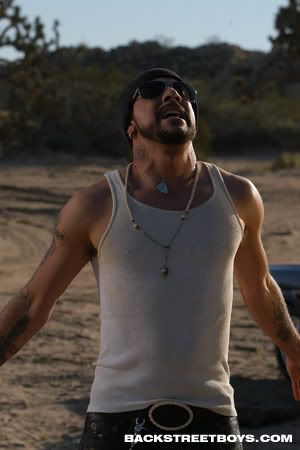
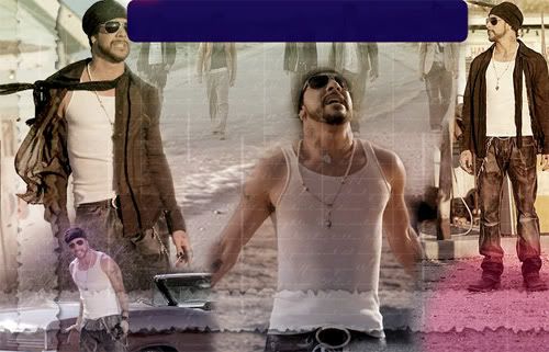
I’m going to take you from these pictures:
Serenity * Band walking * AJ and Kev * AJ windblown * AJ and car * AJ looking up
To:
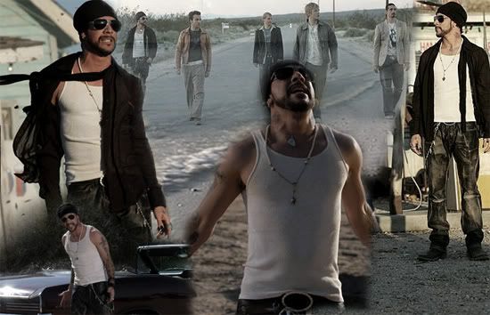
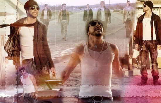
AJ final image
Ready?
Now, before I begin, I have to point out I made this over six months ago. So I’m writing the steps in accordance to the order of the layers, but I’ve not necessarily done them in that order. Also, some elements I may have done and forgotten. If you notice anything like that, let me know and I’ll fix it! Making graphics is pretty much trial and error, you end up with many discarded layers and you tend to rearrange stuff often. So don’t be put off if things aren’t looking quite right when you attempt something, just keep at it. This tutorial is not intended for you to make exact copies of my work. Rather, have a go at it and familiarize yourselves with photoshop tools so you can implement these tricks into your own work. Have fun!
Step 1
* Bring up a blank 750x450 canvas
(File > New> width 750 height 450)
*Copy into it the Serenity image and free transform (ctrl+T) the file until you get this:
(You’ll need to zoom out until you can see the edges of the serenity layer. Then, hold down shift (to keep aspect ratio) while you drag from the corner inwards. You may need to do this in steps, transform slightly, then move the image into position, transform again, etc.)
* Last thing on this layer, you need to set the saturation, otherwise the image comes through too brightly:
Image>Adjustments>Hue/Saturation.
I’ve set the saturation at -58 and left the others at 0.
Step 2
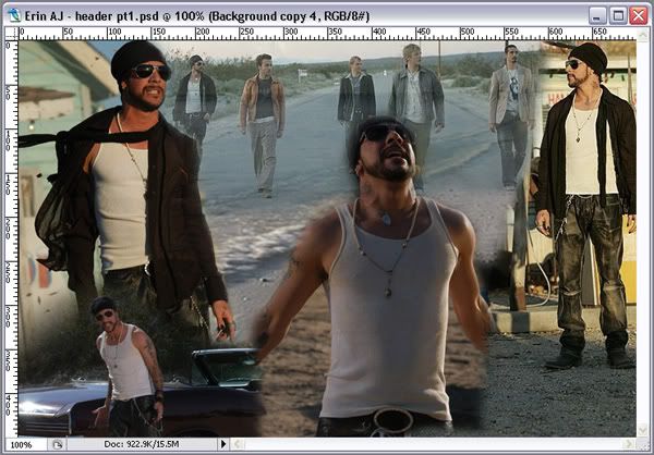
* Next, I took the rest of the pictures and laid them out over my canvas like so:
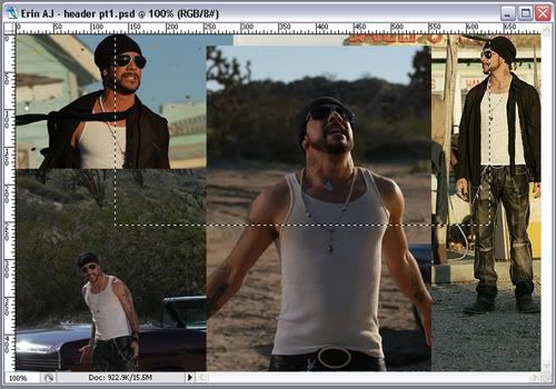
Where you see the selected image, that is of the band walking. I’ve highlighted its position so you can see where I’ve put it.
Now, this step isn’t as simple as copy and pasting. You’ll have to resize some of the original images - either by cropping the parts you want or resizing them before copy and pasting them into your canvas. Personally, I prefer to copy the entire thing and then use the free transform tool (ctrl+T) to mess with the size until I’m happy with it. You have more control that way.
Also, the layer order on mine went as follows: (from lowest to highest)
1. Band walking
2. AJ and Kev
3. AJ windblown
4. AJ and car (which I’ve flipped- Edit>Transform>Flip Horizontal)
5. AJ looking up.
Step 3
* Masking! I adore the mask tool. I don’t use the eraser, or the extract filter even though I know how. Layer masks give you SO much more control, whereas with extract/erase once the image has been edited, that part is gone. With masks, you can always bring them back should you change your mind. Effectively, with the mask tool you are merely hiding parts you don’t want seen on higher layers so stuff on the bottom layers can be seen.
Anyway:
In the layer pallet window you want to select each of the five picture layers in turn and hit the button that depicts a rectangle with a circle in it. See:
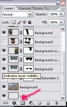
* Then, you want to grab your brush tool. I tend to use the preset 50% flow 45pixels round brush when masking, but feel free to use whichever brush you want. Make sure your selected colours are default black and white (if they’re not, just hit ‘D’) and that the black is selected as the foreground colour.
* When masking I usually work from the bottom layer up, and hide the layers I’ve not done yet. Anyhow, back in the layer palette select the LAYER MASK of your layer you want to edit (the second rectangle - should be completely white at first) and brush away, removing the extra bits of the five main image layers until you have a blended image. Paint with black to remove and white to bring stuff back. Don’t worry if the edges aren’t perfect. Here’s what mine looked like:
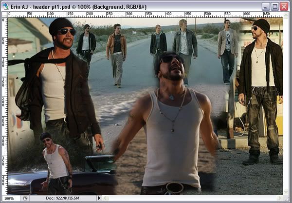
You can clearly see where one picture ends and the next begins, do not worry! We’re still in the beginning stages here :)
* Next, I wanted the picture of the boys walking along the road to be faint, so I lowered the Opacity of that layer to 58%. Problem then was I could see the shore line from the Serenity picture a bit too clearly and everything above that point was too faint. So I went back to the layer palette, right-clicked that layer (ie, of the boys walking) and selected the ‘duplicate layer’ option. On the duplicate, I deleted the current layer mask and setup another one - on this I masked out everything but the portion of the pic above the shoreline. I left the Opacity of this layer also at 58%.
So, my final image at the end of this step looked like this:
* Finally, you want to merge all the layers (Layer>Merge Visible). But before you do this step I would advise you to save the psd file just in case!
Step 4
* The hard part is now over! Now we have the obligatory adjustments to do followed by the fun stuff. Hope you’re still with me.
So this step is about the adjustments to your newly merged image layer. I try not to mess with too many different adjustment options at a time, as they tend to warp the picture entirely. I find that simplicity is often better. In this case:
Layer>Adjustments>Brightness/Contrast - Brightness +6 and Contrast +11
Layer>Adjustments>Hue/Saturation - Hue 0, Saturation -44 and Lightness 0
And I was done! See:
(To confuse the issue slightly, when you adjust the layer settings this way any changes you make are permanent. So, personally I prefer to use the half black/half white circle in the layer palette (next to the mask tool - see above) to select these options, as the adjustments you make are then recorded as a separate layer so you can go back and change if you’re not happy later on.)
Step 5
* On to the fun stuff! This part can be really frustrating, dealing with gradients, brushes, layer styles, the works. Play around, experiment. But ALWAYS paint brushes/gradients/textures etc on their own layer. You’ll end up with a multitude of layers but it’s easier to add, move, erase, edit etc. Plus, it’s a good record of what you did. I cannot stress this point enough. ALWAYS ALWAYS ALWAYS on a new layer. ‘k?
Now, I’m a total resource addict. I’ve recently started making my own brushes and have been making my own gradients for a while, but luckily for you guys all the stuff I’ve used for this are either defaults or I know where you can nab them from.
* Once I’ve done my adjustments, I start colorizing. I usually use preset gradients but you can always paint your own layer with the colours of your choice. In this case I’ve used three different gradients on differing blending modes: (from lowest to highest)
Gradient 1 - The highlighted gradient below:
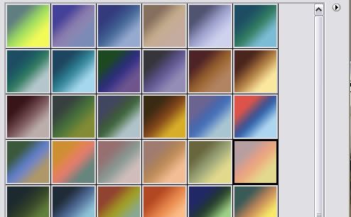
I’ve used it so brown is at the bottom and yellow at the top.
Blending mode: Soft Light (see the drop down menu next to the Opacity option in the layers palette)
Opacity: 100% (These two options are usually the only ones I mess with on coloring layers)
Resource: It’s found in gradient pack two from crumblingwalls. I’ve not tripped over to her LJ in a while but last I knew she had a sticky post right on top listing her resources.
Gradient 2 - Looking back at the pack above, see the gradient three to the left of the selected one? The one that’s a mucky red through to a mucky blue through to dirty white. That one is next. I’ve used that at an angle so that the top right corner is the mucky red and the bottom left is the dirty white.
Blending mode: Soft Light
Opacity: 100%
Gradient 3 - Now I don’t recall for certain exactly which gradient I’ve used here. It MIGHT be the blue gradient second from the right on the top row of that very same pack, but I’ve a feeling that it’s more likely to be this one:
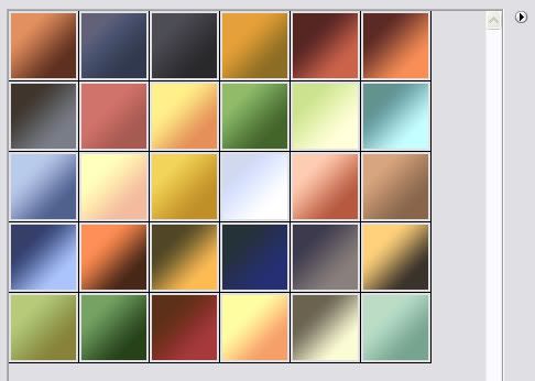
The first blue gradient on the third row. I’ve used it at a sliiiiiight angle so that the top left is light blue and bottom right is dark blue.
Blending mode: Soft Light
Opacity: 48%
Resource: Aikes! Erm, the file is tagged with ‘magdalenaicons’. I can’t recall off the top of my head where exactly that is, but I shall hunt it up and post the link.
And that’s it for the colors! So far we have:
Before I go on to the next step, I’d just like to draw your attention to the blending modes option. Now, it’s highly unusual that I’ve used three successive gradients but all with one mode. Usually I have a layer set to ‘screen’ or ‘hard light’. Admittedly, ‘soft light’ is most popular, but don’t be afraid to try the other modes!
Step 6
The next bunch of steps go through individual brush and effect layers. I thought of grouping them together but it’d be too much to follow! On with the show.
* I created a new layer (shift+ctrl+N), set my foreground color to white and grabbed my shape tool (under the text tool). Then in the options toolbar that comes up at the top, I made sure that ‘fill tool’ option was selected (third button in the second section) and selected the line tool (second from last button in the third section). For ‘Weight’, I believe I used an assortment, ranging from 0.5 cm to 2cm. Then I drew vertical lines randomly all over the image.
* Next, I grabbed my eraser tool and changed my brush to a grunge one. If memory serves I used the one labelled ‘heavy smear wax crayon’ under dry media brushes (default photoshop brushes). I then erased away the edges of the lines I’d just drawn to make them all tattered looking.
* Once satisfied with my grungy lines, I changed the opacity of the layer to 46% and set the layer to ‘soft light.’
Step 7
* New layer (shift+ctrl+N). Foreground color=white
* I then selected my brush tool (BRUSH not eraser) and selected ‘full background - carpenter script’ brush which is in crumblingwalls’s wallpaper brushes pack one. Position your brush and with one click, you’re done!
* I set that layer to ‘soft light’ opacity 68%.
I’ve decided to consider it a minor miracle that I’ve only used one brush on this piece. Seriously, I usually lay them on!
Step 8
* New layer (shift+ctrl+N). Foreground color=white
* Shape tool next. If you’re following this exactly, yours is probably set on line, change it now to rectangle and draw a big white rectangle from about two thirds of the way down to the bottom. Just a huge blank rectangle. Don’t be scared now!
* Add a layer mask to the layer and fill the entire thing with black. Your white rectangle should now disappear. Stay with me, there is a method to my madness!
* Now we mark the area we want to be visible (the banner that’s running across the bottom in the final image) and fill this area on the layer mask with white. So now we should have a white rectangle banner running right across our image.
* Set the blending mode to ‘soft light’
* Now, to get the torn look we use the Crystallize filter on the layer mask (make sure it is active by clicking on it!) (Filter - Pixelate - Crystallize), I don’t recall the strength I used, but play around til one looks right. I’d guess mine was possibly between 6 and 10.
* Then I added a layer style to this layer by clicking the stylised ‘f’ button next to the layer mask button on the layer palette and choosing ‘Outer Glow’. Settings:
Blending mode: soft light
Opacity 95%
Color: solid black
On the left hand side, you’ll see other layer style options. Select ‘Drop Shadow’. Settings:
Blending mode: multiply
Opacity 75%
* Now look, you have yourself a fantabulistic torn banner thingy! I lowered the opacity of the entire layer to 55%.
(I can’t claim credit for thinking this up though, I stole the idea from awmp and customised it ever so slightly!)
* Finally for this step, before I show you what mine looks like up to now, go to your layer palette and right-click the banner layer. Select ‘duplicate layer’. Now, you want to rotate this new layer:
Edit>Transform>Rotate 90 CW (or CCW, doesn’t matter)
You should now have a second banner running vertically. Position that on the left hand side of your image.
So, after the last three steps we should have:
Doing ok so far? Good. Not far to go!
Step 9
The next three layers use only the shape tool and some imagination.
* New layer (shift+ctrl+N). Foreground color=#FFFFFF (it’s a deep red/pink)
* Shape tool: circle. (Remember to make sure that ‘fill pixels’ is still selected) Keeping shift depressed (to make sure you get a perfect circle) draw a circle of any size you wish bang in the middle of the image.
* Move the circle to the bottom tight hand corner so only a portion is visible.
* Now, change the blending mode to ‘linear dodge’ and lower opacity to 57%
* Finally, apply a Guassian Blur filter to it (Filter>Blur>Gaussian Blur). I don’t recall the radius I used but play around with it. I’d say mine was somewhere in the 30s.
Step 10
* New layer (shift+ctrl+N). Foreground color=#1D0249 (it’s a blue/purple)
* Shape tool: the squiggly blob thing. (Remember to make sure that ‘fill pixels’ is still selected) You should get a bunch of tool options appear next to it. The first one should be ‘shape’ and it’s probably set to an arrow. Press the little down arrow next to it. Then when the menu comes up, click on the little arrow pointing right on the right hand side. In the drop down menu, there should be an option labelled ‘all’. Hit that. When the list of shapes comes up, scroll through til you find a five-point star.
* Draw a star so that it covers AJ’s face in the pic where he’s singing by the car.
* Change the blending mode to ‘linear dodge’ and lower opacity to 33%
* Finally, apply a Guassian Blur filter to the layer again (Filter>Blur>Gaussian Blur). Sorry, but I don’t recall the radius I used on this either! Play around with it. I’d say mine was somewhere in the 20s.
Step 11
The last of the shape layers! In fact, the last of any sort of brush work.
* New layer (shift+ctrl+N). Foreground color=#1D0249 (same blue/purple as before)
* Shape tool: rounded rectangle/square. (Remember to make sure that ‘fill pixels’ is still selected) Draw a rectangle so that it covers all the faces of the boys in the walking pic at the top (like so)
* Change blending mode to ‘color dodge’ and opacity to 71%
* Apply layer mask to layer and using the round brush again mask away the edges so it looks blurred.
Done! How you doing so far? Here’s what I have:

Looking good, almost there. Honest!
Step 12
* Now, to me, the colors are looking a bit, well, faded. Basically, the image isn’t as striking as I’d like. But, this is so easily solved! Observe:
- Select all (ctrl+a)
- Copy merged (shift+ctrl+c)
- Deselect all (ctrl+d)
- Paste as new layer (ctrl+v)
- Change blend mode to ‘soft light’ and lower opacity to 57%
Viola!!
Amazing what a difference it makes, huh?
Step 13
This next step I personally believe can either kill your masterpiece or enhance. Be very careful and select your stocks carefully.
* This is the lighting step! The best light stocks around are definitely awmp’s. I’ve used one of hers (stock #3, set#4) for this. I’ve taken this:
and transformed it (ctrl+t) so that it covered the entire canvas. Don’t worry if the stock looks distorted beyond recognition.
* Change the blend mode to ‘hard light’ and lower the opacity to 48%.
Done! See? Enhances the image, providing you use the right stock. Be mindful of blend modes and opacity levels.
Step 14
The end is in sight! Now, you wanna start messing with text. I’ve got to say, back when I did this piece, I was still very crap at text. It shows, it does! My stuff afterwards is somewhat better. Some things I’ve learnt:
- not to be afraid to have lots of text layers, even if some of them are only known to you and you can’t really pick them out in the final image. It’s all about the effect it gives.
- Tiny text is NOT meant to be read, but that does not mean it should be a long line of O’s! Or any other letter/number. It’s obvious when someone does that. I usually grab song lyrics to use in my tiny text.
- have a variety of fonts at hand, but remember, simplicity is often key.
- avoid putting too many layer styles on text layers. Options such as ‘bevel/emboss’ can totally kill your work if not used right.
- try not to have text layers in ‘normal’ blending mode. By using other modes, the text looks more incorporated into your image.
Anyhow, for this particular image, there’s only four text layers:
> ‘Where I’m going is anybody’s guess’
Font: Viner Hand ITC (not sure if this is a default font or not - all my custom fonts are nabbed from DaFont),
Font size: 24
Color: #0D004C (dark blue/purple)
Layer styles: Drop Shadow (Blend mode-multiply, Color-black, Opacity-75%) and Outer Glow (Blend mode-screen, Opacity-75%, Color-yellow[default])
Layer blend mode: ‘color burn’
Opacity: 37%.
I wrote it horizontally, then transformed it (Edit>Transform>Rotate 90 CCW)
> ‘Entries’ / ‘Friends’ / ‘Userinfo’
Font: Pristina (definitely a custom font from DaFont),
Font size: 48
Color: Black
Layer styles: Drop Shadow (Blend mode-multiply, Color-black, Opacity-75%) and Outer Glow (Blend mode-screen, Opacity-53%, Color-yellow[default])
Layer blend mode: ‘linear burn’
Opacity: 100%.
I did the Entries layer with the above settings and then duplicated it twice, changing the first duplicate to ‘Friends’ and the second to ‘Userinfo’ and then positioned them accordingly.
Now, I have this:
Step 15
The last and final step! I bet you’re as glad as I am to reach this point, I’ve been at this for HOURS now. Haha. It probably took longer doing this tute then it did making it first time ‘round!
Slight problem though - I know what I’ve done, but for some reason, my layer palette is not agreeing with me. Huh. I have quite possibly deleted a layer somewhere along the way. That’s my only explanation! Anyhow, the final touch to the image is the border. I’ve chosen not to use an obvious one, but rather enhanced the edges instead. Here’s how:
- select all (ctrl+a)
- copy merged (shift+ctrl+c)
- deselect all (ctrl+d)
- paste in new layer (ctrl+v)
- go to View>Rulers
- when the rulers come up, right-click and select ‘pixels’
- click and hold your mouse in the vertical rule and drag out into the image. You’ll see a line (aka a guide) which’ll stick wherever you let go of the mouse. Take this guide to the last marker on the horizontal rule (so there’s a 5px gap between the guide and the edge of the pic).
- drag a second vertical guide to the first marker on the horizontal rule.
- do the same for the horizontal (drag guides from the horizontal rule to the first and last markers on the vertical rule)
- you should now have a box marked out. Using your rectangular select tool, select all inside this box (the bulk of the image)
- go to Select>Inverse Select
- create new layer (shift+ctrl+n)
- select foreground color #790026
- use paint bucket to fill in selected area with this color
- change blend mode of layer to soft light.
EDIT: I'm SUCH a dork! I finally remember why it seems I have a missing layer before this last step - it's cos I did the border slightly differently. You get the same result but it's a MUCH easier step! Here, follow:
- select all (ctrl+a)
- copy merged (shift+ctrl+c)
- deselect all (ctrl+d)
- paste in new layer (ctrl+v)
- go to Edit>Stroke
- options: weight-5px, color-#790026, location-center, blend mode-soft light
- hit ok
And that's IT! Yeah, dork.
Now swing from the trees, shout from the rooftops, cackle in glee, you are DONE! My final image:

Phew, that took life. Please, please, please leave feedback, even if it’s a simple ‘this sucks!’ And if you try this tute, I beg you to show me your finished products. I would love to see how people interpret this!
Ps. I was contemplating doing a tute going from:
to
I was looking over the psd of it and shocked myself - it has 23 layers! And I took some steps which seem unconventional when viewed in an abstract way. I’d forgotten about many of them, this was really my technique test! If you would be interested in a tutorial for it, please leave a comment.
I attempted to find a graphic I’ve made using photoshop default tools only but I’m a total brush ho so sadly, it was kinda impossible. However, I will point you in the direction of any brushes I have used that aren’t included in a standard installation. I made this particular piece in Photoshop 7 but currently have CS2. It should translate the same though. Also, most of the stuff you can do in PSP also, just the custom brushes won’t work unless you can find the image packs for them. Good luck.
On with the show!
Complete header - graphics tutorial
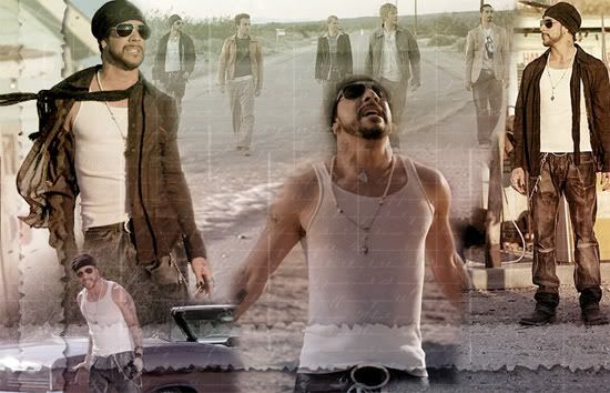
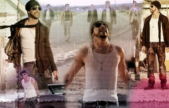
I’m going to take you from these pictures:
Serenity * Band walking * AJ and Kev * AJ windblown * AJ and car * AJ looking up
To:
AJ final image
Ready?
Now, before I begin, I have to point out I made this over six months ago. So I’m writing the steps in accordance to the order of the layers, but I’ve not necessarily done them in that order. Also, some elements I may have done and forgotten. If you notice anything like that, let me know and I’ll fix it! Making graphics is pretty much trial and error, you end up with many discarded layers and you tend to rearrange stuff often. So don’t be put off if things aren’t looking quite right when you attempt something, just keep at it. This tutorial is not intended for you to make exact copies of my work. Rather, have a go at it and familiarize yourselves with photoshop tools so you can implement these tricks into your own work. Have fun!
Step 1
* Bring up a blank 750x450 canvas
(File > New> width 750 height 450)
*Copy into it the Serenity image and free transform (ctrl+T) the file until you get this:
(You’ll need to zoom out until you can see the edges of the serenity layer. Then, hold down shift (to keep aspect ratio) while you drag from the corner inwards. You may need to do this in steps, transform slightly, then move the image into position, transform again, etc.)
* Last thing on this layer, you need to set the saturation, otherwise the image comes through too brightly:
Image>Adjustments>Hue/Saturation.
I’ve set the saturation at -58 and left the others at 0.
Step 2
* Next, I took the rest of the pictures and laid them out over my canvas like so:
Where you see the selected image, that is of the band walking. I’ve highlighted its position so you can see where I’ve put it.
Now, this step isn’t as simple as copy and pasting. You’ll have to resize some of the original images - either by cropping the parts you want or resizing them before copy and pasting them into your canvas. Personally, I prefer to copy the entire thing and then use the free transform tool (ctrl+T) to mess with the size until I’m happy with it. You have more control that way.
Also, the layer order on mine went as follows: (from lowest to highest)
1. Band walking
2. AJ and Kev
3. AJ windblown
4. AJ and car (which I’ve flipped- Edit>Transform>Flip Horizontal)
5. AJ looking up.
Step 3
* Masking! I adore the mask tool. I don’t use the eraser, or the extract filter even though I know how. Layer masks give you SO much more control, whereas with extract/erase once the image has been edited, that part is gone. With masks, you can always bring them back should you change your mind. Effectively, with the mask tool you are merely hiding parts you don’t want seen on higher layers so stuff on the bottom layers can be seen.
Anyway:
In the layer pallet window you want to select each of the five picture layers in turn and hit the button that depicts a rectangle with a circle in it. See:
* Then, you want to grab your brush tool. I tend to use the preset 50% flow 45pixels round brush when masking, but feel free to use whichever brush you want. Make sure your selected colours are default black and white (if they’re not, just hit ‘D’) and that the black is selected as the foreground colour.
* When masking I usually work from the bottom layer up, and hide the layers I’ve not done yet. Anyhow, back in the layer palette select the LAYER MASK of your layer you want to edit (the second rectangle - should be completely white at first) and brush away, removing the extra bits of the five main image layers until you have a blended image. Paint with black to remove and white to bring stuff back. Don’t worry if the edges aren’t perfect. Here’s what mine looked like:
You can clearly see where one picture ends and the next begins, do not worry! We’re still in the beginning stages here :)
* Next, I wanted the picture of the boys walking along the road to be faint, so I lowered the Opacity of that layer to 58%. Problem then was I could see the shore line from the Serenity picture a bit too clearly and everything above that point was too faint. So I went back to the layer palette, right-clicked that layer (ie, of the boys walking) and selected the ‘duplicate layer’ option. On the duplicate, I deleted the current layer mask and setup another one - on this I masked out everything but the portion of the pic above the shoreline. I left the Opacity of this layer also at 58%.
So, my final image at the end of this step looked like this:
* Finally, you want to merge all the layers (Layer>Merge Visible). But before you do this step I would advise you to save the psd file just in case!
Step 4
* The hard part is now over! Now we have the obligatory adjustments to do followed by the fun stuff. Hope you’re still with me.
So this step is about the adjustments to your newly merged image layer. I try not to mess with too many different adjustment options at a time, as they tend to warp the picture entirely. I find that simplicity is often better. In this case:
Layer>Adjustments>Brightness/Contrast - Brightness +6 and Contrast +11
Layer>Adjustments>Hue/Saturation - Hue 0, Saturation -44 and Lightness 0
And I was done! See:
(To confuse the issue slightly, when you adjust the layer settings this way any changes you make are permanent. So, personally I prefer to use the half black/half white circle in the layer palette (next to the mask tool - see above) to select these options, as the adjustments you make are then recorded as a separate layer so you can go back and change if you’re not happy later on.)
Step 5
* On to the fun stuff! This part can be really frustrating, dealing with gradients, brushes, layer styles, the works. Play around, experiment. But ALWAYS paint brushes/gradients/textures etc on their own layer. You’ll end up with a multitude of layers but it’s easier to add, move, erase, edit etc. Plus, it’s a good record of what you did. I cannot stress this point enough. ALWAYS ALWAYS ALWAYS on a new layer. ‘k?
Now, I’m a total resource addict. I’ve recently started making my own brushes and have been making my own gradients for a while, but luckily for you guys all the stuff I’ve used for this are either defaults or I know where you can nab them from.
* Once I’ve done my adjustments, I start colorizing. I usually use preset gradients but you can always paint your own layer with the colours of your choice. In this case I’ve used three different gradients on differing blending modes: (from lowest to highest)
Gradient 1 - The highlighted gradient below:
I’ve used it so brown is at the bottom and yellow at the top.
Blending mode: Soft Light (see the drop down menu next to the Opacity option in the layers palette)
Opacity: 100% (These two options are usually the only ones I mess with on coloring layers)
Resource: It’s found in gradient pack two from crumblingwalls. I’ve not tripped over to her LJ in a while but last I knew she had a sticky post right on top listing her resources.
Gradient 2 - Looking back at the pack above, see the gradient three to the left of the selected one? The one that’s a mucky red through to a mucky blue through to dirty white. That one is next. I’ve used that at an angle so that the top right corner is the mucky red and the bottom left is the dirty white.
Blending mode: Soft Light
Opacity: 100%
Gradient 3 - Now I don’t recall for certain exactly which gradient I’ve used here. It MIGHT be the blue gradient second from the right on the top row of that very same pack, but I’ve a feeling that it’s more likely to be this one:
The first blue gradient on the third row. I’ve used it at a sliiiiiight angle so that the top left is light blue and bottom right is dark blue.
Blending mode: Soft Light
Opacity: 48%
Resource: Aikes! Erm, the file is tagged with ‘magdalenaicons’. I can’t recall off the top of my head where exactly that is, but I shall hunt it up and post the link.
And that’s it for the colors! So far we have:
Before I go on to the next step, I’d just like to draw your attention to the blending modes option. Now, it’s highly unusual that I’ve used three successive gradients but all with one mode. Usually I have a layer set to ‘screen’ or ‘hard light’. Admittedly, ‘soft light’ is most popular, but don’t be afraid to try the other modes!
Step 6
The next bunch of steps go through individual brush and effect layers. I thought of grouping them together but it’d be too much to follow! On with the show.
* I created a new layer (shift+ctrl+N), set my foreground color to white and grabbed my shape tool (under the text tool). Then in the options toolbar that comes up at the top, I made sure that ‘fill tool’ option was selected (third button in the second section) and selected the line tool (second from last button in the third section). For ‘Weight’, I believe I used an assortment, ranging from 0.5 cm to 2cm. Then I drew vertical lines randomly all over the image.
* Next, I grabbed my eraser tool and changed my brush to a grunge one. If memory serves I used the one labelled ‘heavy smear wax crayon’ under dry media brushes (default photoshop brushes). I then erased away the edges of the lines I’d just drawn to make them all tattered looking.
* Once satisfied with my grungy lines, I changed the opacity of the layer to 46% and set the layer to ‘soft light.’
Step 7
* New layer (shift+ctrl+N). Foreground color=white
* I then selected my brush tool (BRUSH not eraser) and selected ‘full background - carpenter script’ brush which is in crumblingwalls’s wallpaper brushes pack one. Position your brush and with one click, you’re done!
* I set that layer to ‘soft light’ opacity 68%.
I’ve decided to consider it a minor miracle that I’ve only used one brush on this piece. Seriously, I usually lay them on!
Step 8
* New layer (shift+ctrl+N). Foreground color=white
* Shape tool next. If you’re following this exactly, yours is probably set on line, change it now to rectangle and draw a big white rectangle from about two thirds of the way down to the bottom. Just a huge blank rectangle. Don’t be scared now!
* Add a layer mask to the layer and fill the entire thing with black. Your white rectangle should now disappear. Stay with me, there is a method to my madness!
* Now we mark the area we want to be visible (the banner that’s running across the bottom in the final image) and fill this area on the layer mask with white. So now we should have a white rectangle banner running right across our image.
* Set the blending mode to ‘soft light’
* Now, to get the torn look we use the Crystallize filter on the layer mask (make sure it is active by clicking on it!) (Filter - Pixelate - Crystallize), I don’t recall the strength I used, but play around til one looks right. I’d guess mine was possibly between 6 and 10.
* Then I added a layer style to this layer by clicking the stylised ‘f’ button next to the layer mask button on the layer palette and choosing ‘Outer Glow’. Settings:
Blending mode: soft light
Opacity 95%
Color: solid black
On the left hand side, you’ll see other layer style options. Select ‘Drop Shadow’. Settings:
Blending mode: multiply
Opacity 75%
* Now look, you have yourself a fantabulistic torn banner thingy! I lowered the opacity of the entire layer to 55%.
(I can’t claim credit for thinking this up though, I stole the idea from awmp and customised it ever so slightly!)
* Finally for this step, before I show you what mine looks like up to now, go to your layer palette and right-click the banner layer. Select ‘duplicate layer’. Now, you want to rotate this new layer:
Edit>Transform>Rotate 90 CW (or CCW, doesn’t matter)
You should now have a second banner running vertically. Position that on the left hand side of your image.
So, after the last three steps we should have:
Doing ok so far? Good. Not far to go!
Step 9
The next three layers use only the shape tool and some imagination.
* New layer (shift+ctrl+N). Foreground color=#FFFFFF (it’s a deep red/pink)
* Shape tool: circle. (Remember to make sure that ‘fill pixels’ is still selected) Keeping shift depressed (to make sure you get a perfect circle) draw a circle of any size you wish bang in the middle of the image.
* Move the circle to the bottom tight hand corner so only a portion is visible.
* Now, change the blending mode to ‘linear dodge’ and lower opacity to 57%
* Finally, apply a Guassian Blur filter to it (Filter>Blur>Gaussian Blur). I don’t recall the radius I used but play around with it. I’d say mine was somewhere in the 30s.
Step 10
* New layer (shift+ctrl+N). Foreground color=#1D0249 (it’s a blue/purple)
* Shape tool: the squiggly blob thing. (Remember to make sure that ‘fill pixels’ is still selected) You should get a bunch of tool options appear next to it. The first one should be ‘shape’ and it’s probably set to an arrow. Press the little down arrow next to it. Then when the menu comes up, click on the little arrow pointing right on the right hand side. In the drop down menu, there should be an option labelled ‘all’. Hit that. When the list of shapes comes up, scroll through til you find a five-point star.
* Draw a star so that it covers AJ’s face in the pic where he’s singing by the car.
* Change the blending mode to ‘linear dodge’ and lower opacity to 33%
* Finally, apply a Guassian Blur filter to the layer again (Filter>Blur>Gaussian Blur). Sorry, but I don’t recall the radius I used on this either! Play around with it. I’d say mine was somewhere in the 20s.
Step 11
The last of the shape layers! In fact, the last of any sort of brush work.
* New layer (shift+ctrl+N). Foreground color=#1D0249 (same blue/purple as before)
* Shape tool: rounded rectangle/square. (Remember to make sure that ‘fill pixels’ is still selected) Draw a rectangle so that it covers all the faces of the boys in the walking pic at the top (like so)
* Change blending mode to ‘color dodge’ and opacity to 71%
* Apply layer mask to layer and using the round brush again mask away the edges so it looks blurred.
Done! How you doing so far? Here’s what I have:
Looking good, almost there. Honest!
Step 12
* Now, to me, the colors are looking a bit, well, faded. Basically, the image isn’t as striking as I’d like. But, this is so easily solved! Observe:
- Select all (ctrl+a)
- Copy merged (shift+ctrl+c)
- Deselect all (ctrl+d)
- Paste as new layer (ctrl+v)
- Change blend mode to ‘soft light’ and lower opacity to 57%
Viola!!
Amazing what a difference it makes, huh?
Step 13
This next step I personally believe can either kill your masterpiece or enhance. Be very careful and select your stocks carefully.
* This is the lighting step! The best light stocks around are definitely awmp’s. I’ve used one of hers (stock #3, set#4) for this. I’ve taken this:
and transformed it (ctrl+t) so that it covered the entire canvas. Don’t worry if the stock looks distorted beyond recognition.
* Change the blend mode to ‘hard light’ and lower the opacity to 48%.
Done! See? Enhances the image, providing you use the right stock. Be mindful of blend modes and opacity levels.
Step 14
The end is in sight! Now, you wanna start messing with text. I’ve got to say, back when I did this piece, I was still very crap at text. It shows, it does! My stuff afterwards is somewhat better. Some things I’ve learnt:
- not to be afraid to have lots of text layers, even if some of them are only known to you and you can’t really pick them out in the final image. It’s all about the effect it gives.
- Tiny text is NOT meant to be read, but that does not mean it should be a long line of O’s! Or any other letter/number. It’s obvious when someone does that. I usually grab song lyrics to use in my tiny text.
- have a variety of fonts at hand, but remember, simplicity is often key.
- avoid putting too many layer styles on text layers. Options such as ‘bevel/emboss’ can totally kill your work if not used right.
- try not to have text layers in ‘normal’ blending mode. By using other modes, the text looks more incorporated into your image.
Anyhow, for this particular image, there’s only four text layers:
> ‘Where I’m going is anybody’s guess’
Font: Viner Hand ITC (not sure if this is a default font or not - all my custom fonts are nabbed from DaFont),
Font size: 24
Color: #0D004C (dark blue/purple)
Layer styles: Drop Shadow (Blend mode-multiply, Color-black, Opacity-75%) and Outer Glow (Blend mode-screen, Opacity-75%, Color-yellow[default])
Layer blend mode: ‘color burn’
Opacity: 37%.
I wrote it horizontally, then transformed it (Edit>Transform>Rotate 90 CCW)
> ‘Entries’ / ‘Friends’ / ‘Userinfo’
Font: Pristina (definitely a custom font from DaFont),
Font size: 48
Color: Black
Layer styles: Drop Shadow (Blend mode-multiply, Color-black, Opacity-75%) and Outer Glow (Blend mode-screen, Opacity-53%, Color-yellow[default])
Layer blend mode: ‘linear burn’
Opacity: 100%.
I did the Entries layer with the above settings and then duplicated it twice, changing the first duplicate to ‘Friends’ and the second to ‘Userinfo’ and then positioned them accordingly.
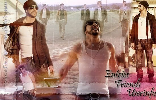
Now, I have this:
Step 15
The last and final step! I bet you’re as glad as I am to reach this point, I’ve been at this for HOURS now. Haha. It probably took longer doing this tute then it did making it first time ‘round!
Slight problem though - I know what I’ve done, but for some reason, my layer palette is not agreeing with me. Huh. I have quite possibly deleted a layer somewhere along the way. That’s my only explanation! Anyhow, the final touch to the image is the border. I’ve chosen not to use an obvious one, but rather enhanced the edges instead. Here’s how:
- select all (ctrl+a)
- copy merged (shift+ctrl+c)
- deselect all (ctrl+d)
- paste in new layer (ctrl+v)
- go to View>Rulers
- when the rulers come up, right-click and select ‘pixels’
- click and hold your mouse in the vertical rule and drag out into the image. You’ll see a line (aka a guide) which’ll stick wherever you let go of the mouse. Take this guide to the last marker on the horizontal rule (so there’s a 5px gap between the guide and the edge of the pic).
- drag a second vertical guide to the first marker on the horizontal rule.
- do the same for the horizontal (drag guides from the horizontal rule to the first and last markers on the vertical rule)
- you should now have a box marked out. Using your rectangular select tool, select all inside this box (the bulk of the image)
- go to Select>Inverse Select
- create new layer (shift+ctrl+n)
- select foreground color #790026
- use paint bucket to fill in selected area with this color
- change blend mode of layer to soft light.
EDIT: I'm SUCH a dork! I finally remember why it seems I have a missing layer before this last step - it's cos I did the border slightly differently. You get the same result but it's a MUCH easier step! Here, follow:
- select all (ctrl+a)
- copy merged (shift+ctrl+c)
- deselect all (ctrl+d)
- paste in new layer (ctrl+v)
- go to Edit>Stroke
- options: weight-5px, color-#790026, location-center, blend mode-soft light
- hit ok
And that's IT! Yeah, dork.
Now swing from the trees, shout from the rooftops, cackle in glee, you are DONE! My final image:
Phew, that took life. Please, please, please leave feedback, even if it’s a simple ‘this sucks!’ And if you try this tute, I beg you to show me your finished products. I would love to see how people interpret this!
Ps. I was contemplating doing a tute going from:
to
I was looking over the psd of it and shocked myself - it has 23 layers! And I took some steps which seem unconventional when viewed in an abstract way. I’d forgotten about many of them, this was really my technique test! If you would be interested in a tutorial for it, please leave a comment.