LIMS Session One - Round 6. Results
We have a tie, and there is quite much time passed after i've started the voting, so I think it is berret to eliminate only one person than wait more votes. So now we are saying goodbye to...
ELIMINATED:
(-6 votes)
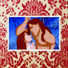
by stam_fan17
PEOPLE'S CHOICE:
(+3 votes)
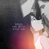
by chacusha
♥ Congratulations!
MOD'S CHOICE:
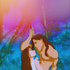
by filmowe
I like the colors! They look so natural and soft! Maybe it will be a bit better if you add some sharpness, but anyway I think this icon is pretty!)
VOTING TALLY:
01| -3
02| +1+1-1+1+1=+3
03| -1+1-1-1=-3
04| -6
05| -1+1+1-1=0
06| -1+1=0
COMMENTS:
(Your icon number is here)
(-)
#01 - Awkward cropping
#01 - as it is a bw icon, it needs more contrast; text is almost unreadable
#01 - I actually really love this icon. The only thing that bothers me is that some parts like Tarzan's chin are pixellated while other parts like Tarzan's hair are a little blurred. The result is the icon looks a little messy. Lovely cropping, text, and black & white effect, though!
#02 - The crop is very nice but the colour spot is disturbing.
#3 - Some of the text is quite hard to read. More contrast would have been nice.
3 - icon is too simple, border is excess
#03 - Gorgeous coloring and text. However, the blue border on top and bottom look too abrupt to me. I think if the edges of the image were softened to blend with the top and bottom parts, it would look better.
#4 - The texture does not fit with the image. It's totally different in color palette and style, and overshadows the icon instead of flattering it. I'd look for a texture that supports the image more. Maybe something simpler?
#04 - Background texture doesn't fit very well with the colors scheme of the icon
#04 - The colours of the backgroud do not match with the picture, the composition is nice though.
#04 - the icon seems to be os a low quality - it's a bit grainy and blurry.
4 - texture is too heavy for this icon
#04 - Such a nice idea for an icon, but the texture just doesn't seem to fit the image (I find its colour especially distracting)
#005 - The texture use is awkward & makes the icon look blotchy.
#05 - I like the colouring, even though it's a bit washed out. I feel, however, that the cropping (having Tarzan's arm cut off and too much background showing) is a little unflattering.
#006 - Great crop & use of space but the texture clashes with the blueness of the icon
(+)
#02 - Very intense. Interesting cropping and nice combination of effects!
#2 - Great crop and text use, and the texture adds well to it.
#02 - croppping is great and love the coloring effect.
#02 - The cropping is so lovely and I love the use of b&w :)
#003 - Great bright color & good use of text
#05 - The colouring is really original
5 - beautiful colouring and lights use, nothing distracting
#06 - I think the cropping is very eye-catching, and the coloring is very romantic!
ELIMINATED:
(-6 votes)

by stam_fan17
PEOPLE'S CHOICE:
(+3 votes)

by chacusha
♥ Congratulations!
MOD'S CHOICE:

by filmowe
I like the colors! They look so natural and soft! Maybe it will be a bit better if you add some sharpness, but anyway I think this icon is pretty!)
VOTING TALLY:
01| -3
02| +1+1-1+1+1=+3
03| -1+1-1-1=-3
04| -6
05| -1+1+1-1=0
06| -1+1=0
COMMENTS:
(Your icon number is here)
(-)
#01 - Awkward cropping
#01 - as it is a bw icon, it needs more contrast; text is almost unreadable
#01 - I actually really love this icon. The only thing that bothers me is that some parts like Tarzan's chin are pixellated while other parts like Tarzan's hair are a little blurred. The result is the icon looks a little messy. Lovely cropping, text, and black & white effect, though!
#02 - The crop is very nice but the colour spot is disturbing.
#3 - Some of the text is quite hard to read. More contrast would have been nice.
3 - icon is too simple, border is excess
#03 - Gorgeous coloring and text. However, the blue border on top and bottom look too abrupt to me. I think if the edges of the image were softened to blend with the top and bottom parts, it would look better.
#4 - The texture does not fit with the image. It's totally different in color palette and style, and overshadows the icon instead of flattering it. I'd look for a texture that supports the image more. Maybe something simpler?
#04 - Background texture doesn't fit very well with the colors scheme of the icon
#04 - The colours of the backgroud do not match with the picture, the composition is nice though.
#04 - the icon seems to be os a low quality - it's a bit grainy and blurry.
4 - texture is too heavy for this icon
#04 - Such a nice idea for an icon, but the texture just doesn't seem to fit the image (I find its colour especially distracting)
#005 - The texture use is awkward & makes the icon look blotchy.
#05 - I like the colouring, even though it's a bit washed out. I feel, however, that the cropping (having Tarzan's arm cut off and too much background showing) is a little unflattering.
#006 - Great crop & use of space but the texture clashes with the blueness of the icon
(+)
#02 - Very intense. Interesting cropping and nice combination of effects!
#2 - Great crop and text use, and the texture adds well to it.
#02 - croppping is great and love the coloring effect.
#02 - The cropping is so lovely and I love the use of b&w :)
#003 - Great bright color & good use of text
#05 - The colouring is really original
5 - beautiful colouring and lights use, nothing distracting
#06 - I think the cropping is very eye-catching, and the coloring is very romantic!