LIMS Session One - Round 5. Results
At last all ties are broken, so we are saying "goodbye" to...
ELIMINATED:
(-4 votes)
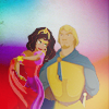
by secret_vision
PEOPLE'S CHOICE:
(+4 votes)

by rabidline
♥ Congratulations!
MOD'S CHOICE:

by secret_vision
I like this icon! The figures are really neatly cutted off, composition is nice and good use of texture!
VOTING TALLY:
01| -1-1-1+1+1-1-1-1=-4
02| -1+1+1=+1
03| -1+1+1+1+1+1=+4
04| +2
05| -1-1-1-1+1+1+1-1-1=-3
COMMENTS:
(Your icon number is here)
The rest participants, who want to get their comments in screened mode, comment here with your icon number.
(-)
#001 - Making the icon a blend is daring, but it's a little distracting because the coloring on Esmeralda doesn't match that of Phoebus (he looks a little more desaturated). Also, Phoebus's face is hard to make out. I really like how Esmeralda's dress blends into the background though -- it's a great effect!
#01 - Too many different colours.
#01 - icon is a bit too blurry and the couple melt into the background.
#01 - his facial features are poorly contrasted and his overall colouring is washed out (due to texture?).
#01 - Don't really like coloring and textures on this one. I think that crop don't good too.
#01 - The background seems a bit off to me. It doesn't have any structure - it's just sort of there. Also the couple seems fuzzy and dulled out. Perhaps wrong use of texture?
#02 -- dull crop, coloring is too dark, and text is unoriginal
#03 - texture looks distracting, also it's too dark
#05 - icon is a bit pixelated and blurry - background is distracting too.
#05 - Nice concept but bad realitazion. Colors are too dark, and the light texture makes the design of the couple too faded.
#005 - The colors are a bit too much in the sepia tones & make the icon look washed out. The harsh cut of the image also make it looks sharper than it really is.
#05 - Weird cropping, the image is too sharpened and there is too yellow in the skin's colouring.
#05 - oversaturated and they look kinda washed out or blurry, can't really understand
#05 - bad coloring, looks kinda dirty, bad quality
(+)
#01 - Nice work with the background!
#01 - awesome textures use! colors and lights look great! bravo!
#02 - Nice interpetation of the theme.
#02 - Nice cropping and colouring, the text fits perfectly the theme.
#03 - I like the composition and the pureness of colouring - great work:)
#03 - coloring is pretty and love the texture use.
#03 - very good quality and beautiful vivid coloring
#03 - good crop and coloring, greate work and texture! Awesome upic!
#03 - It's simple and clean. The background doesn't take away from the focus of the couple. The coloring is vibrant and really catches your eye.
#004 - Amazing use of space/color/texture. Just great composition really ^-^
#04 - nice colors
#005 - Very eye-catching! I love the overall color scheme of the icon.
#05 -- very pretty composition, texture use, and coloring
#05 - background texture colours blend nicely with the subject
ELIMINATED:
(-4 votes)

by secret_vision
PEOPLE'S CHOICE:
(+4 votes)

by rabidline
♥ Congratulations!
MOD'S CHOICE:

by secret_vision
I like this icon! The figures are really neatly cutted off, composition is nice and good use of texture!
VOTING TALLY:
01| -1-1-1+1+1-1-1-1=-4
02| -1+1+1=+1
03| -1+1+1+1+1+1=+4
04| +2
05| -1-1-1-1+1+1+1-1-1=-3
COMMENTS:
(Your icon number is here)
The rest participants, who want to get their comments in screened mode, comment here with your icon number.
(-)
#001 - Making the icon a blend is daring, but it's a little distracting because the coloring on Esmeralda doesn't match that of Phoebus (he looks a little more desaturated). Also, Phoebus's face is hard to make out. I really like how Esmeralda's dress blends into the background though -- it's a great effect!
#01 - Too many different colours.
#01 - icon is a bit too blurry and the couple melt into the background.
#01 - his facial features are poorly contrasted and his overall colouring is washed out (due to texture?).
#01 - Don't really like coloring and textures on this one. I think that crop don't good too.
#01 - The background seems a bit off to me. It doesn't have any structure - it's just sort of there. Also the couple seems fuzzy and dulled out. Perhaps wrong use of texture?
#02 -- dull crop, coloring is too dark, and text is unoriginal
#03 - texture looks distracting, also it's too dark
#05 - icon is a bit pixelated and blurry - background is distracting too.
#05 - Nice concept but bad realitazion. Colors are too dark, and the light texture makes the design of the couple too faded.
#005 - The colors are a bit too much in the sepia tones & make the icon look washed out. The harsh cut of the image also make it looks sharper than it really is.
#05 - Weird cropping, the image is too sharpened and there is too yellow in the skin's colouring.
#05 - oversaturated and they look kinda washed out or blurry, can't really understand
#05 - bad coloring, looks kinda dirty, bad quality
(+)
#01 - Nice work with the background!
#01 - awesome textures use! colors and lights look great! bravo!
#02 - Nice interpetation of the theme.
#02 - Nice cropping and colouring, the text fits perfectly the theme.
#03 - I like the composition and the pureness of colouring - great work:)
#03 - coloring is pretty and love the texture use.
#03 - very good quality and beautiful vivid coloring
#03 - good crop and coloring, greate work and texture! Awesome upic!
#03 - It's simple and clean. The background doesn't take away from the focus of the couple. The coloring is vibrant and really catches your eye.
#004 - Amazing use of space/color/texture. Just great composition really ^-^
#04 - nice colors
#005 - Very eye-catching! I love the overall color scheme of the icon.
#05 -- very pretty composition, texture use, and coloring
#05 - background texture colours blend nicely with the subject