round 3, challenge 1, results

Sorry for all the delays lately. I'll try to be quicker next challenge. Hope you can forgive me. =)
Unfortunately we have to say goodbye to one icon maker this week.
Eliminated:

thatdamnkiss
People's choice:

pwrld
Banner
and

lady_kingsley
Banner
Mod's choice:

heyviolette
Banner
01: - - - - -
02: + - + + -
03: + + +
04: + + +
05: - + - -
06: - +
07: + -
Look here to see your icon number.
01:
- The image is too dark, the image blends into the background too much. I also don't really know what's going on across the top left corner. It's a very strange effect overall and nothing really works.
- Icon is too blurry and texture doesn't match the icon.
02:
+ I love the use of a double crop in this icon. I like how the bottom is a closer crop of the top it really enhances the mood of the icon.
+ Great idea and coloring.
03:
+ Nice coloring.
04:
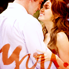
+ I love the colouring and crop on this icon. Miley's face is adorable and it's captured well in the crop. I also really like the use of text, the placement is lovely as is the colour used.
05:
- The image is far too blue overall. The hue on Miley's face is too similar to the background and it makes her fade out a little bit. The glowing orbs along the bottom distract away from the main focus of the icon which should be Katy and Miley. If some text was used over the top of the glow the effect would have been a lot better. Overall it needs more pop.
- Icon is a bit too light, maybe bigger contrast could be better.