Another coloring tutorial 8D
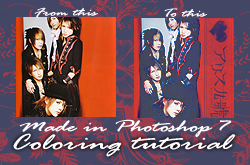
Step 1: Crop and prep your base.
I like very sharp icons, so I always sharpen (Filter>>Sharpen>>Sharpen) them once after I resize them. If your image is not that big to begin with, then I Fade it by 50% (Edit>>Fade Sharpen..).
Note: Fade Sharpen only shows up directly after you've sharpened the image. You cannot fade it later.
Step 2: Selective Coloring layer.
Go to Layer>>New Adjustment Layer>>Selective Color and input these numbers.
Reds: 0,+100, +100, +64
Yellows: +100, 0, +100, -69
Magentas: 0, +100, +100, 0
Neutrals: +100, 0, -61, 0
Blacks: 0, 0, 0, -25
This coloring works best on icons that are fairly bright with lots of reds and blacks. It will make a blue image all that much more blue. So, If your icon has a lot of blue in it, you may want to reduce the number in the Neutrals>>Cyan slot. Unless, of course, you really really like blue. ^_^
Step 3: Decorate!
Here you can enter whatever text, lighting effects, brushes you wish. I cropped the band's logo from an article, desaturated it, and rotated it to fit the icon as you see it in the header. The heart was added afterwards (I had it saved with credit to "daisukeicons" but I can't seem to find their journal now. If you know of a new journal for them, please let me know so I can link them here.). Then I brought the selective coloring layer and set it above the decorations so the blacks would match the rest of the icon.
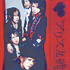
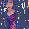
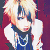
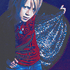
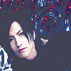
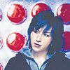
Below are a batch of icons that used this same coloring, minus the decoration because I liked them better without it. So, you can skip this step all together if you don't feel it suits your icons.
And that's it! 8D Simple, really.
1
2
3
4


5
6
7
8




9
10
11
12


13
14
15
16


I'd love to see any results people get from testing out this tutorial. ^_^
If you take any icons please comment and credit me when you use them.
You can see my other icon tutorials here.