(no subject)
Someone asked for a tutorial for this icon:
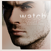
And I decided to have a go at it, even though I've never done a tutorial before. If I forget anything, by all means, comment and let me know.
I use Adobe Photoshop 7.0, it is my baby. You'll need some basic knowledge of the program to be able to follow the tutorial, it's not beginner-friendly.
I started out with this picture:
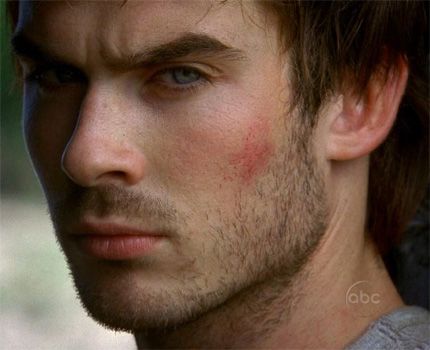
(from Lost Media)
Cropped it and got this:

Duplicate, desaturate and set the blending mode to Screen:

Duplicate again and set that layer to Soft Light:

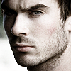
Merge and sharpen:
Create a new layer, cover it with this gradient:
Set it to Hard Light:
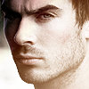
Duplicate the gradient, set to Multiply:
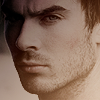
Make a new layer, take a white-to-transparent gradient and drag it half way from the top right corner:
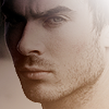
New layer, apply a simple border brush in a slightly off-white colour:
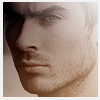
Now text. Arial size 16, anti-alias Sharp, tracking 150 (makes the text stretch horizontally). Rasterize the text layer, and erase the bottom part. A quick tiny-text brush underneath:
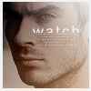
Voilá, we have our Boone icon. I obviously couldn't make it exactly the same, my memory just sucks and I made that icon over a week ago. For information about the gradients and brushes I used, check my resources page.
I hope that was helpful to someone! Feel free to use the icon, just credit crazy_perfume. Oh, and I don't mean to brag (sure I do), but that icon won 1st place at lost_stillness. ^^

And I decided to have a go at it, even though I've never done a tutorial before. If I forget anything, by all means, comment and let me know.
I use Adobe Photoshop 7.0, it is my baby. You'll need some basic knowledge of the program to be able to follow the tutorial, it's not beginner-friendly.
I started out with this picture:

(from Lost Media)
Cropped it and got this:

Duplicate, desaturate and set the blending mode to Screen:

Duplicate again and set that layer to Soft Light:

Merge and sharpen:

Create a new layer, cover it with this gradient:

Set it to Hard Light:

Duplicate the gradient, set to Multiply:

Make a new layer, take a white-to-transparent gradient and drag it half way from the top right corner:

New layer, apply a simple border brush in a slightly off-white colour:

Now text. Arial size 16, anti-alias Sharp, tracking 150 (makes the text stretch horizontally). Rasterize the text layer, and erase the bottom part. A quick tiny-text brush underneath:

Voilá, we have our Boone icon. I obviously couldn't make it exactly the same, my memory just sucks and I made that icon over a week ago. For information about the gradients and brushes I used, check my resources page.
I hope that was helpful to someone! Feel free to use the icon, just credit crazy_perfume. Oh, and I don't mean to brag (sure I do), but that icon won 1st place at lost_stillness. ^^