tutorial 005.
A friend of mine requested a tutorial for one of the Evi icons in the last batch.
This will be in NO way comparable to my last tut, which was a hit. (yay!)
But nonetheless, it might be helpful, and I always like to stay useful.
No step-by-step pictures this time, I'm a little rushed at the moment.
Subject- Evangeline Lilly
Difficulty- Beginner
Program- PS CS2
Translatable- Yes
TO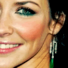
This tutorial will NOT work for every icon. It is meant to be used as a guide, and to help you come up with techniques of your own as a result of fiddling with colors and layers. Please do not replicate the example exactly for posting purposes, but feel free to practice with this base.
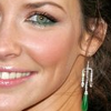
001.
Duplicate your base and set it to screen at 100%.
Duplicate your screen layers as many times as it takes until your base is nice and bright.
You can always go back and lower the opacities later on.
Sharpen if needed.
002.
Create the following color layers.
(#729D80) - softlight at 100%.
(#9CB49D) - softlight at 100%.
(#7878A7) - colorburn at 100%.
(#EFE3C6) - multiply at 70%.
(#A4C4BB) - softlight at 100%.
(#797979) - colorburn at 30%.
003.
Create a brightness/contrast adjustment layer.
Increase the contrast +10.
004.
If your base is still too dark, which mine was slightly, duplicate your base and drag it to the top.
Set it to screen at 20%.
005.
Evi's cheek and lips were lacking alot of color.
I created a new, blank layer and set it to softlight.
With a smaller round brush, I went over those areas with a reddish color.
I lowered the opacity of the layer to 20%, giving it a little more natural color.
Again, sorry its not as detailed, but I think its still pretty easy, yes?
Any questions/comments/etc, leave it here.
This will be in NO way comparable to my last tut, which was a hit. (yay!)
But nonetheless, it might be helpful, and I always like to stay useful.
No step-by-step pictures this time, I'm a little rushed at the moment.
Subject- Evangeline Lilly
Difficulty- Beginner
Program- PS CS2
Translatable- Yes
TO
This tutorial will NOT work for every icon. It is meant to be used as a guide, and to help you come up with techniques of your own as a result of fiddling with colors and layers. Please do not replicate the example exactly for posting purposes, but feel free to practice with this base.
001.
Duplicate your base and set it to screen at 100%.
Duplicate your screen layers as many times as it takes until your base is nice and bright.
You can always go back and lower the opacities later on.
Sharpen if needed.
002.
Create the following color layers.
(#729D80) - softlight at 100%.
(#9CB49D) - softlight at 100%.
(#7878A7) - colorburn at 100%.
(#EFE3C6) - multiply at 70%.
(#A4C4BB) - softlight at 100%.
(#797979) - colorburn at 30%.
003.
Create a brightness/contrast adjustment layer.
Increase the contrast +10.
004.
If your base is still too dark, which mine was slightly, duplicate your base and drag it to the top.
Set it to screen at 20%.
005.
Evi's cheek and lips were lacking alot of color.
I created a new, blank layer and set it to softlight.
With a smaller round brush, I went over those areas with a reddish color.
I lowered the opacity of the layer to 20%, giving it a little more natural color.
Again, sorry its not as detailed, but I think its still pretty easy, yes?
Any questions/comments/etc, leave it here.