049
I really haven't been making icons/graphics for that many years, but I do believe I've learned a lot about the styling over the years and have improved a lot since I first began. I've stuck mainly with icons and mixes, but after getting onto tumblr fell into the trap that is tumblr graphics. And with my mixes, I went from just making covers to also creating mini picspams or lyrics graphics to go along with the mix. I think my biggest improvement is probably cropping, since before I would just take any picture, resize, and go from there. Now I'm more specific and try to choose caps that I think could be cropped in an interesting way, and then I experiment with the cropping before deciding on which to use. Text is another big thing for me. I've loved typography for a long time and was always scared to try it myself, especially when I was doing so on such a small canvas. But I did, and at first I wasn't knowledgeable on all the smaller aspects so I was really just typing and stamping it onto the icon. Maybe I would go big and change the colour, text, or size-but that's not very exciting and doesn't make for a very interesting end result. Over the years I've learned more, though, and am still learning. Still, I'd say text is definitely my second best in improvements.
Here are the icons I'm most proud of:
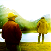
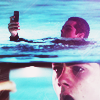
I wanted this one so badly, but at first the crop just wouldn't work. They both wouldn't fit, and I wasn't yet that experienced with extending backgrounds so it was a no go. I didn't want to completely removed the mountains, either, so I was stuck. Eventually I cropped Ennis in one rectangle, Jack in another, and just pushed them closer together until they fit in a square. I love the colouring I did with this as well. Simple, not too vibrant, dark but colourful.
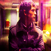
Although it seems a bit too vibrant now, I've always loved this one. It's simple but not.The colours are very one toned and not overbearing. Tommy looking off to the side, yet I still decided to crop him dead center because it seemed to work better. I then duplicated and motion blurred and screened that layer over top to get the kind of blurred/grunge effect. The b&w one I just added a gradient over top and adjusted the levels to make the shadows less dark and lighten up Tommy's face a bit more.
I love b&w. It's my favourite thing in graphics and photography. I love it best in emotional graphics and pictures because the no colour, shadows, and darkness adds so much more to the emotions. This is a simple icon and something everyone made after the episode but it's still a favourite. Good crop, good colouring (I think, anyway).
John&Mary foreverandalways<3 I just really like the crop, even if it's a bit odd and cuts of faces. Simple colouring, but I was focused more on brightening the characters and keeping the shadows and background darker.
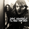
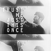
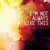
Text. I was really proud with how this turned out. Simple black and white colouring because I couldn't get a good colouring with this stupid cap I felt it fit the scene better.
I had never tried blocking and blocking before. This one happened by accident but I love how it layered like that.
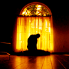
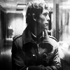
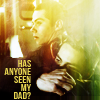
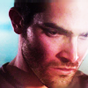
Incredibly simple icon but I wanted to icon this cap so badly because of the lighting and shadows, and the way the characters are positioned.
Again with the blending and blocking, but this time it was intentional :P
More blending experimentation. Added textures to cover up some too distracting spots and help blend more. Text because it seemed too empty without.
Again some accidental leveling that turned out actually okay. I had the colour version but decided B&W as well because it toned down the image and brought more focus to the characters instead of the water. The last because that spot was begging for text.
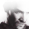
Usualy when I crop faces it's simple and like every other crop in existence. With this, his head is tilted down a bit so it was impossible to do a clean crop so this instead. It didn't look horrendous, though, and it still portrays the emotion really well. B&W again, plus some texture use to fade out the top because his forehead seemed too distracting, ha.

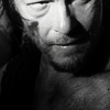
Had him cropped dead center. Things at the sides were too distracting. Added the texture to cover those up and to frame Daryl a bit.
Again with facial cropping. Usually I crop to the side, not to the top. But while moving the image around this one happened and I decided to keep it.
I had just the top image but decided the bottom looked too empty and leaving in his body looked weird. I was going along with the lyrics as well and decided to add in a smiling Mitchell to go with lyrics and fill in the bottom. Texture because the side there was really bright and white and uber distracting.

Started getting into background replacement this past year. I am glad I managed to figure it out because sometimes you really want the screencap for the character but the background is horrendous. Easy fix, that:)

Another obscure facial crop for me. I also like how the ~texture~ turned out like that. It was around the time that whole paintbrush effect thing was in craze and I always wondered how people made icons that way. I sort of did it accidentally and was all :O :D

Another where I stumbled upon a paintbrush effect, ha. How the hell do I do this? I still don't know how it happened. Blackened out beside and under to focus more on Emma's face.

Dov Epstein that's why. I have no idea how it happened but I cut out the background and wound up with a 3Dish looking image. Black and white because the colours looked too bland.

More paintbrush with added 3Dishness. Man, I need to remember how I do these things because I really like it. Simple colouring, onetoned to match the shirt.

Another proud of the text icon. Added the texture to cover up parts of his shirt/body that seemed distracting, then the text when the texture looked too overbearing and out of place on the side.

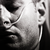
Simple centre crop, focusing on the face because eyes/beard/scrapes. B&W after coloured seemed too bright and took focus away from eyes (emotions!)
Here are the icons I'm most proud of:
I wanted this one so badly, but at first the crop just wouldn't work. They both wouldn't fit, and I wasn't yet that experienced with extending backgrounds so it was a no go. I didn't want to completely removed the mountains, either, so I was stuck. Eventually I cropped Ennis in one rectangle, Jack in another, and just pushed them closer together until they fit in a square. I love the colouring I did with this as well. Simple, not too vibrant, dark but colourful.
Although it seems a bit too vibrant now, I've always loved this one. It's simple but not.The colours are very one toned and not overbearing. Tommy looking off to the side, yet I still decided to crop him dead center because it seemed to work better. I then duplicated and motion blurred and screened that layer over top to get the kind of blurred/grunge effect. The b&w one I just added a gradient over top and adjusted the levels to make the shadows less dark and lighten up Tommy's face a bit more.
I love b&w. It's my favourite thing in graphics and photography. I love it best in emotional graphics and pictures because the no colour, shadows, and darkness adds so much more to the emotions. This is a simple icon and something everyone made after the episode but it's still a favourite. Good crop, good colouring (I think, anyway).
John&Mary foreverandalways<3 I just really like the crop, even if it's a bit odd and cuts of faces. Simple colouring, but I was focused more on brightening the characters and keeping the shadows and background darker.
Text. I was really proud with how this turned out. Simple black and white colouring because I couldn't get a good colouring with this stupid cap I felt it fit the scene better.
I had never tried blocking and blocking before. This one happened by accident but I love how it layered like that.
Incredibly simple icon but I wanted to icon this cap so badly because of the lighting and shadows, and the way the characters are positioned.
Again with the blending and blocking, but this time it was intentional :P
More blending experimentation. Added textures to cover up some too distracting spots and help blend more. Text because it seemed too empty without.
Again some accidental leveling that turned out actually okay. I had the colour version but decided B&W as well because it toned down the image and brought more focus to the characters instead of the water. The last because that spot was begging for text.
Usualy when I crop faces it's simple and like every other crop in existence. With this, his head is tilted down a bit so it was impossible to do a clean crop so this instead. It didn't look horrendous, though, and it still portrays the emotion really well. B&W again, plus some texture use to fade out the top because his forehead seemed too distracting, ha.
Had him cropped dead center. Things at the sides were too distracting. Added the texture to cover those up and to frame Daryl a bit.
Again with facial cropping. Usually I crop to the side, not to the top. But while moving the image around this one happened and I decided to keep it.
I had just the top image but decided the bottom looked too empty and leaving in his body looked weird. I was going along with the lyrics as well and decided to add in a smiling Mitchell to go with lyrics and fill in the bottom. Texture because the side there was really bright and white and uber distracting.
Started getting into background replacement this past year. I am glad I managed to figure it out because sometimes you really want the screencap for the character but the background is horrendous. Easy fix, that:)
Another obscure facial crop for me. I also like how the ~texture~ turned out like that. It was around the time that whole paintbrush effect thing was in craze and I always wondered how people made icons that way. I sort of did it accidentally and was all :O :D
Another where I stumbled upon a paintbrush effect, ha. How the hell do I do this? I still don't know how it happened. Blackened out beside and under to focus more on Emma's face.
Dov Epstein that's why. I have no idea how it happened but I cut out the background and wound up with a 3Dish looking image. Black and white because the colours looked too bland.
More paintbrush with added 3Dishness. Man, I need to remember how I do these things because I really like it. Simple colouring, onetoned to match the shirt.
Another proud of the text icon. Added the texture to cover up parts of his shirt/body that seemed distracting, then the text when the texture looked too overbearing and out of place on the side.
Simple centre crop, focusing on the face because eyes/beard/scrapes. B&W after coloured seemed too bright and took focus away from eyes (emotions!)