036
"What are your best Icons of 2012/2013" Meme?
2012 was the year I decided to purge my old icon community and create a new one. It was to clear things out and have a more organized community for displaying my graphics. Mainly icons, but I also enjoy mixes and picspams as well (although few are posted here; I'm still in the process of moving things over). I don't think I made a lot of icons, but it was definitely time of experimenting and learning more and basically, trying out a ton of different iconning styles. (And going cuckooforcocoapuffs with icon challenges). Fresh start and all that, yeah? Below are icons I made throughout 2012 (and early 2013) that (I believe) show my progression.
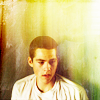
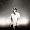
Posted February 28 2013; John Mitchell claimed for tvcharacter20
Being Human BBC was one of those shows I really got into quickly and marathoned the hell out of it online. And of course, dove into graphics making with.
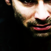
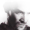
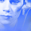
#1 I've noticed an icon trend involving icons that look painted, or as if they were done with pastel and turned cartoony. I never could figure out how the hell to get that effect myself but alas, I accidentally did it with this icon and I really quite like it. I was focused more on the crop and his expression (the theme for this was 'conflict' and I felt this scene was the epitome of Mitchell's conflict with being a vampire and losing control) and so the colouring was all done last minute, quickly, with me trying not to overdo it and keep it simple so the focus on his face wasn't taken away. And, well, I wound up with that effect I had never been able to figure out but lovedlovedloved<3
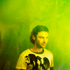
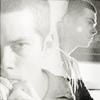
#2 Basically, theme was green. I've been experimenting a lot with selective colour and textures and I really liked how I was able to make this icon with those and not overpower it. I managed to have the overall colour be green and fit the theme, and yet at thesame time still make Mitchell visible, the main focus, and looking human. I also try to experiment with cutting out backgrounds if they seem too distracting and I've found that lately, I've gotten better at it, ha.
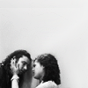
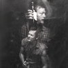
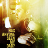
#3 Soso simple, but of course my main focus was meant to be Mitchell and Annie, their faces, Annie's hands. (The theme was plus one, and this image spoke to me, ya know?). I love icons that are incredibly simple and empty yet show so much. And I guess that's what I tried to do here. I also really love black and white icons and find that it works great on icons where you don't want a million colours distracting you from the main focus. (Also great for close ups involving faces/emotions, I find).
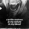
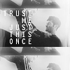
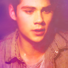
#4 Ah. Black and white icon again. I had it in colour at first, to show the blood, but then I felt that distracted too much from the text. I also had his whole face showing, but then decided the fangs would be the perfect focus and go with the text. (This was from the category set: choose one song and incorporate at least three lines onto each icon; I chose Glittering Cloud by Imogen Heap, which screamed John Mitchell to me). So, fangtastic Mitchell for you all.
----
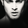
Another set of icons or tvcharacter20, this time the claim was Daryl Dixon (The Walking Dead). These were posted on December 20th 2012.
So, TWD. Amazing show. Almost watced from the beginning but was sick that Halloween and by the time 10pm rolled round I just wanted bed:P But then I found out Norman Reedus (had just saw BDS for the first time not too long before) was in it, and well...watched every marathon of the first season AMC had, marathoned it online, fell in love, and have been following it since. So, graphics, of course-y main way of geeking out over fandoms (well, besides tumblr-but making graphics is a bit more fun).


[holy black and white batman!]
#1 Also been experimenting with blending. I find that blocking works just fine, but sometimes I find that the two images merging together would work better and look neater. Here the theme was drink-and ofc I chose from this scene:P-and I thought putting the two together would look less plain and more interesting than just one or the other. I really just like how I blended these two images together, though, ha.
#2 and #3 were both from the category set: images from the same scene. I had just seen that episode and looking through screencaps was torn by Daryl's face. Norman's acting in this scene was marvelous; he showed emotions soso well and really developed his character. (What I love about this show: the way they can have the toughest characters break and fray and still manage to be that person you've know all along. Ah. The characters and their developments throughout just three short seasons is so beautiful<3). Erm...#2, I was again experimenting with erasing the background and textures; #3, close crops and facial expressions. #3 is definitely my favourite icon (if my main display icon wasn't an indication of that..)
#4 Artist's choice set. I'm not overly fond of the colouring because it seems a bit faded, but overall I love the crop and the way his head is darkened a bit yet still visible and uhm. Armporn coughcough.
----
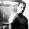
Hm, Teen Wolf. I only just got into thisshow last year but fell in headlong and grew slightly obsessed. I marathoned both seasons online and went crazy with graphics making:P
These are from a random batch of TW icons posted November 25 2012
I had a few alternatives in this batch, #3 and #4 being two of them.
For #3 I had done it in colour, no text, then b&w, then this one with text. I really love how the blocking turned out on this, with the subtle blending and in the end I felt this was the best because the text was one of the things that added well to this whole scene-neither could really survive without helping the other yet they were too stubborn to admit it.
With #4, I had it in colour with none of Derek's head faded out. But then when I converted to black and white I felt like his forehead really drew away from the icon-it was his facial expression I was trying to focus on and fading out at the top helped to do that.
#1
just experimenting with blending again. And Isaac in this scene:(:( I loved how easily he went from predator!wolf to scared!teen. :/
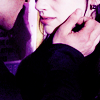
Annnnd #2 cause it's pretty. I really wanted to focus on the touch because that was definitely the main subject of the scene. And simple pinkish colouring to not overbrighten/colour the skin, haha.
----
Teen Wolf again. This time, it was a claim of Stiles Stilinski for tvcharacter20.
#1 Blending and black and white again. This was such a wonderful scene and I wanted to try and portray Stiles acting fine aginst his being nervous without realizing-to go with the quote (he's fine except for...) because he would love to be fine but realizes subconsciously that he uisn't. And his body seems to think nd act the same way. Black and white but I felt colours would just take away from the icon.
#2 Ah, my main experimentations were blending, heh. I loved how this one turned out, actually. The text was added last minute, mainly because I had that giant empty space in the corner-lol-but lso because I felt it helped tie the whole icon together.
#3 A bit more simple. Just cutting out BG and texture experimenting.
#4 Again, really simple, but I loved the subtle colours and blurred/faded effect I achieved. (Also seemed to get that pastely effect again witnhout meaning too???)
----
TEEN WOLF AGAIN
Looking at this batch, I kinda hate most of the icons lol.
Teen Wolf claim for inspired20in20-theme was rainbows or coloursor something IDK Septembe 3 2012
#1 TEXTTEXTTEXT Yah, apparently putting text over face is BAD but IDK I liked it...
#2 Yup, I suppose if I'd done this later in the year I would have tried blending a bit more. Butalas, just basic blocking here:)
#3 Cropping and er. I dunno. I didn't really do a lot of anytrhing with this batch did I?
#4 ^^ Really. Ah :/
----
OMG LETS FORGET THIS NEVER HAPPENED HAHA
Mixed; August 29 2012
[itoldyouilikedblackandwhite]
#1 I really like the shading in this. But looking back, cutting out the BG would have really helped in drawing the focus to Steve more.
#2 Texturesssss. I started experimenting a lot with them last year. This i an icon where it doesn't look I just put a texture on and saved.
#3 Haaaa. I remember seeing this pic and squeeing because IT WOULD MAKE SUCH A GOOD ICON and it did. Except...The light blob thingy? WTF is that omg.
#4 More contrast would have been nice. I have an alternate without text...erm. I think I should have made the text a bit less subtle:P
2012 was the year I decided to purge my old icon community and create a new one. It was to clear things out and have a more organized community for displaying my graphics. Mainly icons, but I also enjoy mixes and picspams as well (although few are posted here; I'm still in the process of moving things over). I don't think I made a lot of icons, but it was definitely time of experimenting and learning more and basically, trying out a ton of different iconning styles. (And going cuckooforcocoapuffs with icon challenges). Fresh start and all that, yeah? Below are icons I made throughout 2012 (and early 2013) that (I believe) show my progression.
Posted February 28 2013; John Mitchell claimed for tvcharacter20
Being Human BBC was one of those shows I really got into quickly and marathoned the hell out of it online. And of course, dove into graphics making with.
#1 I've noticed an icon trend involving icons that look painted, or as if they were done with pastel and turned cartoony. I never could figure out how the hell to get that effect myself but alas, I accidentally did it with this icon and I really quite like it. I was focused more on the crop and his expression (the theme for this was 'conflict' and I felt this scene was the epitome of Mitchell's conflict with being a vampire and losing control) and so the colouring was all done last minute, quickly, with me trying not to overdo it and keep it simple so the focus on his face wasn't taken away. And, well, I wound up with that effect I had never been able to figure out but lovedlovedloved<3
#2 Basically, theme was green. I've been experimenting a lot with selective colour and textures and I really liked how I was able to make this icon with those and not overpower it. I managed to have the overall colour be green and fit the theme, and yet at thesame time still make Mitchell visible, the main focus, and looking human. I also try to experiment with cutting out backgrounds if they seem too distracting and I've found that lately, I've gotten better at it, ha.
#3 Soso simple, but of course my main focus was meant to be Mitchell and Annie, their faces, Annie's hands. (The theme was plus one, and this image spoke to me, ya know?). I love icons that are incredibly simple and empty yet show so much. And I guess that's what I tried to do here. I also really love black and white icons and find that it works great on icons where you don't want a million colours distracting you from the main focus. (Also great for close ups involving faces/emotions, I find).
#4 Ah. Black and white icon again. I had it in colour at first, to show the blood, but then I felt that distracted too much from the text. I also had his whole face showing, but then decided the fangs would be the perfect focus and go with the text. (This was from the category set: choose one song and incorporate at least three lines onto each icon; I chose Glittering Cloud by Imogen Heap, which screamed John Mitchell to me). So, fangtastic Mitchell for you all.
----
Another set of icons or tvcharacter20, this time the claim was Daryl Dixon (The Walking Dead). These were posted on December 20th 2012.
So, TWD. Amazing show. Almost watced from the beginning but was sick that Halloween and by the time 10pm rolled round I just wanted bed:P But then I found out Norman Reedus (had just saw BDS for the first time not too long before) was in it, and well...watched every marathon of the first season AMC had, marathoned it online, fell in love, and have been following it since. So, graphics, of course-y main way of geeking out over fandoms (well, besides tumblr-but making graphics is a bit more fun).
[holy black and white batman!]
#1 Also been experimenting with blending. I find that blocking works just fine, but sometimes I find that the two images merging together would work better and look neater. Here the theme was drink-and ofc I chose from this scene:P-and I thought putting the two together would look less plain and more interesting than just one or the other. I really just like how I blended these two images together, though, ha.
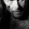
#2 and #3 were both from the category set: images from the same scene. I had just seen that episode and looking through screencaps was torn by Daryl's face. Norman's acting in this scene was marvelous; he showed emotions soso well and really developed his character. (What I love about this show: the way they can have the toughest characters break and fray and still manage to be that person you've know all along. Ah. The characters and their developments throughout just three short seasons is so beautiful<3). Erm...#2, I was again experimenting with erasing the background and textures; #3, close crops and facial expressions. #3 is definitely my favourite icon (if my main display icon wasn't an indication of that..)
#4 Artist's choice set. I'm not overly fond of the colouring because it seems a bit faded, but overall I love the crop and the way his head is darkened a bit yet still visible and uhm. Armporn coughcough.
----
Hm, Teen Wolf. I only just got into thisshow last year but fell in headlong and grew slightly obsessed. I marathoned both seasons online and went crazy with graphics making:P
These are from a random batch of TW icons posted November 25 2012
I had a few alternatives in this batch, #3 and #4 being two of them.
For #3 I had done it in colour, no text, then b&w, then this one with text. I really love how the blocking turned out on this, with the subtle blending and in the end I felt this was the best because the text was one of the things that added well to this whole scene-neither could really survive without helping the other yet they were too stubborn to admit it.
With #4, I had it in colour with none of Derek's head faded out. But then when I converted to black and white I felt like his forehead really drew away from the icon-it was his facial expression I was trying to focus on and fading out at the top helped to do that.
#1
just experimenting with blending again. And Isaac in this scene:(:( I loved how easily he went from predator!wolf to scared!teen. :/
Annnnd #2 cause it's pretty. I really wanted to focus on the touch because that was definitely the main subject of the scene. And simple pinkish colouring to not overbrighten/colour the skin, haha.
----
Teen Wolf again. This time, it was a claim of Stiles Stilinski for tvcharacter20.
#1 Blending and black and white again. This was such a wonderful scene and I wanted to try and portray Stiles acting fine aginst his being nervous without realizing-to go with the quote (he's fine except for...) because he would love to be fine but realizes subconsciously that he uisn't. And his body seems to think nd act the same way. Black and white but I felt colours would just take away from the icon.
#2 Ah, my main experimentations were blending, heh. I loved how this one turned out, actually. The text was added last minute, mainly because I had that giant empty space in the corner-lol-but lso because I felt it helped tie the whole icon together.
#3 A bit more simple. Just cutting out BG and texture experimenting.
#4 Again, really simple, but I loved the subtle colours and blurred/faded effect I achieved. (Also seemed to get that pastely effect again witnhout meaning too???)
----
TEEN WOLF AGAIN
Looking at this batch, I kinda hate most of the icons lol.
Teen Wolf claim for inspired20in20-theme was rainbows or coloursor something IDK Septembe 3 2012
#1 TEXTTEXTTEXT Yah, apparently putting text over face is BAD but IDK I liked it...
#2 Yup, I suppose if I'd done this later in the year I would have tried blending a bit more. Butalas, just basic blocking here:)
#3 Cropping and er. I dunno. I didn't really do a lot of anytrhing with this batch did I?
#4 ^^ Really. Ah :/
----
OMG LETS FORGET THIS NEVER HAPPENED HAHA
Mixed; August 29 2012
[itoldyouilikedblackandwhite]
#1 I really like the shading in this. But looking back, cutting out the BG would have really helped in drawing the focus to Steve more.
#2 Texturesssss. I started experimenting a lot with them last year. This i an icon where it doesn't look I just put a texture on and saved.
#3 Haaaa. I remember seeing this pic and squeeing because IT WOULD MAKE SUCH A GOOD ICON and it did. Except...The light blob thingy? WTF is that omg.
#4 More contrast would have been nice. I have an alternate without text...erm. I think I should have made the text a bit less subtle:P