LIMS Round 2 Challenge 4 Results
This week we have to say goodbye to ...
acting_chica with 3 negative votes

Community Choice with 2 positive votes ...

by fluorescentt

by eclecticglamour
Votes Tally
01: -0 +2
02: -0 +2
03: -0 +1
04: -2 +0
05: -3 +0
COMMENTS TABLE
~ONE~
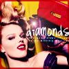
+ Original, i like the placing of the text and the crop.
+ I like this, it's quirky with the text, and the coloring is fantastic.
~TWO~
+ I love this kind of coloring! also good cropping!
+ lovely cropping
~THREE~
+ simple yet cute and still has colour. very well done
~FOUR~
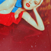
- The orange overpowers the icon. Less is more.
- because the photoshoot had amazing colour, it seems really unfair to the subject matter to desaturate it. Playing up the colours, or at least keeping them, would have kept the icon more interesting. What colour there is and the brushes seem to take away from the subject as well.
~FIVE~
- not very good cropping and text looks really random and not thought through.
- The icon looks too blurry, and it was too oversaturated. Also the text here overwhelms the whole icon and drwas the attention there instead of to the picture.
- the word does not fit in to theme and the border is unsuitable
acting_chica with 3 negative votes
Community Choice with 2 positive votes ...
by fluorescentt
by eclecticglamour
Votes Tally
01: -0 +2
02: -0 +2
03: -0 +1
04: -2 +0
05: -3 +0
COMMENTS TABLE
~ONE~
+ Original, i like the placing of the text and the crop.
+ I like this, it's quirky with the text, and the coloring is fantastic.
~TWO~
+ I love this kind of coloring! also good cropping!
+ lovely cropping
~THREE~
+ simple yet cute and still has colour. very well done
~FOUR~
- The orange overpowers the icon. Less is more.
- because the photoshoot had amazing colour, it seems really unfair to the subject matter to desaturate it. Playing up the colours, or at least keeping them, would have kept the icon more interesting. What colour there is and the brushes seem to take away from the subject as well.
~FIVE~
- not very good cropping and text looks really random and not thought through.
- The icon looks too blurry, and it was too oversaturated. Also the text here overwhelms the whole icon and drwas the attention there instead of to the picture.
- the word does not fit in to theme and the border is unsuitable