Progress Report 2015
I personally love reading these end-of-year posts, so I decided to do one myself. I was a little hesitant at first because I actually didn't do much iconning this year until May. But then I realized that just because I didn't start in January doesn't mean I didn't improve, so why not share all the same XD
There may be some overlap in the month-by-month because I'm basing these on when the icons were posted to my journal. It still serves as a pretty good outline of my year though.
january-may
I'd been struggling to get back into iconning more regularly, and finally just decided that it was important enough that I should just jump back in and make it work. Thankfully, all that pent up creativity I'd been holding back made up for my somewhat rusty skills.
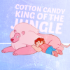
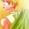
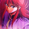
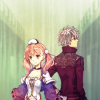
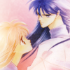
focus: grainy textures, pastel coloring
may
I jumped right into doing contests again, opened up a request post, did a 20in20. Basically any way to stay active, I tried it. Looking back, I can tell I was exploring my own style again. Trying to figure out how my style would evolve and what to focus on improving for the rest of the year.
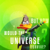
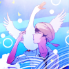

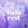
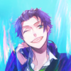
focus: typography, complex texture usage.
june
June is usually one of my most creative points of the year, so I tried even more new things. My goal was to keep making icons, and make sure that I was proud of every single icon that went out so that I would be motivated to keep improving.
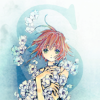
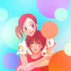
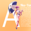
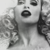
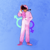
focus: layering typography and textures, 3 distinct colors or more in a single icon
july-august
RL doesn't always agree with your ambition, so there was a slow period over the summer in terms of icon making. I think the only reason I got any icons completed was thanks to participating in a 20in20, and opening up my first Screencap Battle.
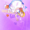

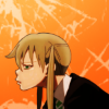
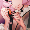
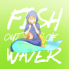
focus: lighting techniques, typography effects
september
Thankfully, the dry spell ended and I was able to participate more regularly in communities again. Notice that the colors are getting darker? Well, that's actually a seasonal thing. I felt pastels were "so last summer" and began to gravitate toward jewel tones.
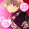
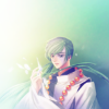
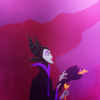
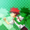
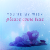
focus: lighting, layering textures
october
I joined a couple of 20in20s in October, which ended up being a lot of fun. One was a Screencap Battle, and one was for Disney. Playing with different animation styles was a lot of fun, and I think it really helped my animanga icons improve as well. I think this ended up being one of my most productive months of the year.
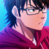
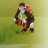
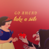
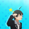

focus: non-standard coloring (for me), more complex use of textures
november-december
There's some overlap between November and December because I entered a few contests like turbo_rumble and the 400th Challenge Celebration at disney_hush, so those icons couldn't be shared until December. In the span of these two months I also opened up a new graphics journal, classic_shades!
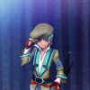
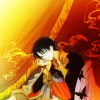
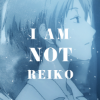
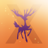


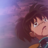
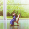
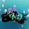
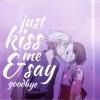
focus: creative composition, darker coloring, muted coloring, lighting
january forecast
Seeing my style evolve through this post is a huge motivation for me to continue to improve and stay active in the iconning community. Hopefully this time next year, I can do a similar post that includes all twelve months.
My resolutions are to focus on: complex composition, darker coloring, new typography styles, grayscale/b&w, close crops, and using more than two distinct colors in a single icon.
There may be some overlap in the month-by-month because I'm basing these on when the icons were posted to my journal. It still serves as a pretty good outline of my year though.
january-may
I'd been struggling to get back into iconning more regularly, and finally just decided that it was important enough that I should just jump back in and make it work. Thankfully, all that pent up creativity I'd been holding back made up for my somewhat rusty skills.
focus: grainy textures, pastel coloring
may
I jumped right into doing contests again, opened up a request post, did a 20in20. Basically any way to stay active, I tried it. Looking back, I can tell I was exploring my own style again. Trying to figure out how my style would evolve and what to focus on improving for the rest of the year.
focus: typography, complex texture usage.
june
June is usually one of my most creative points of the year, so I tried even more new things. My goal was to keep making icons, and make sure that I was proud of every single icon that went out so that I would be motivated to keep improving.
focus: layering typography and textures, 3 distinct colors or more in a single icon
july-august
RL doesn't always agree with your ambition, so there was a slow period over the summer in terms of icon making. I think the only reason I got any icons completed was thanks to participating in a 20in20, and opening up my first Screencap Battle.
focus: lighting techniques, typography effects
september
Thankfully, the dry spell ended and I was able to participate more regularly in communities again. Notice that the colors are getting darker? Well, that's actually a seasonal thing. I felt pastels were "so last summer" and began to gravitate toward jewel tones.
focus: lighting, layering textures
october
I joined a couple of 20in20s in October, which ended up being a lot of fun. One was a Screencap Battle, and one was for Disney. Playing with different animation styles was a lot of fun, and I think it really helped my animanga icons improve as well. I think this ended up being one of my most productive months of the year.
focus: non-standard coloring (for me), more complex use of textures
november-december
There's some overlap between November and December because I entered a few contests like turbo_rumble and the 400th Challenge Celebration at disney_hush, so those icons couldn't be shared until December. In the span of these two months I also opened up a new graphics journal, classic_shades!


focus: creative composition, darker coloring, muted coloring, lighting
january forecast
Seeing my style evolve through this post is a huge motivation for me to continue to improve and stay active in the iconning community. Hopefully this time next year, I can do a similar post that includes all twelve months.
My resolutions are to focus on: complex composition, darker coloring, new typography styles, grayscale/b&w, close crops, and using more than two distinct colors in a single icon.