Icon Tutorial 13
I was cleaning out my dusty inbox and realized that I hadn't posted this yet! I'm so very sorry I didn't realize until now, but hopefully it'll still be fun to read through anyway XD
This was requested by kayable.
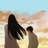
to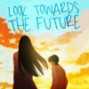
01: Start by cropping your image. I needed a lot of negative space for the text that I will be adding later, so I need to create more sky. For this first step I simply create a new layer underneath the icon and fill it in with the light blue color at the top.

02: Next I doodle in the rest of the missing clouds. Nothing fancy, just a fuzzy brush to cover up the hard lines. Icon sized stuff usually is easy to fake this... I've done it a lot to add negative space.

03: Now I want to brighten up the image, so I create a New From Visible layer and use the Gaussian Blur tool.

This layer goes on Hard Light at 22.0 Opacity.
04: I want a little more contrast in the colors so I create another New From Visible layer on multiply. I don't really like the way it looks, so I go into the Curves feature and just mess around until the colors look good. For the record, this layer is at 60.0 Opacity.
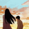
This is what the layer looks like when it's not on multiply.
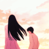
05: This is looking good, but not quite enough contrast. I create another New From Visible layer, and amp up the contrast with the Brightness-Contrast tool.
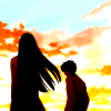
That gets put down to 40.0 Opacity.
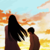
06: I'm pleased with this, so now I'm going to make the colors pretty! I add this texture by vividtruth on Overlay, around 30.0 Opacity.
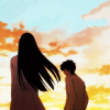
07: I like the contrast, but I also want this to blend a bit better, so I use a fuzzy brush and paint a light color from the clouds around the hair in the center of the icon. That gets blurred really good. I like using the Smudge Tool, and Gaussian Blur.
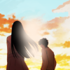
That gets put on Screen at 30.0 Opacity.
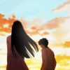
08: Now back to coloring. I add this texture by an unknown source on Screen at about 20.0 Opacity.

09: New From Visible, Gaussian Blur, Hard Light at about 30.0 Opacity.
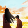
10: I create a New From Visible layer, and mess around in curves until I get something like this.
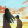
That goes down to 50.0 Opacity.
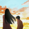
11: Now I want to selectively brighten some of the colors, so I use a fuzzy brush and paint colors into certain areas that I want to pop.
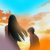
That gets put on Overlay, and I adjust the Opacity for the right intensity. That will vary from icon to icon, sometimes you'll even need to duplicate this type of layer a few times if you want something super strong. For this I only needed this layer at about 50.0 Opacity.
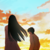
12: To add a bit of a gradient I add this texture by sanctuarylight at around 65.0 Opacity on Overlay.
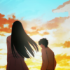
13: Looking at the icon, I realize that the yellow and the blue is a really lovely contrast, but I want to amp up the gold a bit more, so I add this texture by deliquesce. It's oversized, so I use a corner with a lot of yellow. It gets put on Soft Light at 40.0 Opacity.
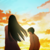
14: Now I go into Hue-Saturation and really brighten up those colors.
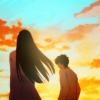
That gets put on 40.0 Opacity.
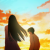
15: Now this is the point where I was going to add the text. The theme that inspired this icon was the provided font Pea Cuartas, so I start by adding the text. I don't have a clue how my brain came up with “look towards the future", but there you go.
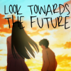
After that I rotate the text at an angle, because I want the text to have more flow. I ended up also sizing it down a little bit, because it was too dominating.
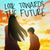
16: Now, there's a small problem. I like the text placement, but there isn't as much negative space as I wanted for the icon. Fortunately, this icon doesn't have a very complicated background, so it will be easy to fix. I hide the text layer and create a New From Visible layer, and then size it down.

Next I simply adjust the clouds with a fuzzy paintbrush so that they blend with the stuff that's showing badly. It's fairly easy to adjust and use the natural edges still, just cover up the seam and make sure it doesn't look too repeated.

17: And finally I bring the text back. The black is really stark against the lightness, so I change the color with the Colorize Tool, and then lock the layer and paint a bit of a gradient so that it matches the background. You can switch the paintbrush options to Overlay, and Multiply in order to accomplish this. And lastly, I make a quick touch up to the colors to finish it off!

Easy, right? I love working with sky backgrounds :3
This was requested by kayable.
to
01: Start by cropping your image. I needed a lot of negative space for the text that I will be adding later, so I need to create more sky. For this first step I simply create a new layer underneath the icon and fill it in with the light blue color at the top.
02: Next I doodle in the rest of the missing clouds. Nothing fancy, just a fuzzy brush to cover up the hard lines. Icon sized stuff usually is easy to fake this... I've done it a lot to add negative space.
03: Now I want to brighten up the image, so I create a New From Visible layer and use the Gaussian Blur tool.
This layer goes on Hard Light at 22.0 Opacity.
04: I want a little more contrast in the colors so I create another New From Visible layer on multiply. I don't really like the way it looks, so I go into the Curves feature and just mess around until the colors look good. For the record, this layer is at 60.0 Opacity.
This is what the layer looks like when it's not on multiply.
05: This is looking good, but not quite enough contrast. I create another New From Visible layer, and amp up the contrast with the Brightness-Contrast tool.
That gets put down to 40.0 Opacity.
06: I'm pleased with this, so now I'm going to make the colors pretty! I add this texture by vividtruth on Overlay, around 30.0 Opacity.
07: I like the contrast, but I also want this to blend a bit better, so I use a fuzzy brush and paint a light color from the clouds around the hair in the center of the icon. That gets blurred really good. I like using the Smudge Tool, and Gaussian Blur.
That gets put on Screen at 30.0 Opacity.
08: Now back to coloring. I add this texture by an unknown source on Screen at about 20.0 Opacity.
09: New From Visible, Gaussian Blur, Hard Light at about 30.0 Opacity.
10: I create a New From Visible layer, and mess around in curves until I get something like this.
That goes down to 50.0 Opacity.
11: Now I want to selectively brighten some of the colors, so I use a fuzzy brush and paint colors into certain areas that I want to pop.
That gets put on Overlay, and I adjust the Opacity for the right intensity. That will vary from icon to icon, sometimes you'll even need to duplicate this type of layer a few times if you want something super strong. For this I only needed this layer at about 50.0 Opacity.
12: To add a bit of a gradient I add this texture by sanctuarylight at around 65.0 Opacity on Overlay.
13: Looking at the icon, I realize that the yellow and the blue is a really lovely contrast, but I want to amp up the gold a bit more, so I add this texture by deliquesce. It's oversized, so I use a corner with a lot of yellow. It gets put on Soft Light at 40.0 Opacity.
14: Now I go into Hue-Saturation and really brighten up those colors.
That gets put on 40.0 Opacity.
15: Now this is the point where I was going to add the text. The theme that inspired this icon was the provided font Pea Cuartas, so I start by adding the text. I don't have a clue how my brain came up with “look towards the future", but there you go.
After that I rotate the text at an angle, because I want the text to have more flow. I ended up also sizing it down a little bit, because it was too dominating.
16: Now, there's a small problem. I like the text placement, but there isn't as much negative space as I wanted for the icon. Fortunately, this icon doesn't have a very complicated background, so it will be easy to fix. I hide the text layer and create a New From Visible layer, and then size it down.
Next I simply adjust the clouds with a fuzzy paintbrush so that they blend with the stuff that's showing badly. It's fairly easy to adjust and use the natural edges still, just cover up the seam and make sure it doesn't look too repeated.
17: And finally I bring the text back. The black is really stark against the lightness, so I change the color with the Colorize Tool, and then lock the layer and paint a bit of a gradient so that it matches the background. You can switch the paintbrush options to Overlay, and Multiply in order to accomplish this. And lastly, I make a quick touch up to the colors to finish it off!
Easy, right? I love working with sky backgrounds :3