Tutorial #004
benelie asked me about the text effect I used on the Dollhouse picspam, so here’s a simple tutorial.

Tutorial #004: Text effect
Made in: Photoshop CS2
Level of Difficulty: Easy, even for beginners
Let’s start with a screencap that I’ve already worked (colorings etc.) on as a base.

Sometimes it can be hard to come up with a text that fits a certain scene, so just try to be creative, you can use quotes or even lyrics, that’s all up to you.
Once you have an idea what kind of text you want to write on your icon, you have to decide what font to use. There are unlimited ways of how to use a font: use different sizes --> make important words bigger, use different styles like bold or italic, or just use different fonts! There are many sites that offer fonts for free, my personal favourite is dafont!
Anyhoodle, for this tutorial I decided to use BorisBlackBloxxx (1), size 30pt (2), set the anti-aliasing to “Smooth” (3), because the other methods (Sharp, Crisp, Strong) make this font look a bit pixelated.
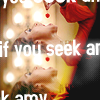
Another important thing when it comes to text is the placement. I personally try to avoid long sentences otherwise your icon looks distracting and overloaded. Therefore I'd recommend to use only a few words that reflect the cap/scene. Don’t just copy and paste a long NY Times article…
I could already finish this cap, because the background of the cap is not too bright so you’re still able to read the text. But sometimes you have brighter caps, and bright cap + white font color = hardly readable. So that’s why we have to change the color (plus, it makes the font look more interesting). I usually use the EYEDROPPER TOOL (4) to get a color from the actual screencap which I then use instead of the white font color.
Then I look for another color, usually a similar color but just a bit darker to use it as an outline. Double-click the text in the layers palette (or right-click and then “Blending Options…” (5) ), go to STROKE (6), use the new color and set the size to 1, then click OK.
Then right-click your text layer and duplicate it. Make sure that the duplicate's stroke function is TURNED OFF (7).
Then go to Filter >> Blur >> Gaussian Blur… and in order to go on you have to rasterize the text. Now you can decide what pixels you set for the radius (8), I wouldn’t use more than 3 pixels, otherwise the blur won’t cover the actual font anymore.
Merge all the layers and you’re finished!
Other examples using the same technique:
°°° PREVIOUS TUTORIALS
UNLIMITED REQUESTS (at least for now)
*** IT'S ALL YOUR FAULT
- a supernatural/veronica mars crossover video
*** SCREAM
- a supernatural video
*** SOMETHING ABOUT YOU
- a true blood video
*** GIMME MORE SUPERNATURAL
- a britney/spn video made by me
--- PIC SPAM #006: Dollhouse - 1x08 "Needs" - favorite scenes
--- PIC SPAM #005: Buffy the Vampire Slayer - sad scenes
--- PIC SPAM #004: Tru Calling 1x01 "Pilot"
--- PIC SPAM #003: 2008 Review
--- PIC SPAM #002: Britney Spears
+++ GRAPHIC POST #067 (incl. dollhouse, spn, harper's island, chuck, animated banners etc.)
+++ GRAPHIC POST #066 (incl. bsg, btvs, csi: miami, dollhouse, ncis, spn, weeds etc.)
+++ GRAPHIC POST #065 (incl. interest icons, dollhouse, himym, the oc, spn etc.)
+++ GRAPHIC POST #064 (incl. american idol, the closer, damages, dollhouse etc.)
+ credit cool_graphix when using
+ comments make my day
+ do not hotlink nor customize
+ feel free to FRIEND
++ affiliates; font guide; resources
Tutorial #004: Text effect
Made in: Photoshop CS2
Level of Difficulty: Easy, even for beginners
Let’s start with a screencap that I’ve already worked (colorings etc.) on as a base.
Sometimes it can be hard to come up with a text that fits a certain scene, so just try to be creative, you can use quotes or even lyrics, that’s all up to you.
Once you have an idea what kind of text you want to write on your icon, you have to decide what font to use. There are unlimited ways of how to use a font: use different sizes --> make important words bigger, use different styles like bold or italic, or just use different fonts! There are many sites that offer fonts for free, my personal favourite is dafont!
Anyhoodle, for this tutorial I decided to use BorisBlackBloxxx (1), size 30pt (2), set the anti-aliasing to “Smooth” (3), because the other methods (Sharp, Crisp, Strong) make this font look a bit pixelated.
Another important thing when it comes to text is the placement. I personally try to avoid long sentences otherwise your icon looks distracting and overloaded. Therefore I'd recommend to use only a few words that reflect the cap/scene. Don’t just copy and paste a long NY Times article…
I could already finish this cap, because the background of the cap is not too bright so you’re still able to read the text. But sometimes you have brighter caps, and bright cap + white font color = hardly readable. So that’s why we have to change the color (plus, it makes the font look more interesting). I usually use the EYEDROPPER TOOL (4) to get a color from the actual screencap which I then use instead of the white font color.
Then I look for another color, usually a similar color but just a bit darker to use it as an outline. Double-click the text in the layers palette (or right-click and then “Blending Options…” (5) ), go to STROKE (6), use the new color and set the size to 1, then click OK.
Then right-click your text layer and duplicate it. Make sure that the duplicate's stroke function is TURNED OFF (7).
Then go to Filter >> Blur >> Gaussian Blur… and in order to go on you have to rasterize the text. Now you can decide what pixels you set for the radius (8), I wouldn’t use more than 3 pixels, otherwise the blur won’t cover the actual font anymore.
Merge all the layers and you’re finished!
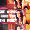
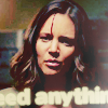
Other examples using the same technique:


°°° PREVIOUS TUTORIALS
UNLIMITED REQUESTS (at least for now)
*** IT'S ALL YOUR FAULT
- a supernatural/veronica mars crossover video
*** SCREAM
- a supernatural video
*** SOMETHING ABOUT YOU
- a true blood video
*** GIMME MORE SUPERNATURAL
- a britney/spn video made by me
--- PIC SPAM #006: Dollhouse - 1x08 "Needs" - favorite scenes
--- PIC SPAM #005: Buffy the Vampire Slayer - sad scenes
--- PIC SPAM #004: Tru Calling 1x01 "Pilot"
--- PIC SPAM #003: 2008 Review
--- PIC SPAM #002: Britney Spears
+++ GRAPHIC POST #067 (incl. dollhouse, spn, harper's island, chuck, animated banners etc.)
+++ GRAPHIC POST #066 (incl. bsg, btvs, csi: miami, dollhouse, ncis, spn, weeds etc.)
+++ GRAPHIC POST #065 (incl. interest icons, dollhouse, himym, the oc, spn etc.)
+++ GRAPHIC POST #064 (incl. american idol, the closer, damages, dollhouse etc.)
+ credit cool_graphix when using
+ comments make my day
+ do not hotlink nor customize
+ feel free to FRIEND
++ affiliates; font guide; resources