i dont really have a lot to say about these layouts but i thought that i would share. i thought that i liked the papers until i actually put them to use and then i realized that the colors were really kind of strange.
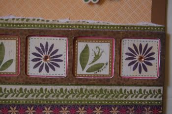
The borders are great, the colors are very vivid - love the swirly-flowly backgrounds =) The stitches on the last one, and ribbons with beads on the engagement one are lovely.
The only thing I don't like is actually the use of photos on the husband-infant pages. On the very first layout 60% of photo are depicting white wall. And it takes time and concentration to find the baby, the one to whom this layout is devoted. If I were dealing with a photo like that I definitely would cut off the upper half - it's absolutely useless and adds no information to the page. The same thing about the "1st birthday" layout. The left photo has only 20% of a baby and the rest shows something that shouldn't be there, why not to crop it properly?.. Sorry for criticism, just wanted to be honest ;)
It seems that you do all your scrapbooking "for someone" or only for money not caring about your own point of view. I thought that at least your husband's photos were used for your private layouts... If I were in your pair of shoes I would convice those "who asked to use them as is" that cropped would look better, don't they see it themselves?..
It's really very sad =( such a great layout with such poor photos and absolutely no care about how it looks.
i never said that someone was paying for these layouts... please think again before you say that i do all of my scrapbooking for money and not caring about my own artistic interpretation.
how many layouts have i posted in the past 3 years? lets take it into perspective before you throw stones.
The stitches on the last one, and ribbons with beads on the engagement one are lovely.
The only thing I don't like is actually the use of photos on the husband-infant pages. On the very first layout 60% of photo are depicting white wall. And it takes time and concentration to find the baby, the one to whom this layout is devoted. If I were dealing with a photo like that I definitely would cut off the upper half - it's absolutely useless and adds no information to the page.
The same thing about the "1st birthday" layout. The left photo has only 20% of a baby and the rest shows something that shouldn't be there, why not to crop it properly?..
Sorry for criticism, just wanted to be honest ;)
Reply
Reply
It's really very sad =( such a great layout with such poor photos and absolutely no care about how it looks.
Reply
how many layouts have i posted in the past 3 years? lets take it into perspective before you throw stones.
Reply
Reply
Reply
Leave a comment