(no subject)
i am somewhat between kits right now and playing with some random supplies on hand. you would think that with all the random supplies that i have on hand, i would do this more often but i always tend to opt for the ease of already coordinated products instead of having to do this process on a whim when i am ready to just enjoy creating.
regardless, i played a bit with kaiser paper. i am really loving kaiser right now and am somewhat sad that they are in austrailia though i hear they have a US branch in IL.
i played a bit with ranger glossy accents again. this paper had a bunch of splotches on it that screamed to be coated with glossy accents to make them look like real and wet paint splotches.
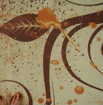
other than the glossy accents on this layout, i also played a bit with some more ribbon techniques. i think i am exhausting the rouching technique.
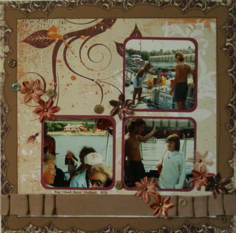
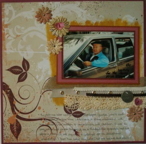
i tried the rouching again with the ribbon here but did not hide the staples. had i the opportunity to do this layout over again, i might have hidden the staples but you all know how i feel about tearing apart and/or redoing layouts.
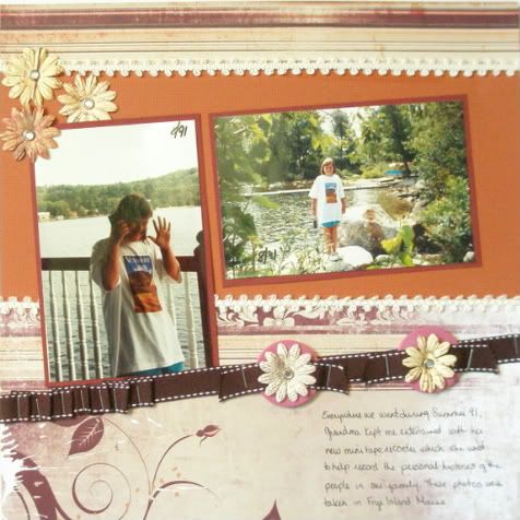
this is a fairly modest layout. i really wanted to show off the photos and the papers on their own for this layout so there isnt much flash or flair on the paper.
this is about my grandfather and how i didnt have much of a relationship with him at the time that these photos were taken... i wish i had. it was 15 years before his death.... i wanted the layout to focus on the photo and the journaling and i think i did. i used a lot of ribbon. and i used some brown paint to highlight the photo area. i think it looks decent but not the best amy work.
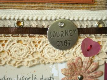
a close up of the ribbon and charms:
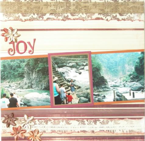
this one i love. its not what i anticipated but i really like it. look at those thicker letters.
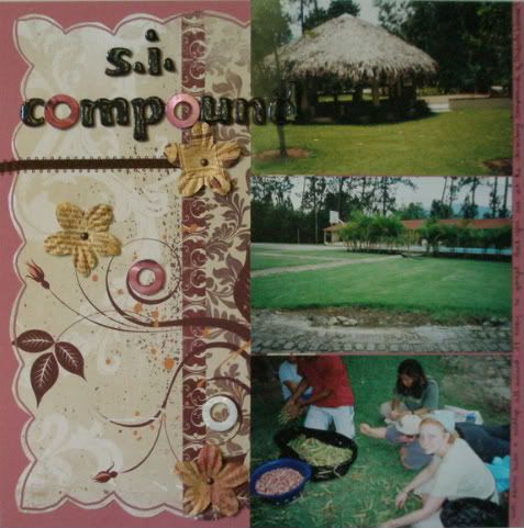
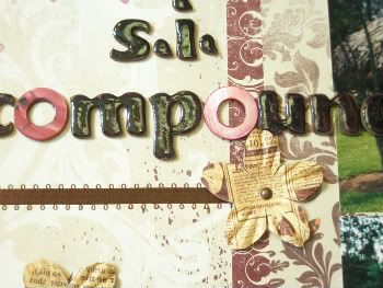
those thickers were brown originally. i covered them with a glitter grey american crafts marker. i outlined them with a pinkish color. i didnt have any "o"s so i used some mother of pearl type finish ring beads instead. then i poured some glossy accents over the top of the colored thickers. the results were quite unexpected. apparently the markers didnt like the liquid of the glossy accents and the colors lifted into the glossy accents and marbling effect and now matches those mother of pearl rings perfectly. its awesome and these photos dont do it justice. sorry.
I get to play with the september commit 2 paper kit this weekend. i am totally excited about that. and i have some other awesome layout ideas still floating around in my head.
thanks for looking. as always, feedback and comments appreciated.
253, 254, 255, 256, 257
regardless, i played a bit with kaiser paper. i am really loving kaiser right now and am somewhat sad that they are in austrailia though i hear they have a US branch in IL.
i played a bit with ranger glossy accents again. this paper had a bunch of splotches on it that screamed to be coated with glossy accents to make them look like real and wet paint splotches.

other than the glossy accents on this layout, i also played a bit with some more ribbon techniques. i think i am exhausting the rouching technique.

i tried the rouching again with the ribbon here but did not hide the staples. had i the opportunity to do this layout over again, i might have hidden the staples but you all know how i feel about tearing apart and/or redoing layouts.

this is a fairly modest layout. i really wanted to show off the photos and the papers on their own for this layout so there isnt much flash or flair on the paper.

this is about my grandfather and how i didnt have much of a relationship with him at the time that these photos were taken... i wish i had. it was 15 years before his death.... i wanted the layout to focus on the photo and the journaling and i think i did. i used a lot of ribbon. and i used some brown paint to highlight the photo area. i think it looks decent but not the best amy work.

a close up of the ribbon and charms:

this one i love. its not what i anticipated but i really like it. look at those thicker letters.

those thickers were brown originally. i covered them with a glitter grey american crafts marker. i outlined them with a pinkish color. i didnt have any "o"s so i used some mother of pearl type finish ring beads instead. then i poured some glossy accents over the top of the colored thickers. the results were quite unexpected. apparently the markers didnt like the liquid of the glossy accents and the colors lifted into the glossy accents and marbling effect and now matches those mother of pearl rings perfectly. its awesome and these photos dont do it justice. sorry.

I get to play with the september commit 2 paper kit this weekend. i am totally excited about that. and i have some other awesome layout ideas still floating around in my head.
thanks for looking. as always, feedback and comments appreciated.
253, 254, 255, 256, 257