093: Tutorial
michelle's second (ever) tutorial.
i haven't done a tutorial in a really long time. i don't like doing them. they are time consuming and annoying, but i'll do one anyhow, because i was asked nicely and i managed to almost recreate the icon that was requested.
so here we go. i would like to point out that most things i do were taken from other people. while i play with things a lot, i too get stuff from other people's tutorials.
so, going from this to this.
this first part is taken borrowed from brasaremean's veronica mars tutorial:
crop your base however you want. resize it to 200x200px.
why 200x200px and not straight down? i dunno. i feel it keeps some detail that way, but i've been doing it like that for a while. so do it or not, i don't care.
here's mine:
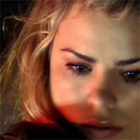
duplicate the base and set to screen 100%.
go to layer > new adjustment layer > hue/saturation. increase saturation to +11.
go to layer > new adjustment layer > selective color. here are the settings i used;
reds;
cyan: -100
yellow: +100
yellows;
cyan: -100
yellow: +100
neutrals;
cyan: +100
yellow: -35
go to layer > new adjustment layer > selective color again. here are the settings i used;
reds;
cyan: -100
yellow: +100
yellows;
cyan: -77
yellow: +6
neutrals;
cyan: +13
yellow: -14
now, depending on the picture, the crop, etc. these last 3 steps can be modified. if the cap looks kind of grayish, you'll want to increase the saturation more so the colors can be magnified more with selective color. if you want less yellows, in the first selective color layer, under yellows, move the yellow bar down into the negatives for as long as it still looks natural. these three previous steps are what i really use to color my icons, though for every icon, the settings are different.
now, flatten all layers and resize to 100x100px. mine is looking like this right now:
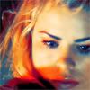
create a new layer and fill it with a light blue color. for this icon, i used #D3E0F7. set this layer on color burn. duplicate it, but change the opacity(well, i use fill...) to 50%. this brings out the blue.
create another new layer and fill this one with a light orangish color. i used #F7E6D3. set this layer on soft light. create another new layer with this same color and set it to color burn. duplicate that layer, changing the opacity to 50%. this brings out the orange and yellows, and makes it darker. it also hides some of the blue.
again, these last steps really are up to you. stop when you get an icon you like. if you like the coloring, go a little further, but if it doesn't look nice, delete the layers and stick with what you liked.
merge these layers. next i sometimes but a smog texture by perforada at peoplemachines and set it either to exclusion or screen, depending on if i want it lighter or darker. i end with a curves layer to brighten or darken the icon. on this icon, i used the smog texture on screen, and my curves settings were as such;
RBG;
input: 40
output: 0
input: 235
ouput: 255
so looking like this
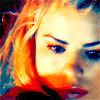
so here's the final product again:
icons that were made like this one;
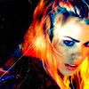
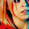
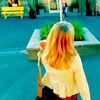
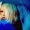
actually, almost everything in this post was made in a similar way to this, with some differences here and there, obviously.
so there you are. now. traditionally there is a 1 year gap between my tutorials. but i might change that. might. depending on how this goes over. but if you have any icons that you'd like to know how i made, please comment here with the icon. but don't choose something that i made back like a year ago, because i won't know what i did. ok?
this tutorial was requested by ninnui
i haven't done a tutorial in a really long time. i don't like doing them. they are time consuming and annoying, but i'll do one anyhow, because i was asked nicely and i managed to almost recreate the icon that was requested.
so here we go. i would like to point out that most things i do were taken from other people. while i play with things a lot, i too get stuff from other people's tutorials.
so, going from this to this.
this first part is taken borrowed from brasaremean's veronica mars tutorial:
crop your base however you want. resize it to 200x200px.
why 200x200px and not straight down? i dunno. i feel it keeps some detail that way, but i've been doing it like that for a while. so do it or not, i don't care.
here's mine:

duplicate the base and set to screen 100%.
go to layer > new adjustment layer > hue/saturation. increase saturation to +11.
go to layer > new adjustment layer > selective color. here are the settings i used;
reds;
cyan: -100
yellow: +100
yellows;
cyan: -100
yellow: +100
neutrals;
cyan: +100
yellow: -35
go to layer > new adjustment layer > selective color again. here are the settings i used;
reds;
cyan: -100
yellow: +100
yellows;
cyan: -77
yellow: +6
neutrals;
cyan: +13
yellow: -14
now, depending on the picture, the crop, etc. these last 3 steps can be modified. if the cap looks kind of grayish, you'll want to increase the saturation more so the colors can be magnified more with selective color. if you want less yellows, in the first selective color layer, under yellows, move the yellow bar down into the negatives for as long as it still looks natural. these three previous steps are what i really use to color my icons, though for every icon, the settings are different.
now, flatten all layers and resize to 100x100px. mine is looking like this right now:

create a new layer and fill it with a light blue color. for this icon, i used #D3E0F7. set this layer on color burn. duplicate it, but change the opacity(well, i use fill...) to 50%. this brings out the blue.
create another new layer and fill this one with a light orangish color. i used #F7E6D3. set this layer on soft light. create another new layer with this same color and set it to color burn. duplicate that layer, changing the opacity to 50%. this brings out the orange and yellows, and makes it darker. it also hides some of the blue.
again, these last steps really are up to you. stop when you get an icon you like. if you like the coloring, go a little further, but if it doesn't look nice, delete the layers and stick with what you liked.
merge these layers. next i sometimes but a smog texture by perforada at peoplemachines and set it either to exclusion or screen, depending on if i want it lighter or darker. i end with a curves layer to brighten or darken the icon. on this icon, i used the smog texture on screen, and my curves settings were as such;
RBG;
input: 40
output: 0
input: 235
ouput: 255
so looking like this
so here's the final product again:

icons that were made like this one;
actually, almost everything in this post was made in a similar way to this, with some differences here and there, obviously.
so there you are. now. traditionally there is a 1 year gap between my tutorials. but i might change that. might. depending on how this goes over. but if you have any icons that you'd like to know how i made, please comment here with the icon. but don't choose something that i made back like a year ago, because i won't know what i did. ok?
this tutorial was requested by ninnui