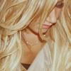
(no subject)

to

Photoshop 7
Medium
Adjustment Layers (Curves, Colour Balance & Channel Mixer)
Image Heavy
.PSD
01. Prep your base. I normally work on a full size picture and then crop once I've finished editing. I also never sharpen my base first - again, I always sharpen my base once I've finished editing. This time I used Variations {image-->adjustments-->variations}, I can't remember the exact settings I used but I think I went Darker, More Yellow, More Cyan.

02. Duplicate your base and set to SCREEN with 60% fill.

03. Create a new colour fill layer {layer-->new fill layer-->solid colour) and fill with #341603. Set to EXCLUSION at 100% opacity.

04. Obviously, it's too washed out now so to add some more colour I created another colour fill layer and filled it with #D23B3B and set it to SOFT LIGHT with fill and opacity both on 50%.

05. Go layer-->new adjustment layer-->gradient map. Chose the black & white gradient. Click 'okay'. Tick the box that says 'reverse'. {SCREENCAP}. If your using PSP, merge everything, dupicate, desaturate and invert the image. Set to SOFT LIGHT with opacity and fill both on 50%.

06. It's still really washed out so create another new colour fill layer and fill with #000000 set to SOFT LIGHT at 50%.

07. Create a Channel Mixer new adjustment layer.
OUTPUT CHANNEL
Blue:
Red: 0%
Green: 0%
Blue: 114%

08. Create a Colour Balance new adjustment layer.
Midtones: -20, 0, -13
Highlights: -5, 0, -6
Shadows: +1, 0, -1

09. The rest of the steps are just used to increase the brightness and contrast, because with this picture I wasn't happy with either. This is different for all pictures though & these settings mighten work for your pic... but I found that they did with most pictures. Create another colour fill layer and fill it with #E6E6E6 and set to COLOUR BURN at 100% opacity.

10. Create a Brightness and Contrast new adjustment layer.
Brightness: -4
Contrast: +6

11. Create a Curves new adjustment layer.
RBG
first point;
Input: 15 || Output: 0
second point;
Input: 119 || Output: 129
third point;
Input: 240 || Output: 255
BLUE
first point;
Input: 15 || Output: 0
second point;
Input: 119 || Output: 129
third point;
Input: 240 || Output: 255

12. Create a Curves new adjustment layer.
RBG
first point;
Input: 117 || Output: 140

Done!
Hope this was useful & If you use this to make icons I'd love to see the results =)
Nearly ALL the icons/headers in THIS post, was made using this colouring.